Labis Home OfficeBrand Identity
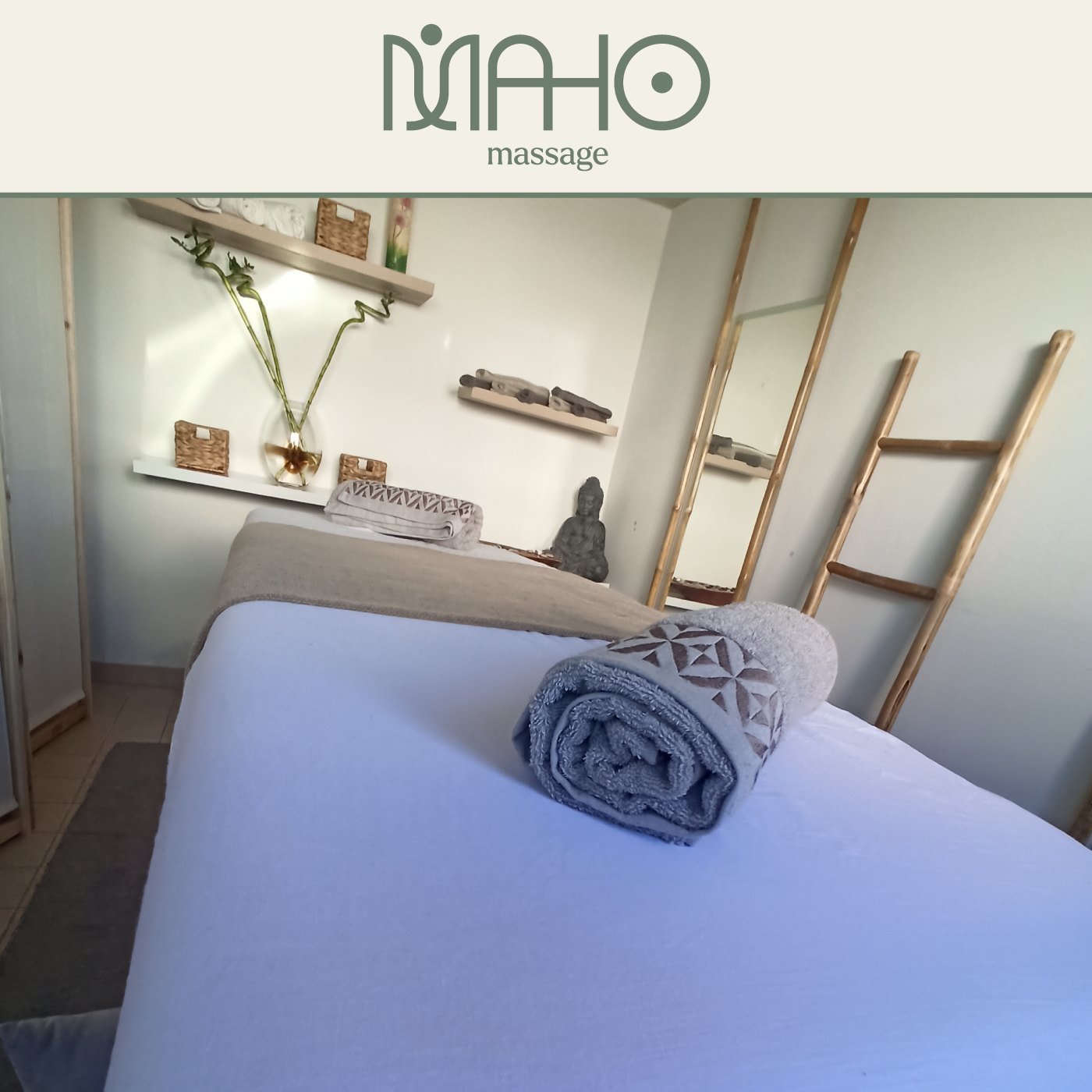
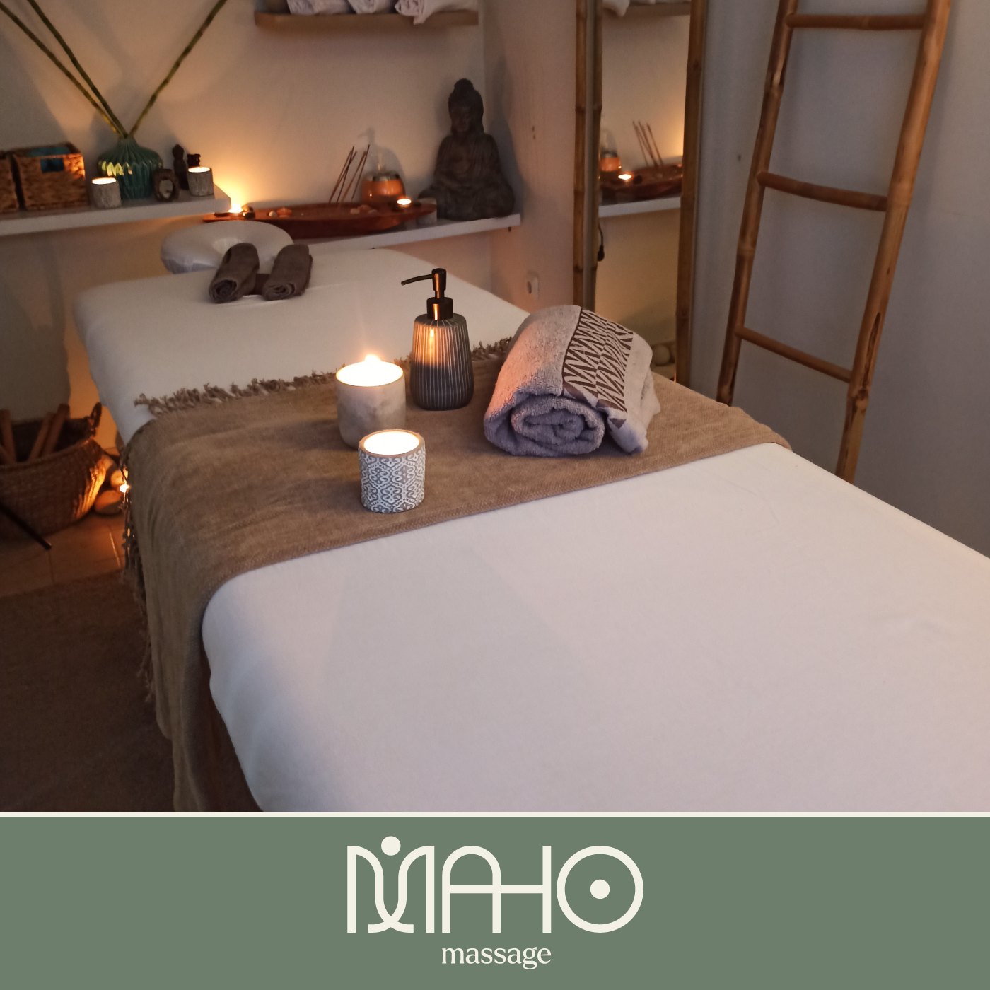
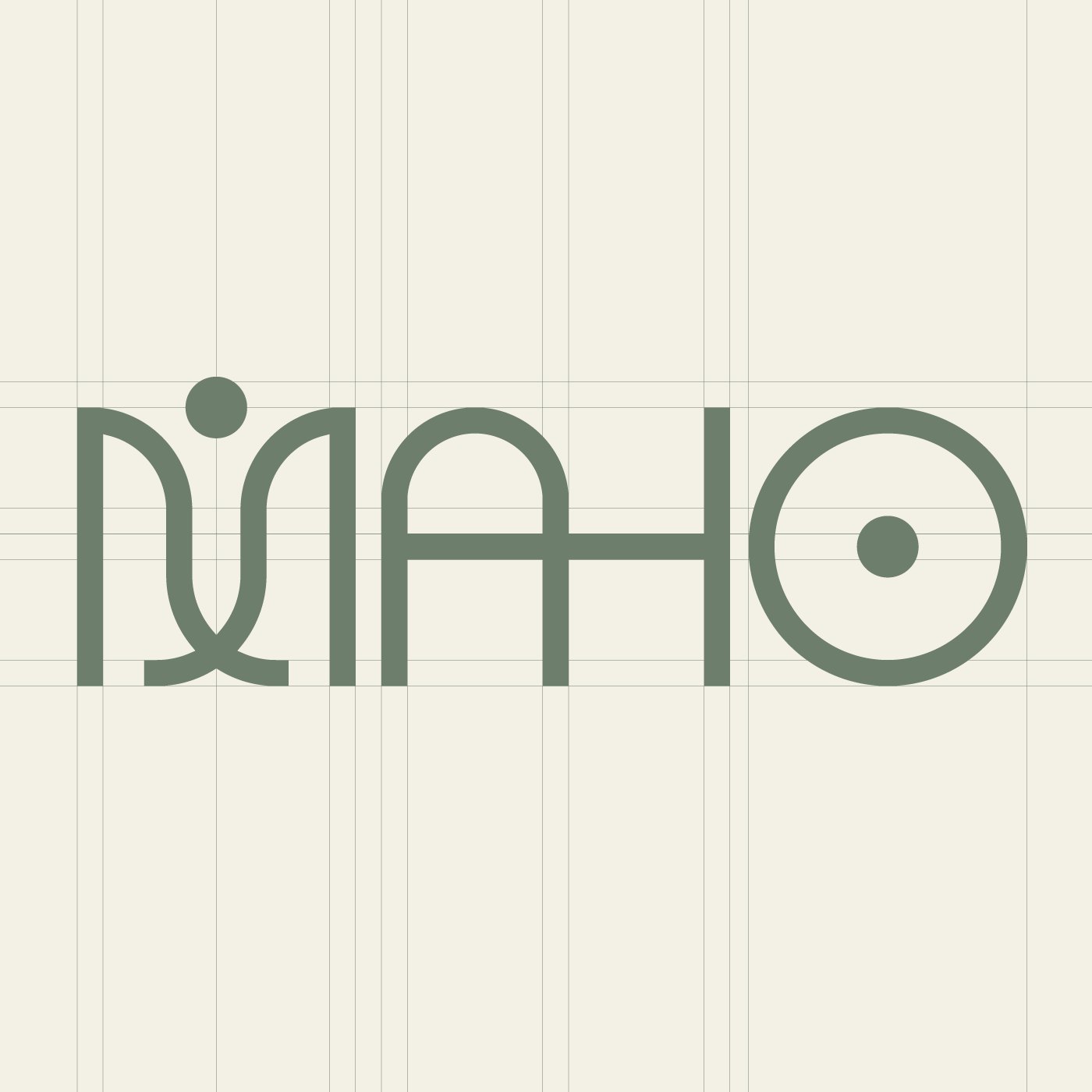
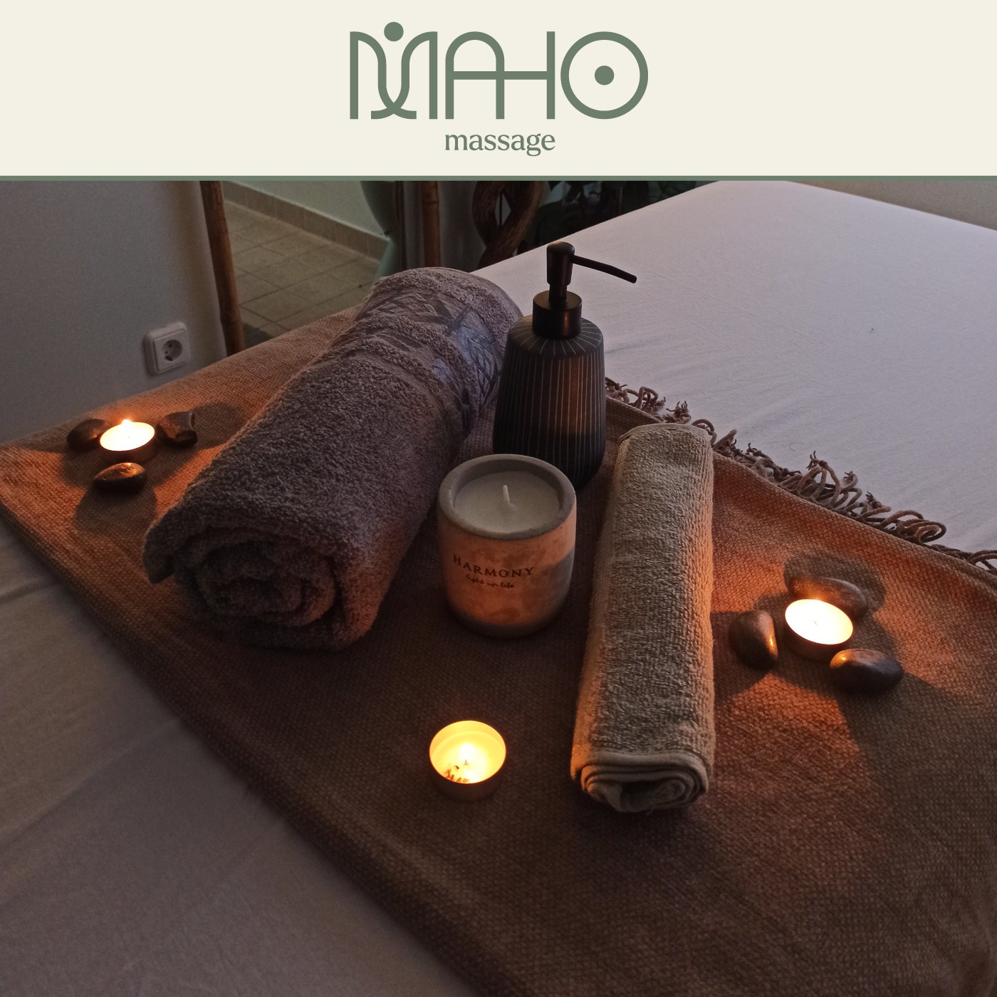
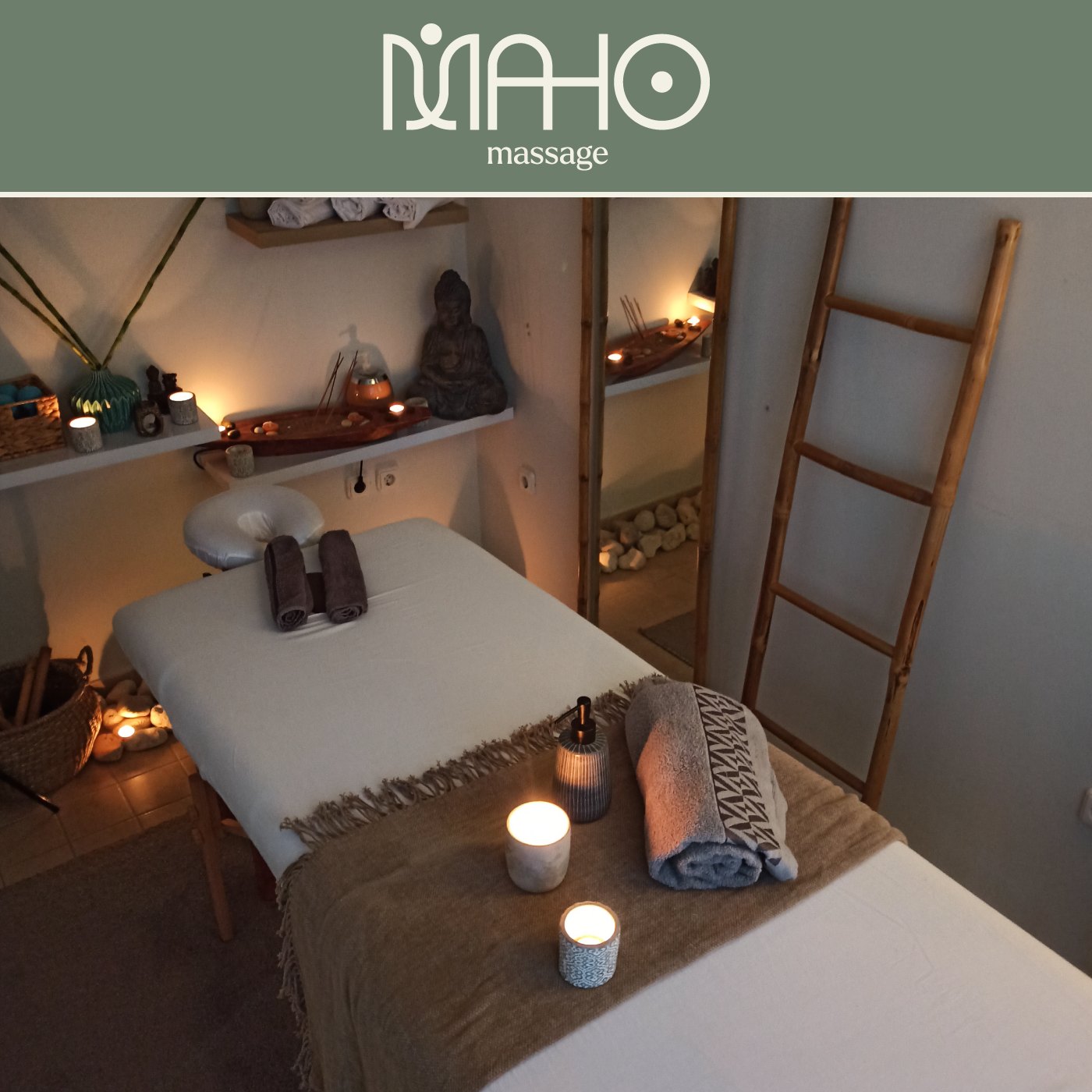
Brand identity for Maho Massage. The M is drawn as one continuous line that forms a human figure, in calm green and cream. The identity continues in avatars and social media posts, with a soft typeface and photos that carry the feeling of rest.
I designed it from the first sketch to the final files, working step by step with the client. If you want something similar for your own business, get in touch.
Images (16)
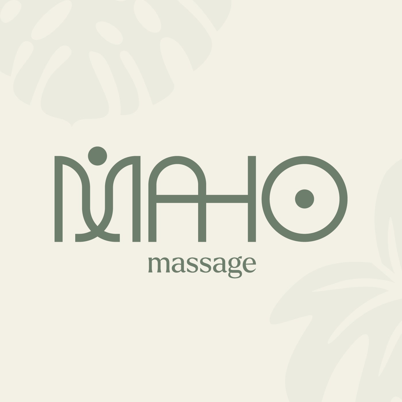
Logo design. A logo that reads at a glance and that you won't want to replace in two years. When it helps, I draw custom lettering or a whole typeface, as I did for Nikol Tools.
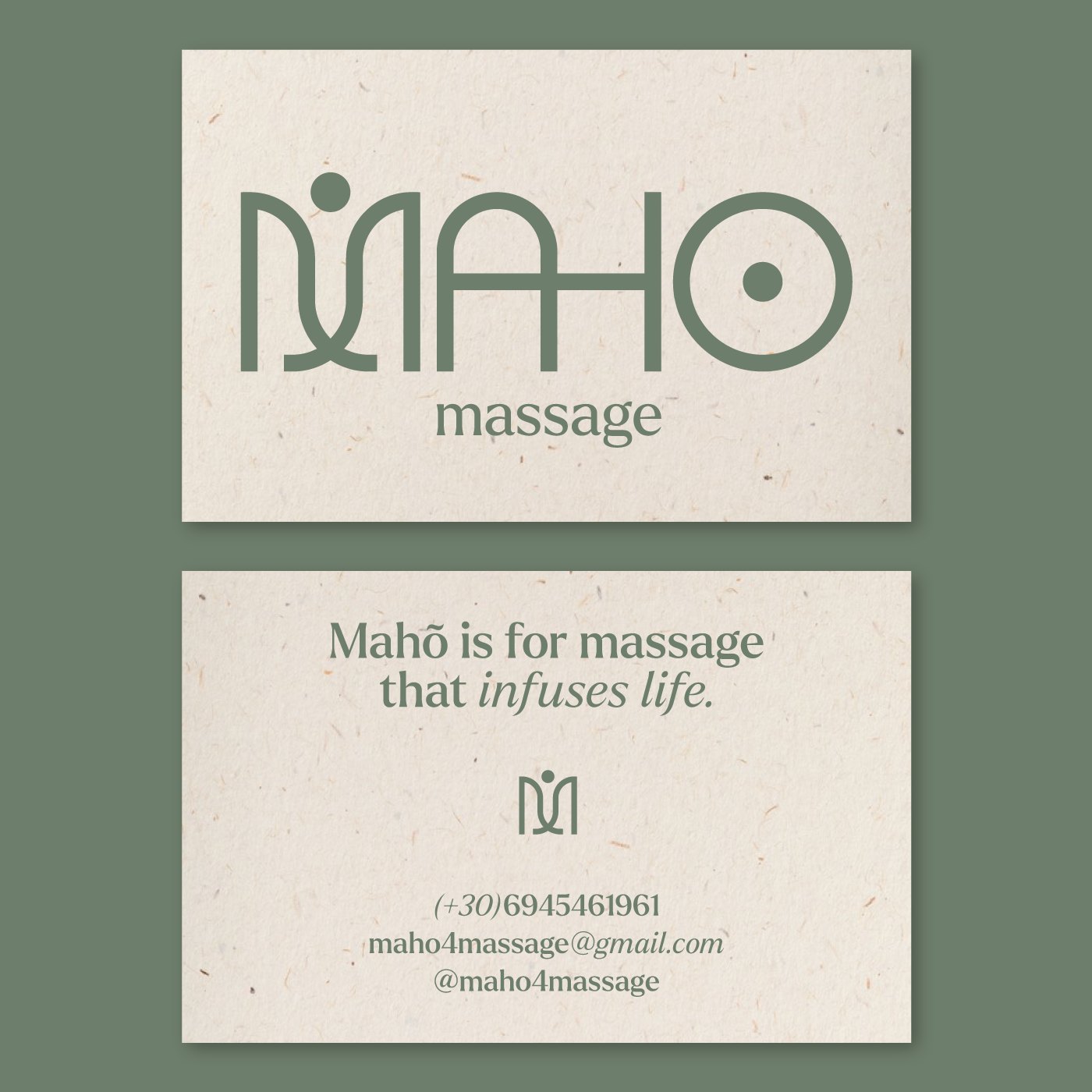
Brand identity. The logo is the start. The identity is the colours, type and rules that make a business card, a paper bag and a post look like they came from the same shop.
Digital, social and events. Posts, stories, short animations and event material, such as the Corinthian Carnival and the Seaside Days festival.
Looking for a logo, a brand identity and social media design for your own business? Tell me about it and I will reply with a written quote, or see the packages with prices.