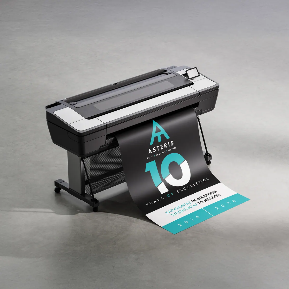
Asteris · 10 YearsRebranding
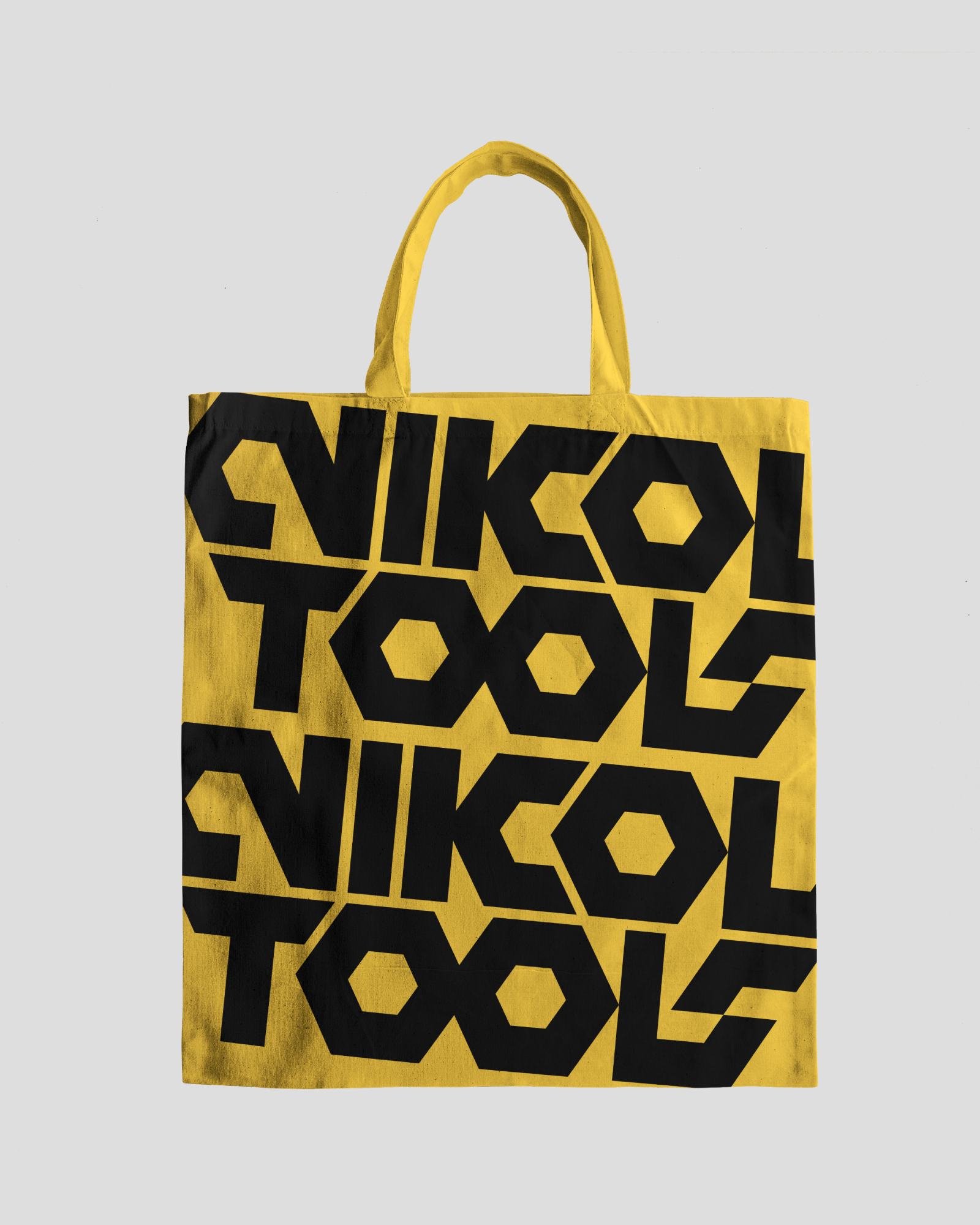
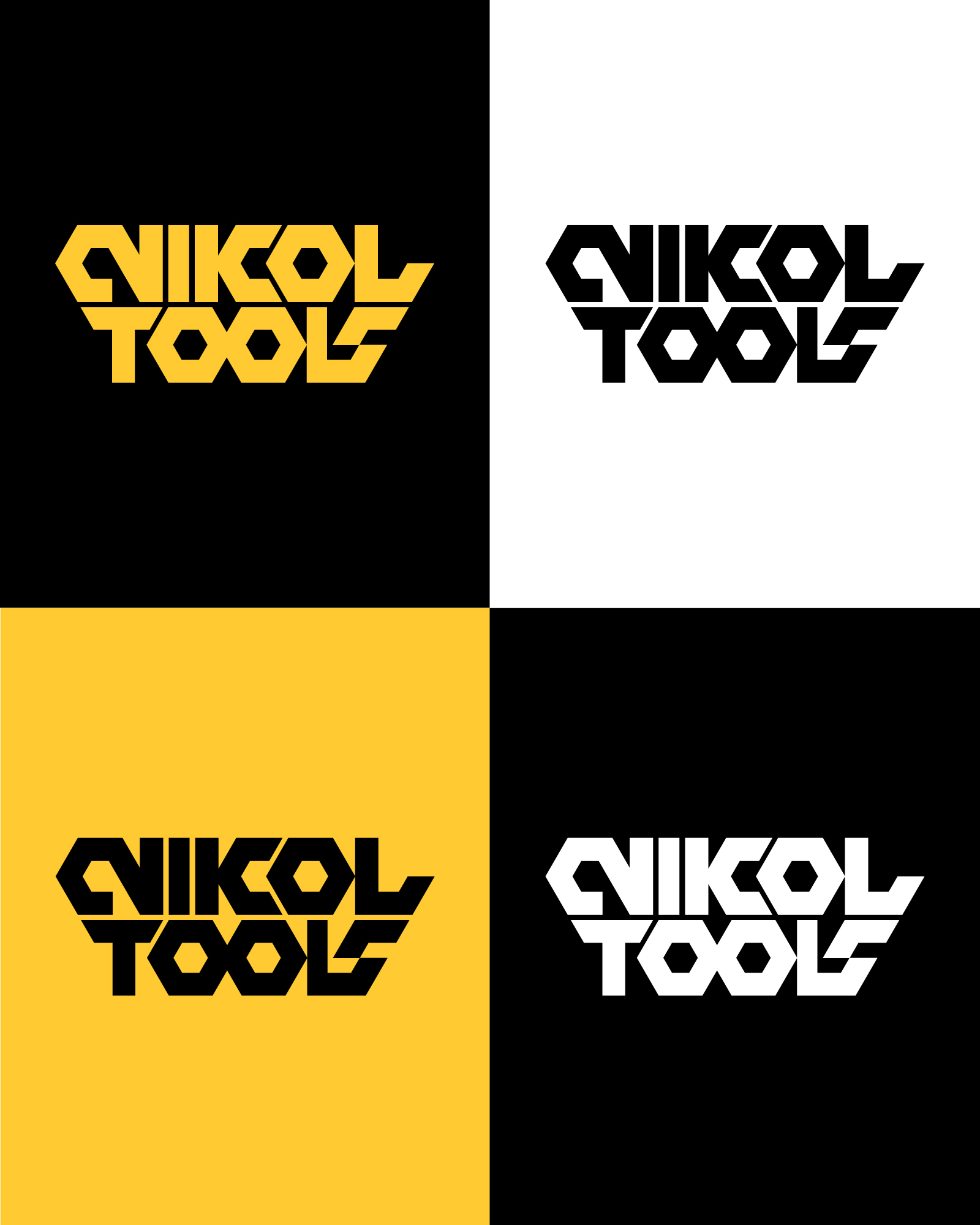
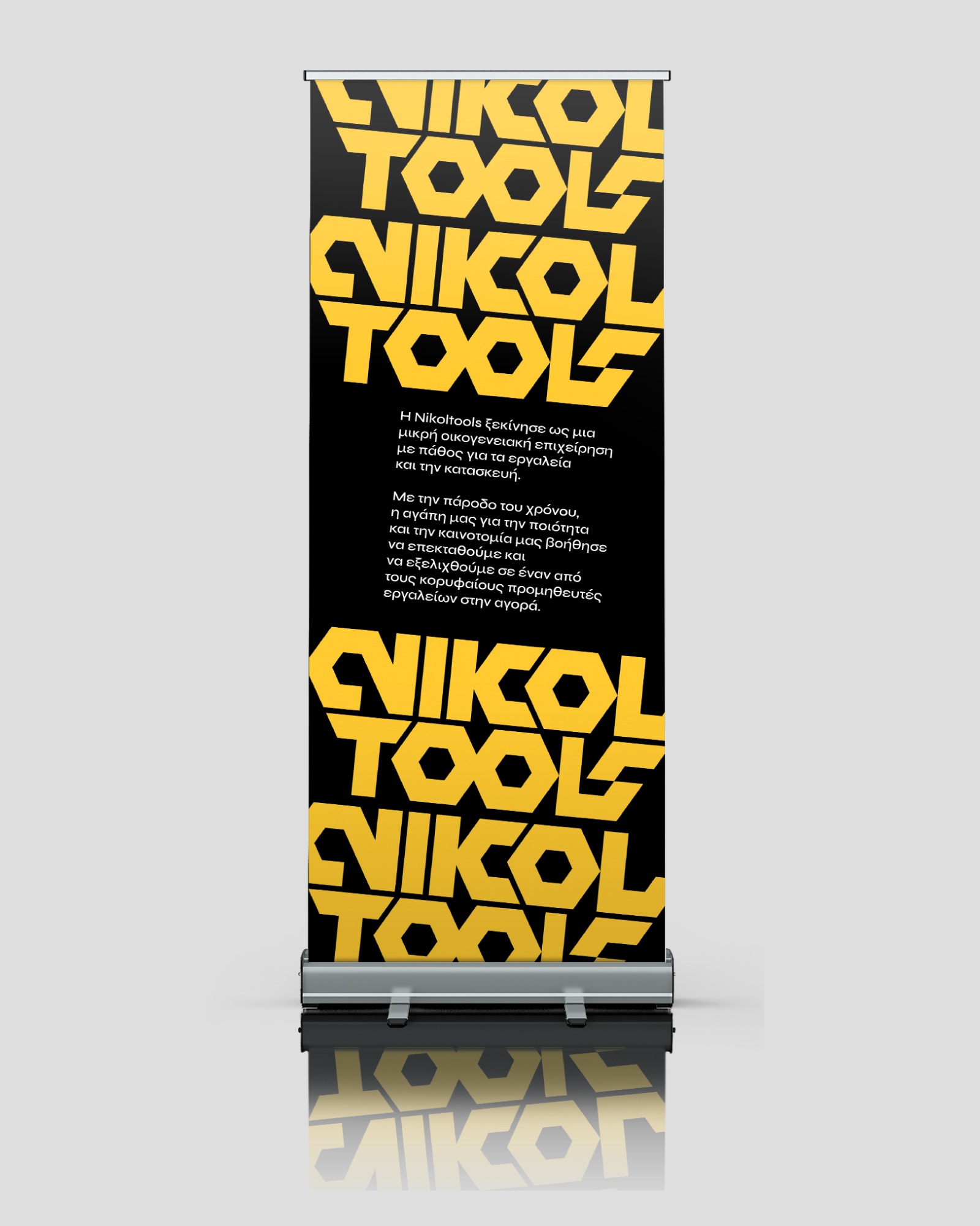
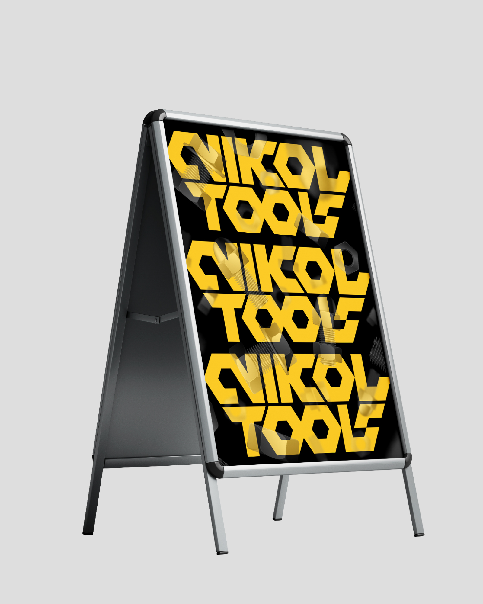
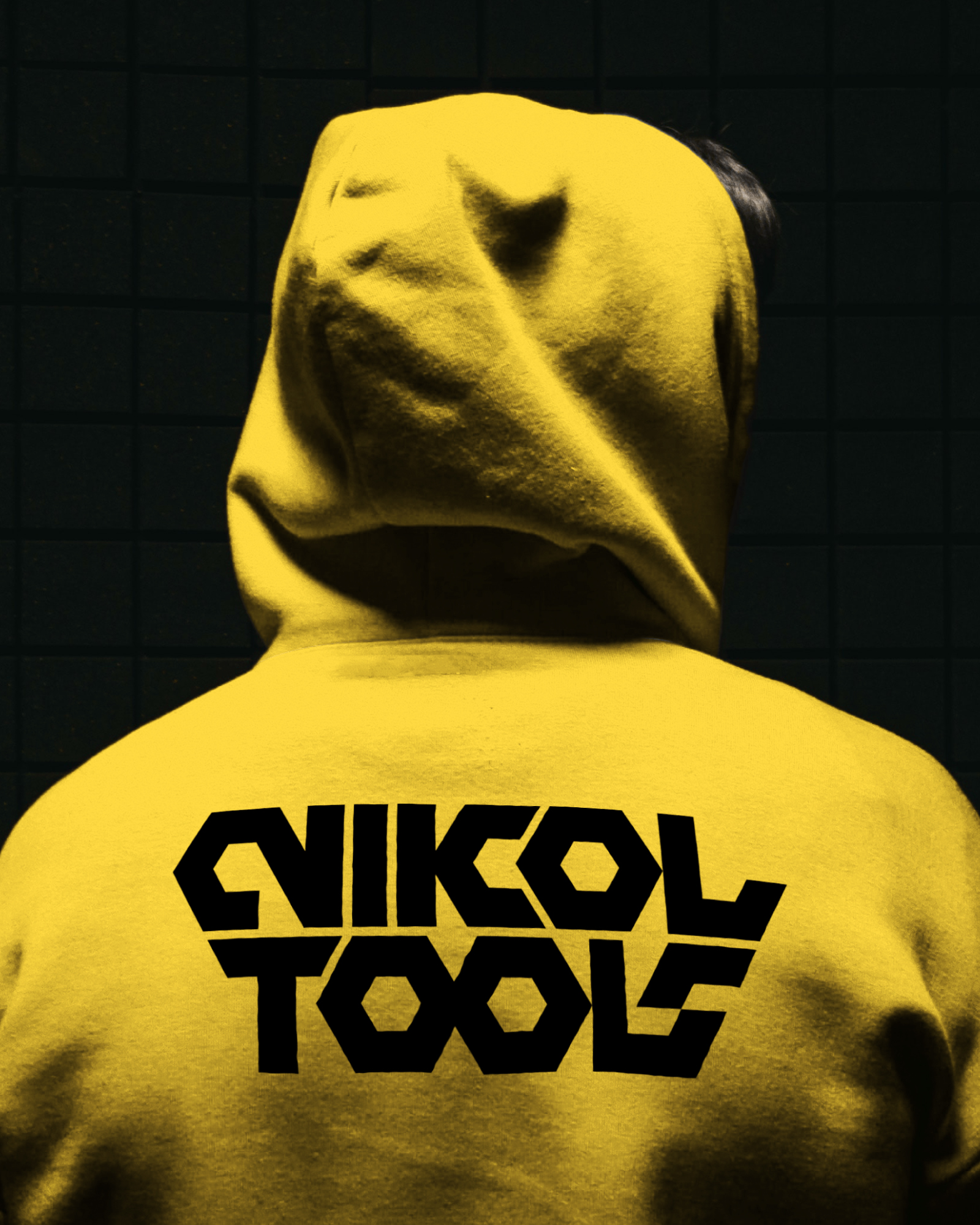
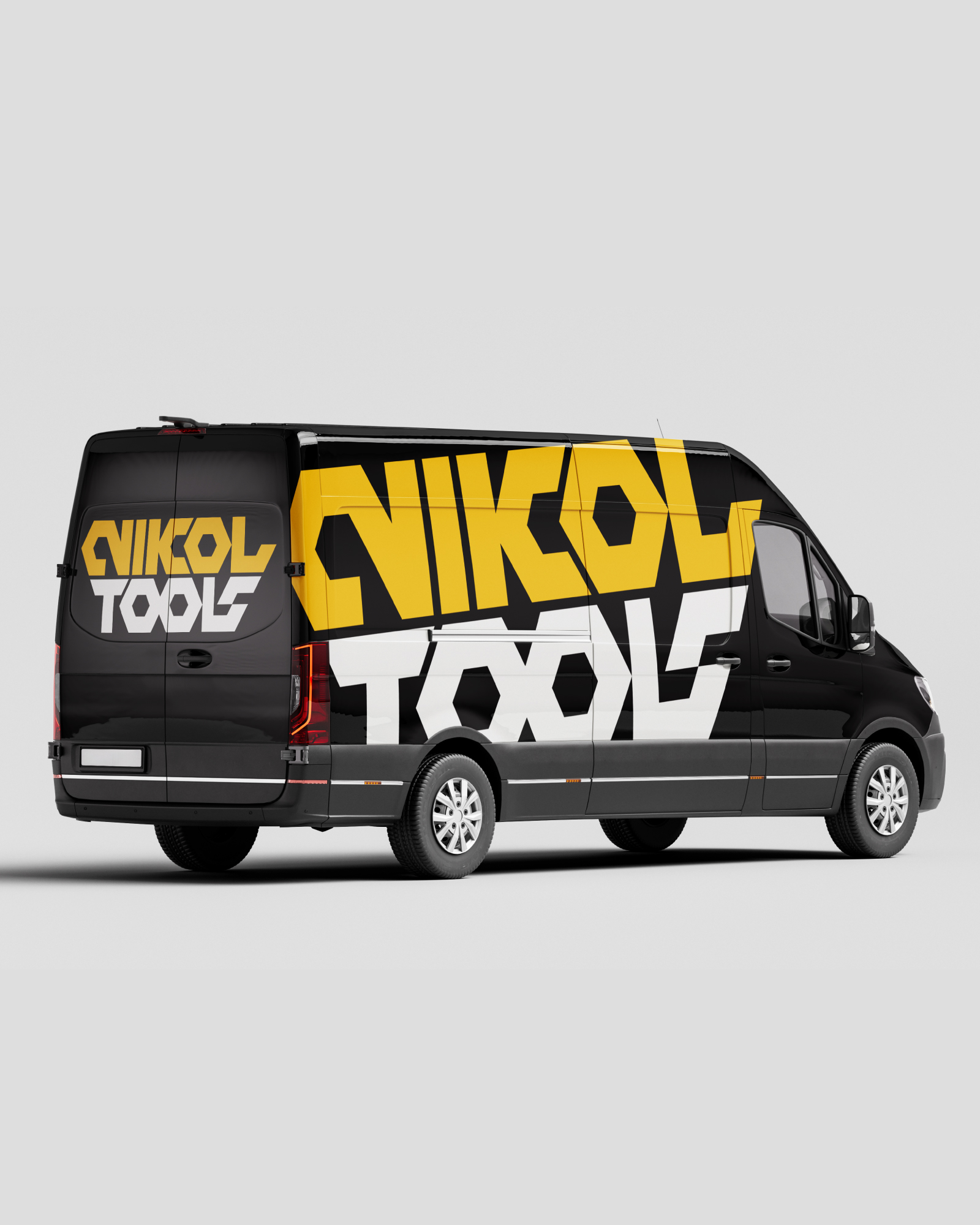
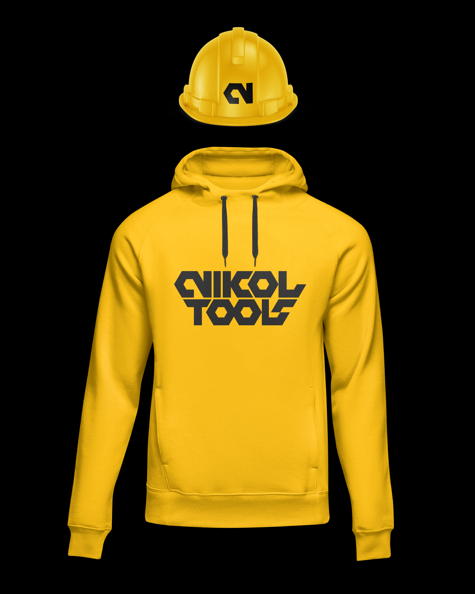
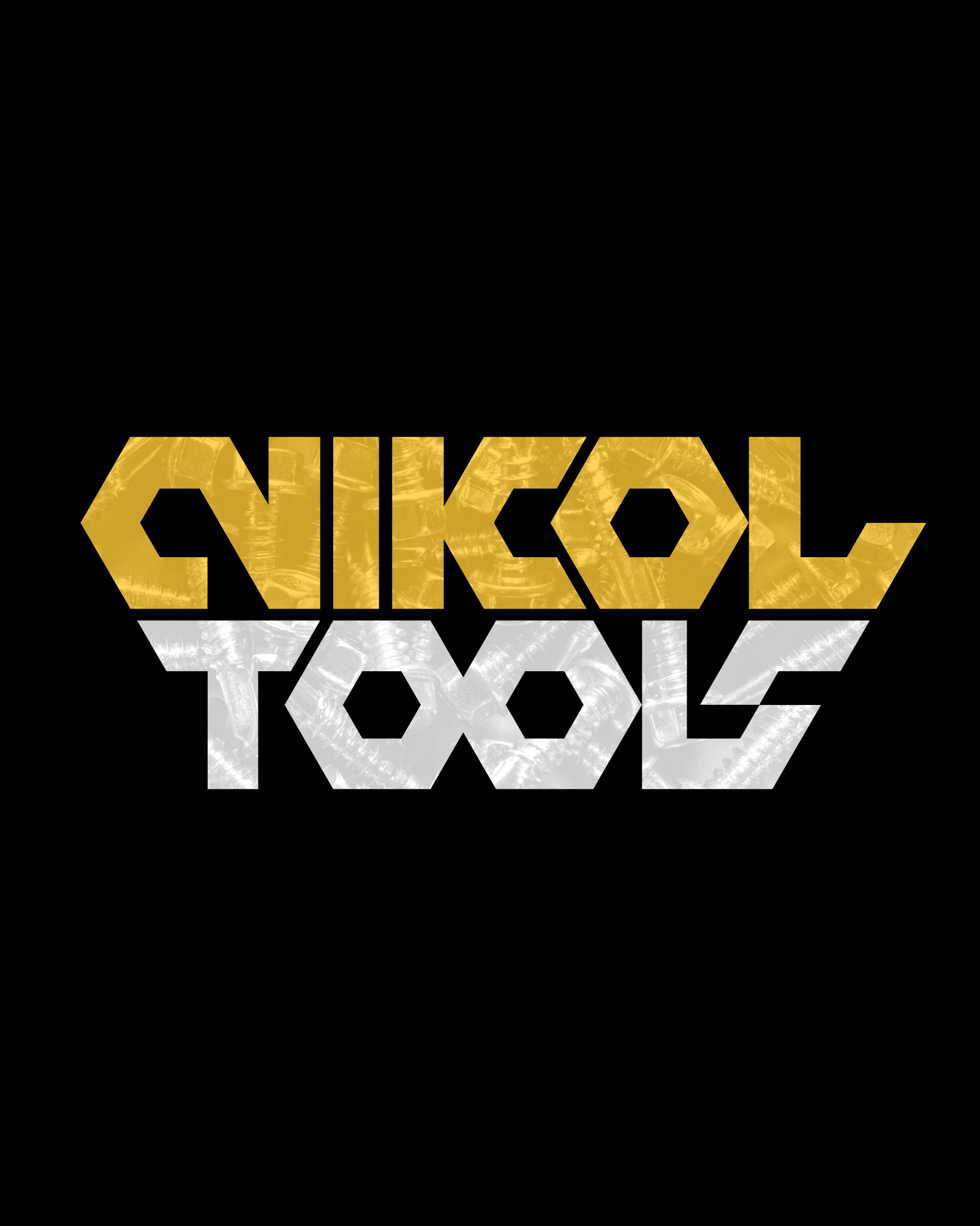
Logo and new e-shop design for Nikol Tools, a tools and paints company based in Keratsini. The logo is based on the shape of a nut, a custom geometric typeface where each letter is cut and adapted to the brand's form. The identity was applied across digital and physical media, from workwear to vehicle and print, with the bold yellow-and-black palette.
Here I did the whole package: logo, visuals and website, so everything speaks the same language. If you want something similar, get in touch.
Images (10)
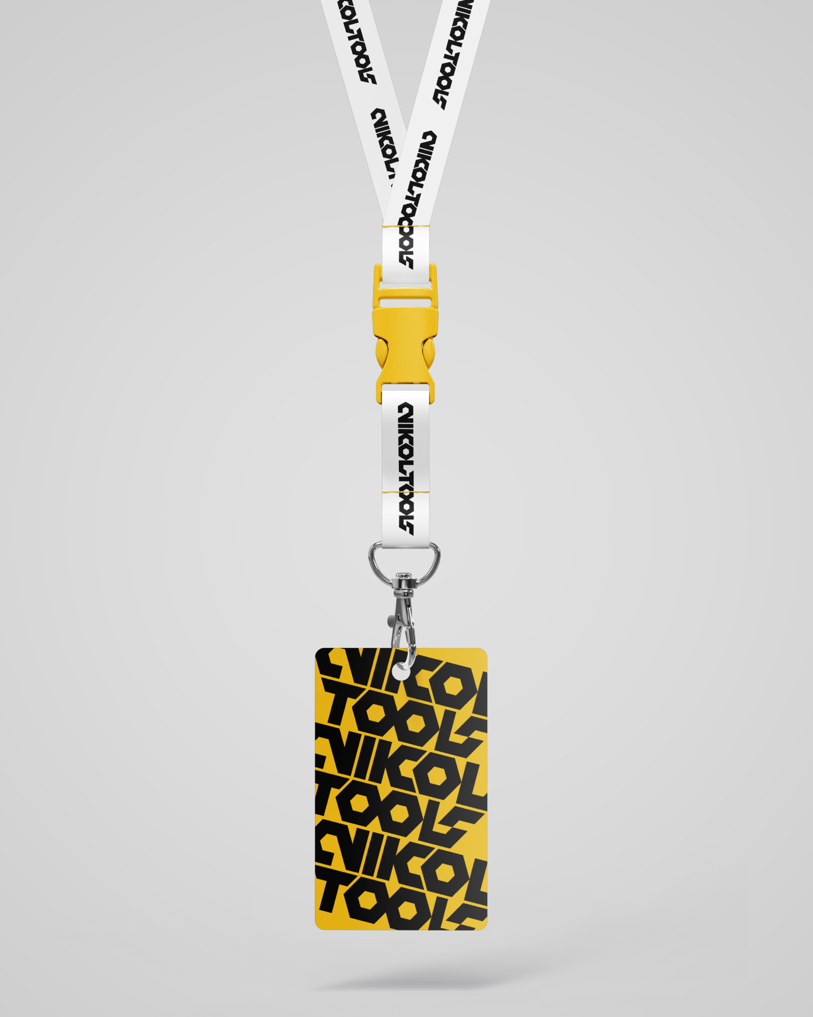
Brand identity. The logo is the start. The identity is the colours, type and rules that make a business card, a paper bag and a post look like they came from the same shop.
Logo design. A logo that reads at a glance and that you won't want to replace in two years. When it helps, I draw custom lettering or a whole typeface, as I did for Nikol Tools.
E-shop design. A shop customers get straight away: they find the product, add it to the cart and pay. The fewer the steps, the fewer carts left half-full. We decide categories, payments and shipping together, and you get a shop you run yourself.
Signage and space. Shopfronts, signs, murals and vehicles. Walls are where I started, so I especially enjoy this part.
Looking for a brand identity, a logo, an e-shop and signage for your own business? Tell me about it and I will reply with a written quote, or see the packages with prices.