Mantzioros FruitsBrand Identity
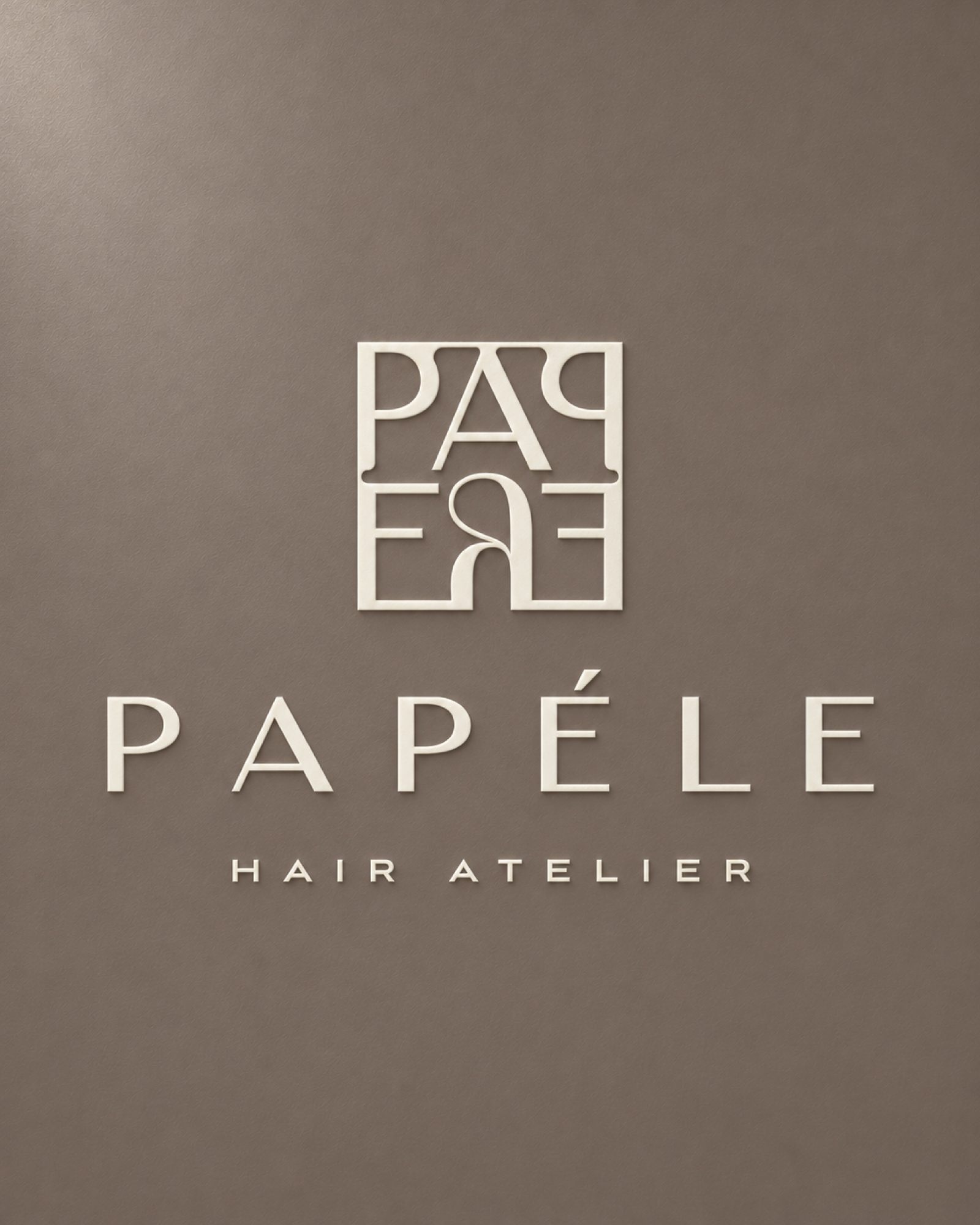
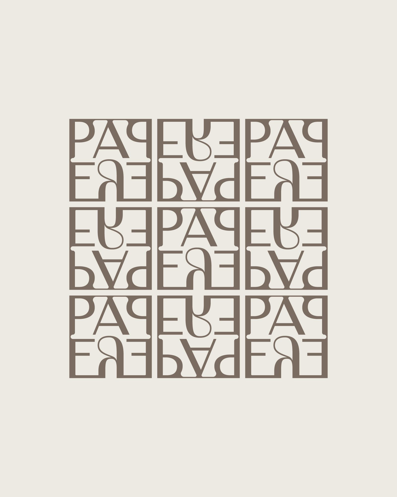
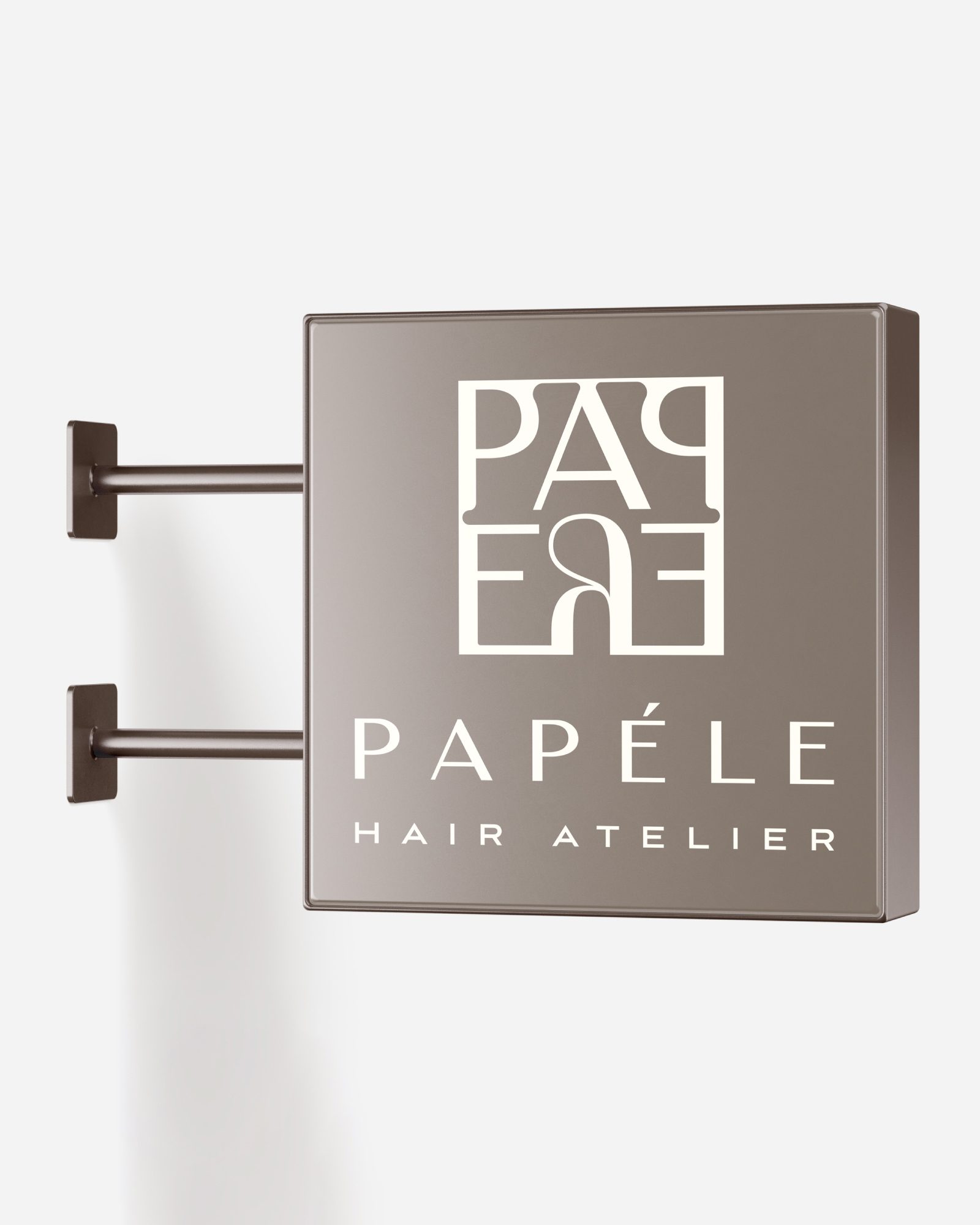
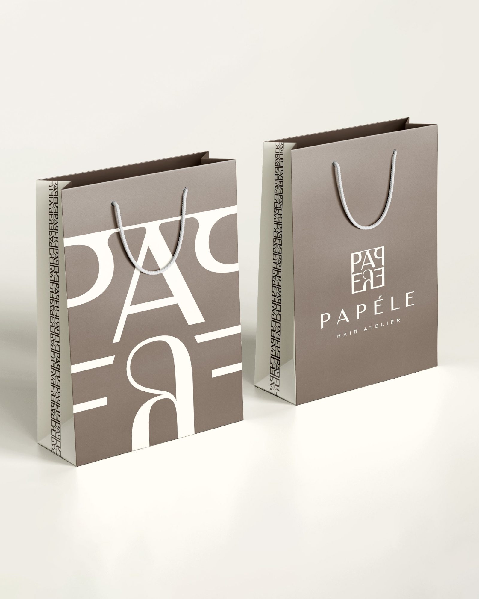
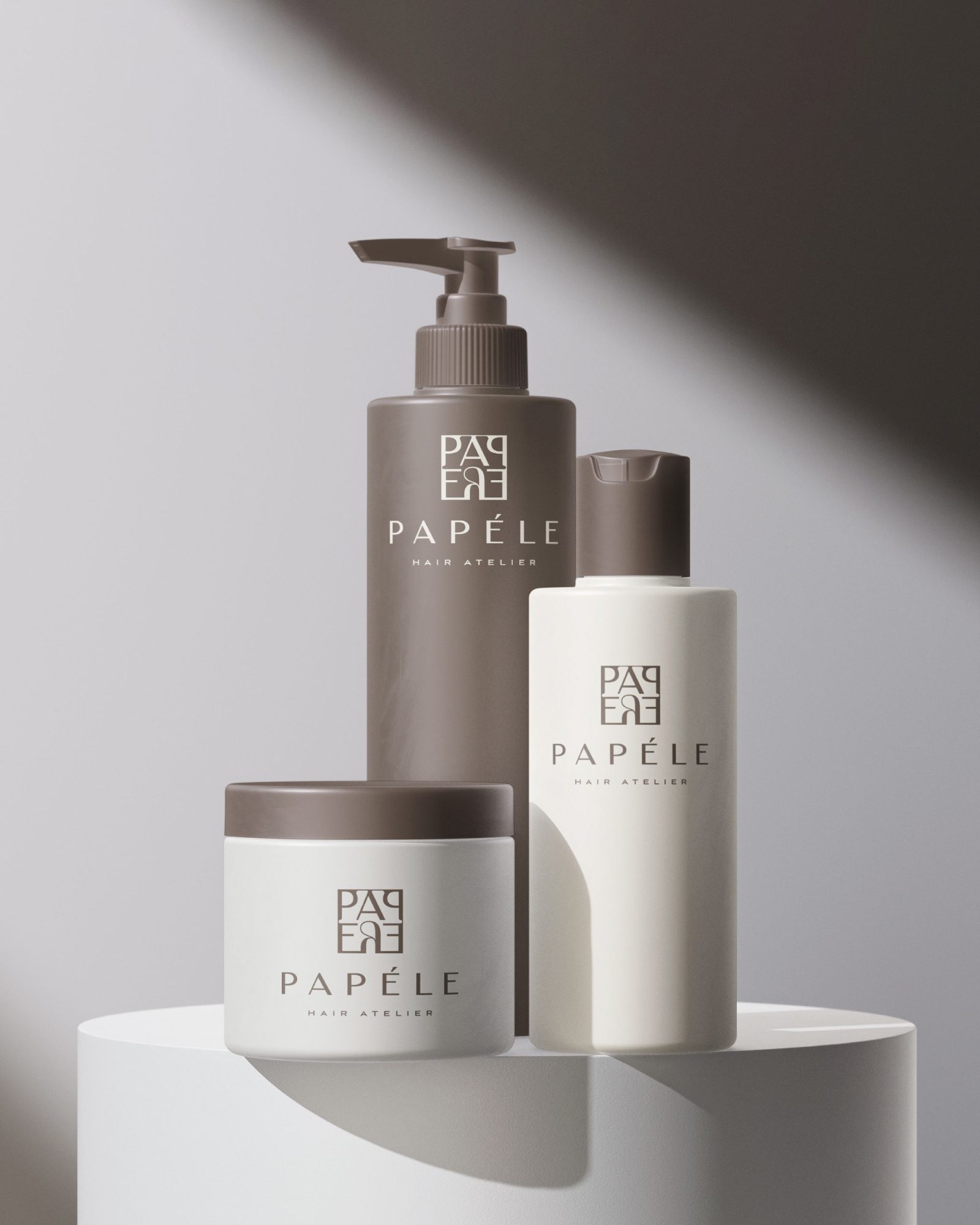
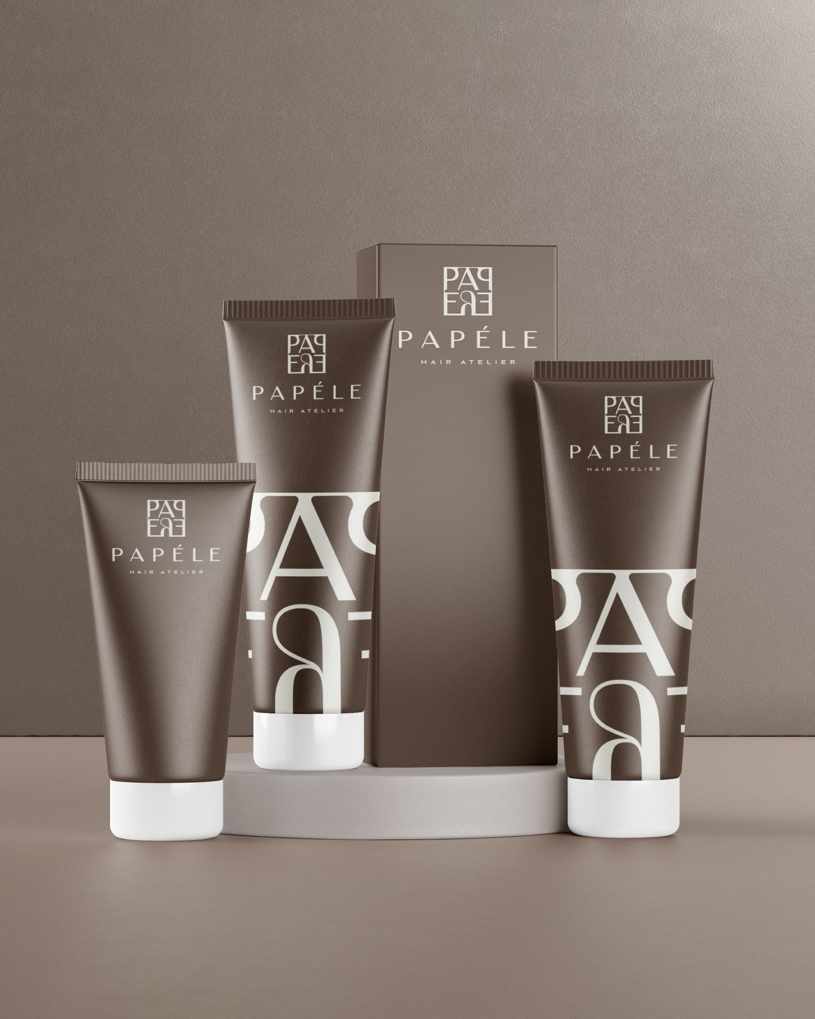
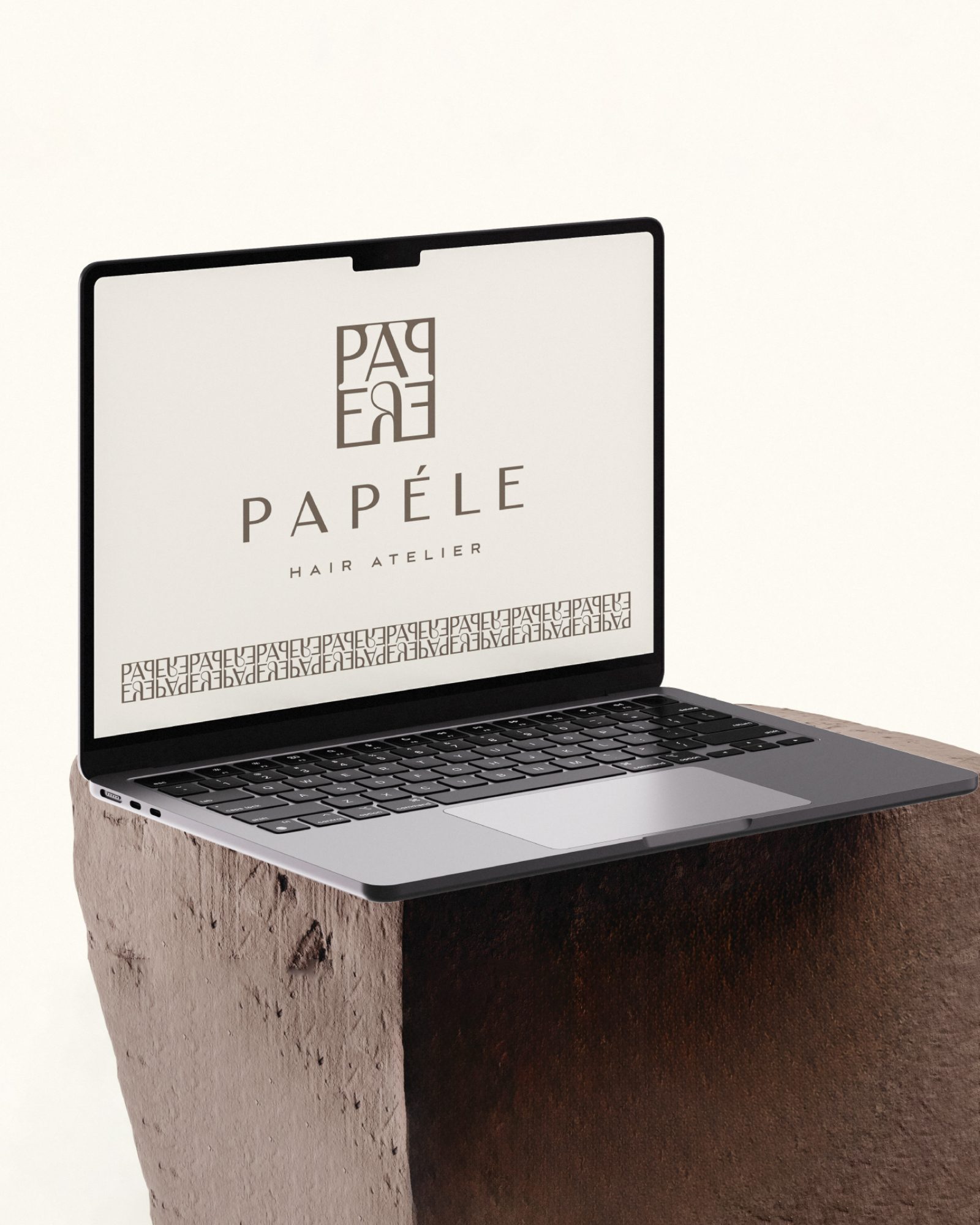
Brand identity for Papéle Hair Atelier, a hair studio. The logo is a typographic monogram: the letters of the name mirror each other and lock together inside a square. The same monogram becomes a repeating pattern for bags and backgrounds. The palette stays in warm taupe and cream, and the identity carries through to the shop sign, product packaging, shopping bags and digital presence.
I designed it from the first sketch to the final files, working step by step with the client. If you want something similar for your own business, get in touch.
Images (10)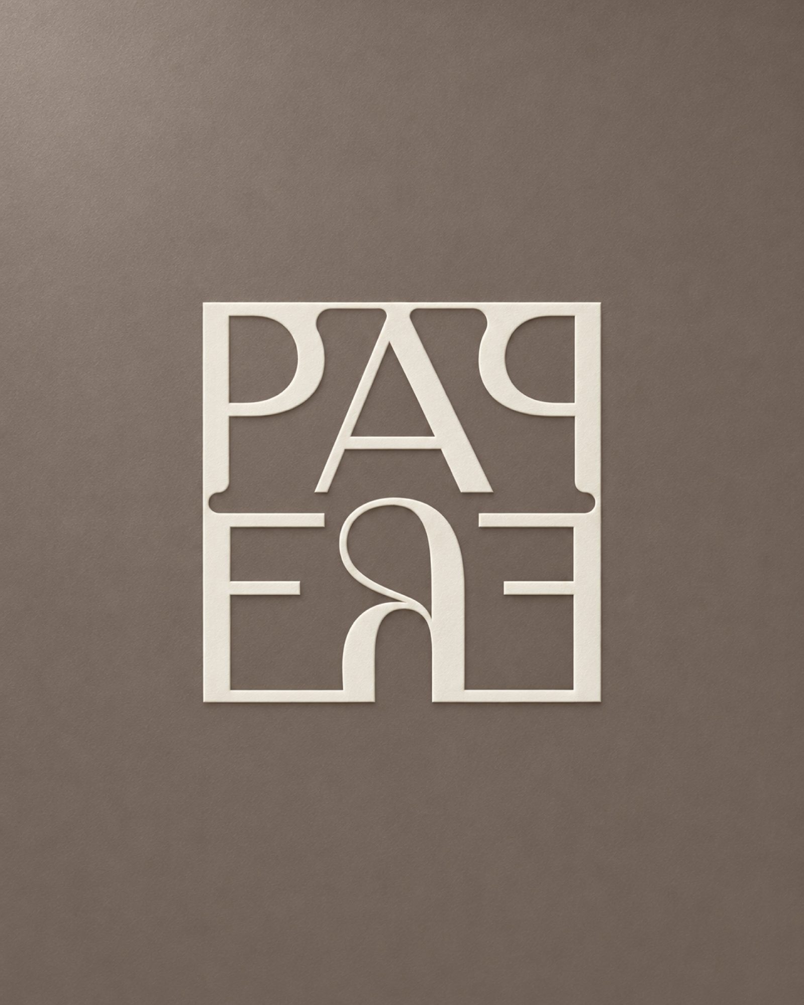
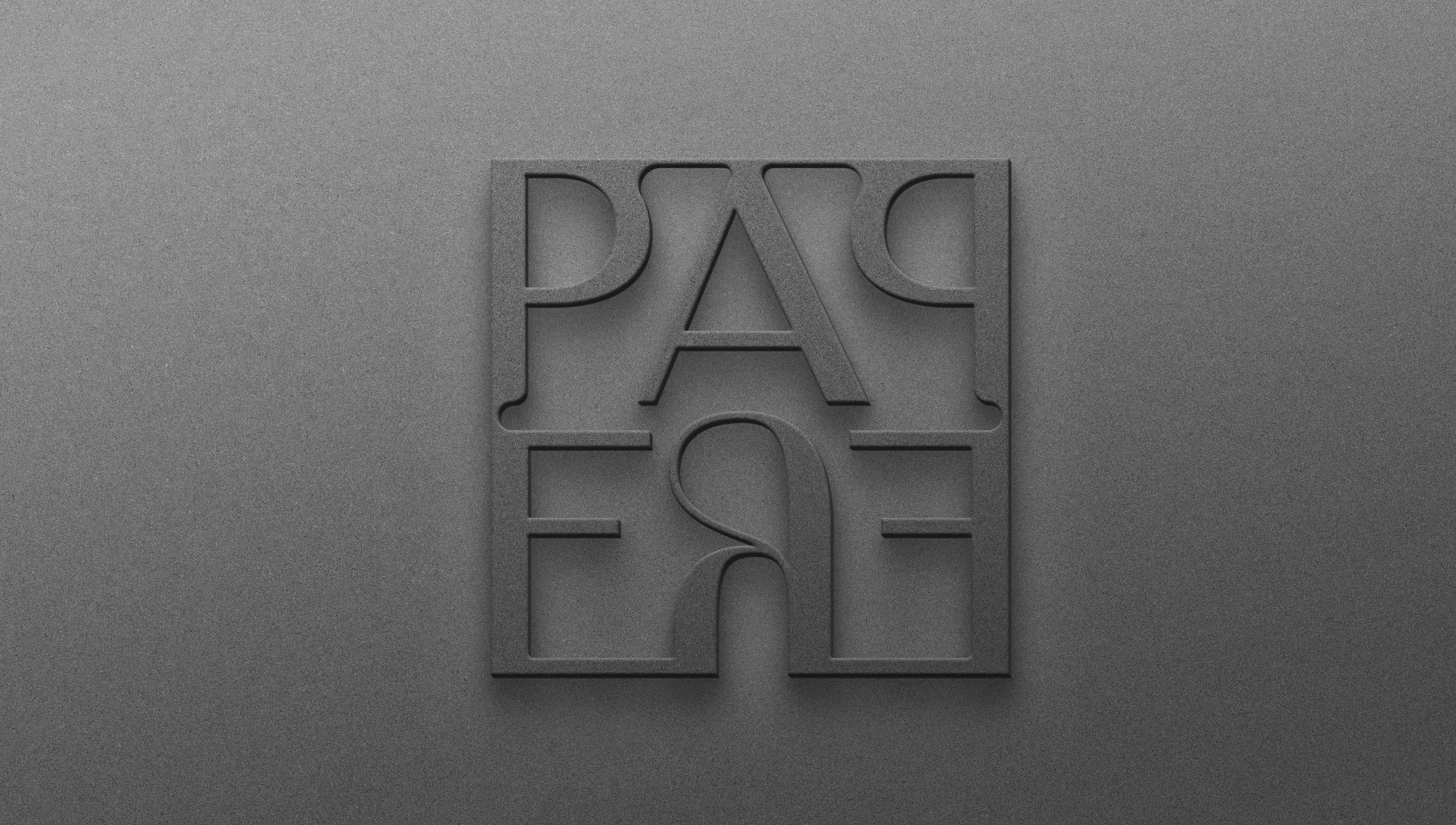
Logo design. A logo that reads at a glance and that you won't want to replace in two years. When it helps, I draw custom lettering or a whole typeface, as I did for Nikol Tools.
Brand identity. The logo is the start. The identity is the colours, type and rules that make a business card, a paper bag and a post look like they came from the same shop.
Packaging. Labels, boxes and bags you notice on the shelf and can read easily, from bread and pastries to coffee and olive oil.
Signage and space. Shopfronts, signs, murals and vehicles. Walls are where I started, so I especially enjoy this part.
Looking for a logo, a brand identity, packaging and signage for your own business? Tell me about it and I will reply with a written quote, or see the packages with prices.