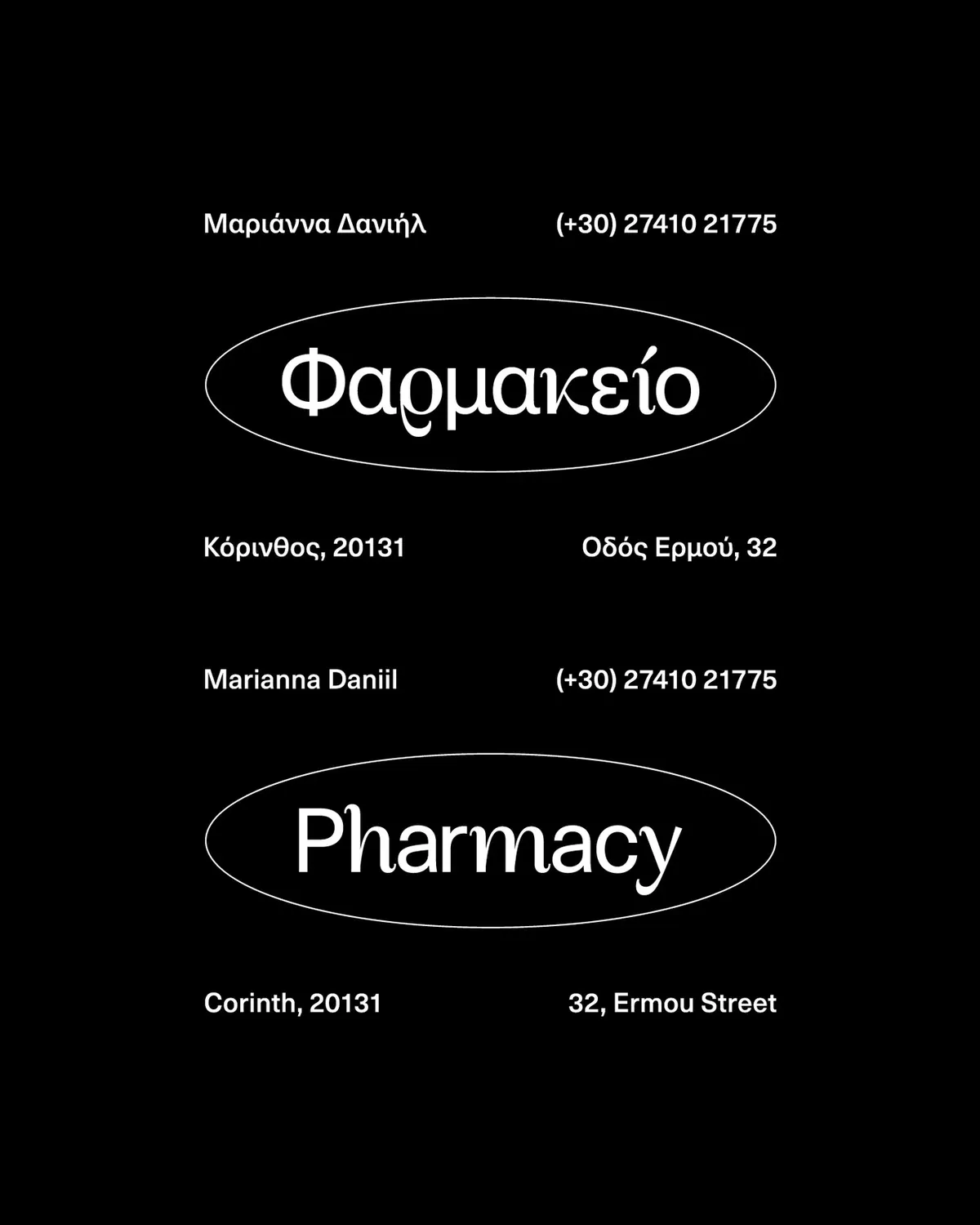
Daniil PharmacyVisual Identity Proposal
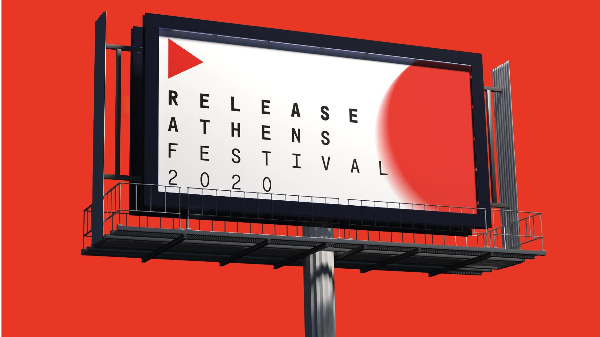
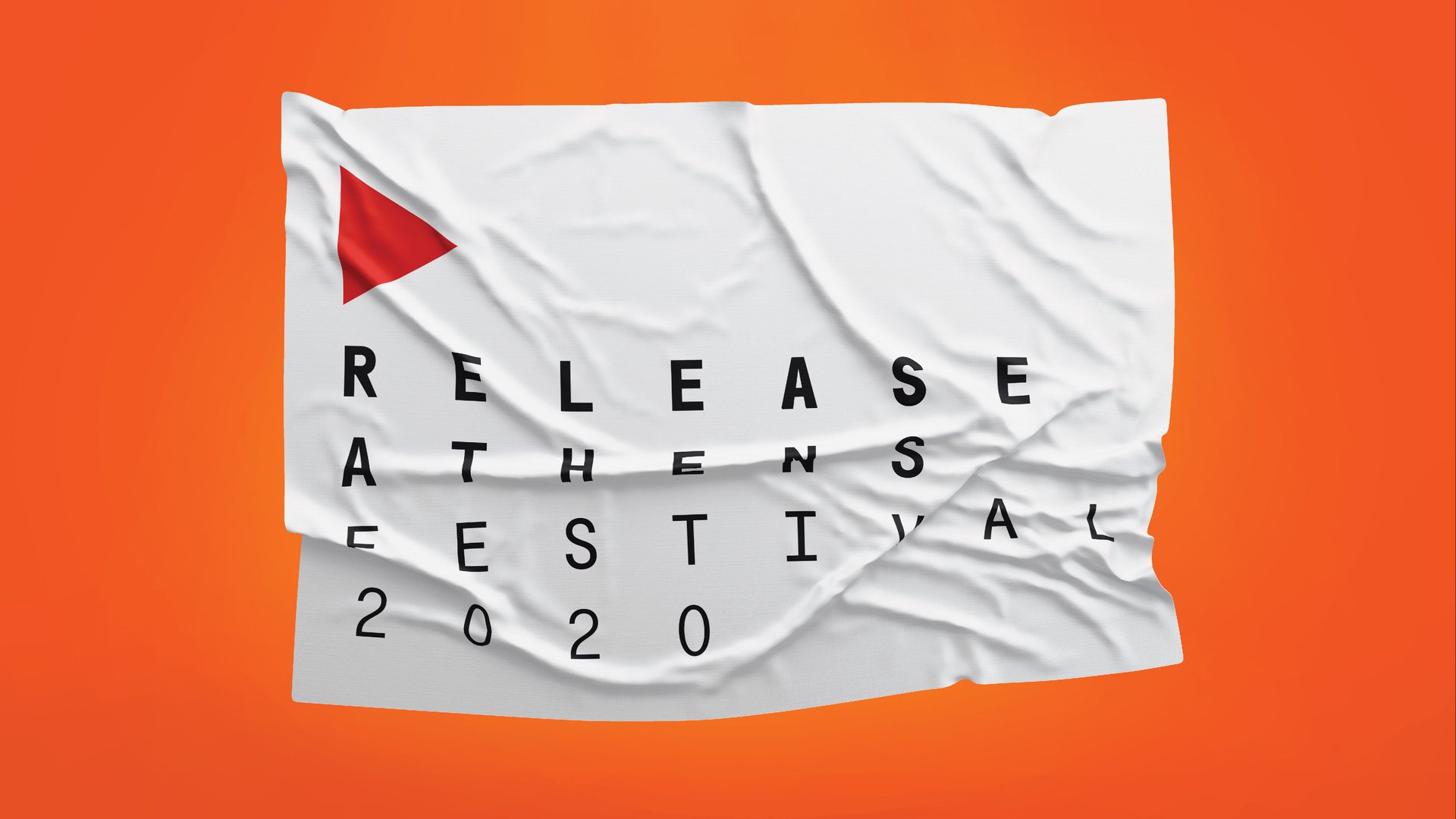
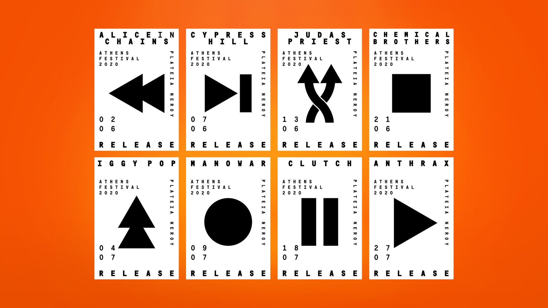
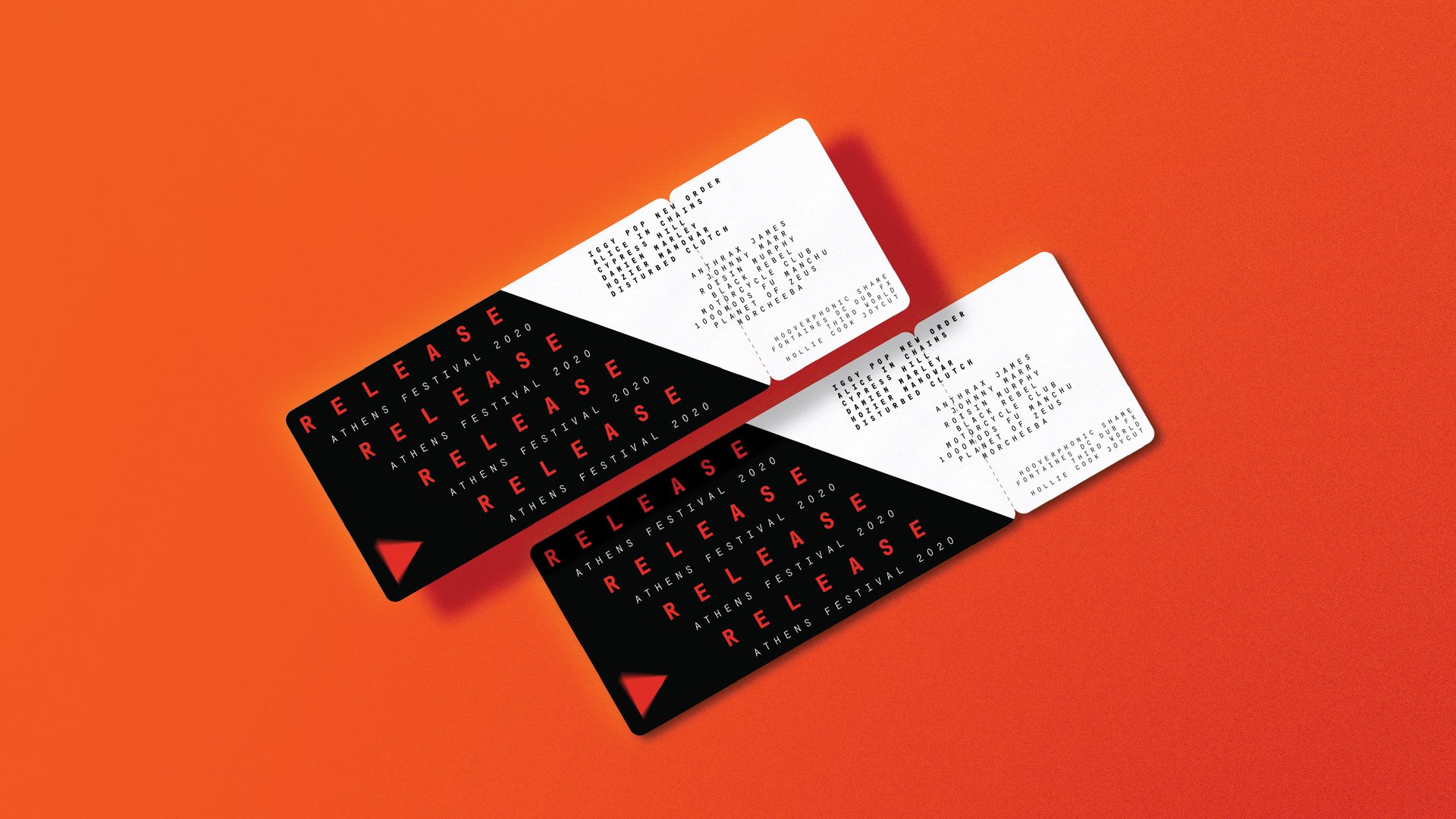
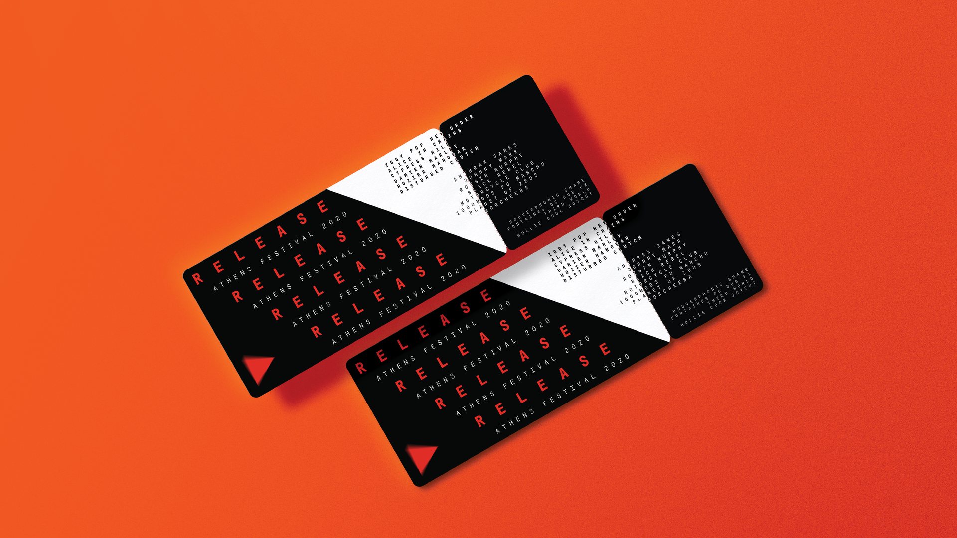
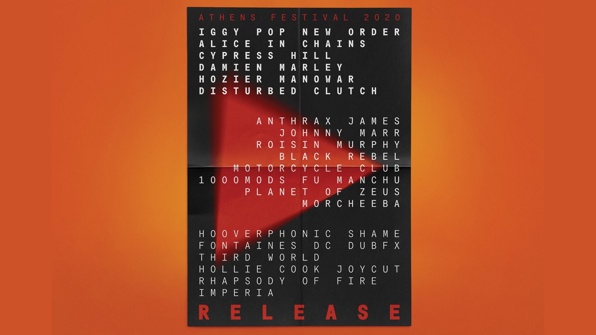
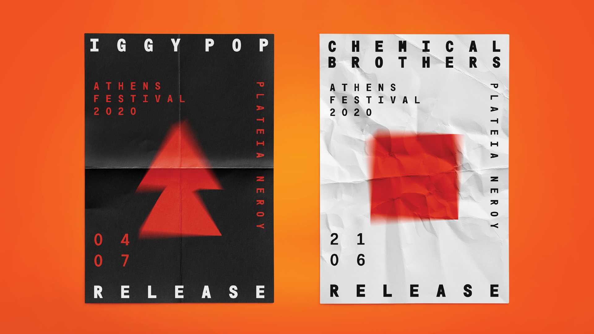
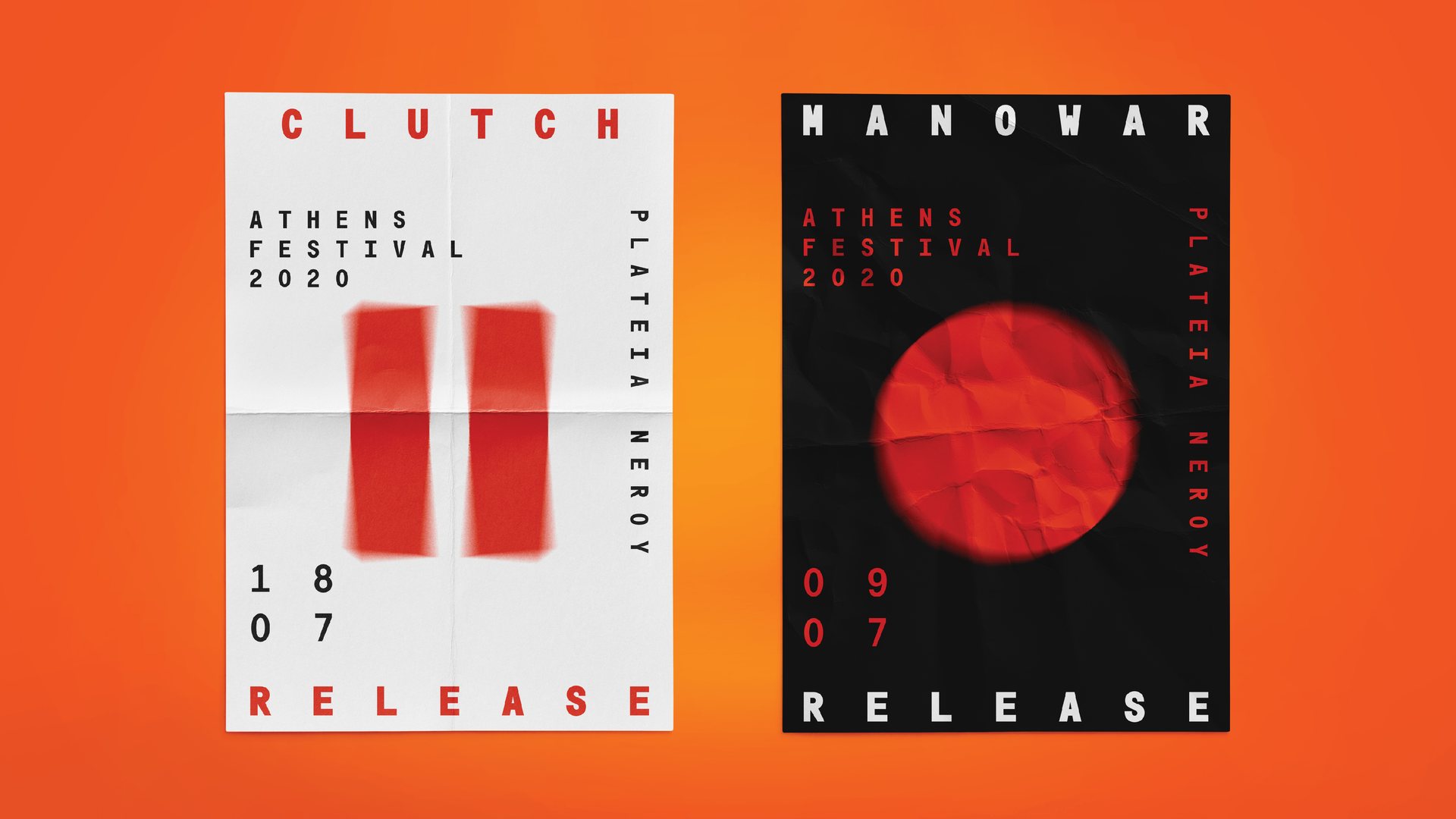
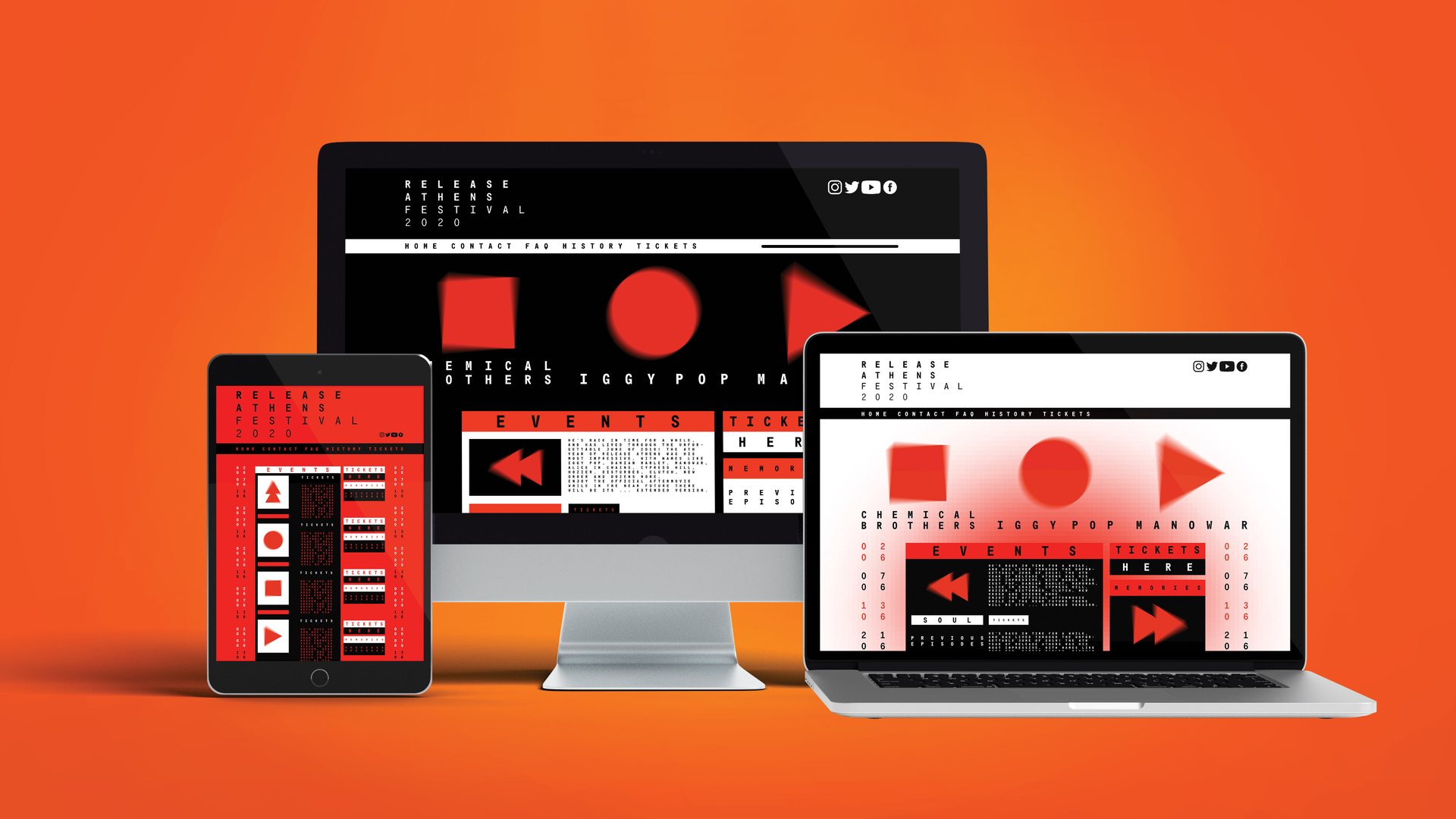
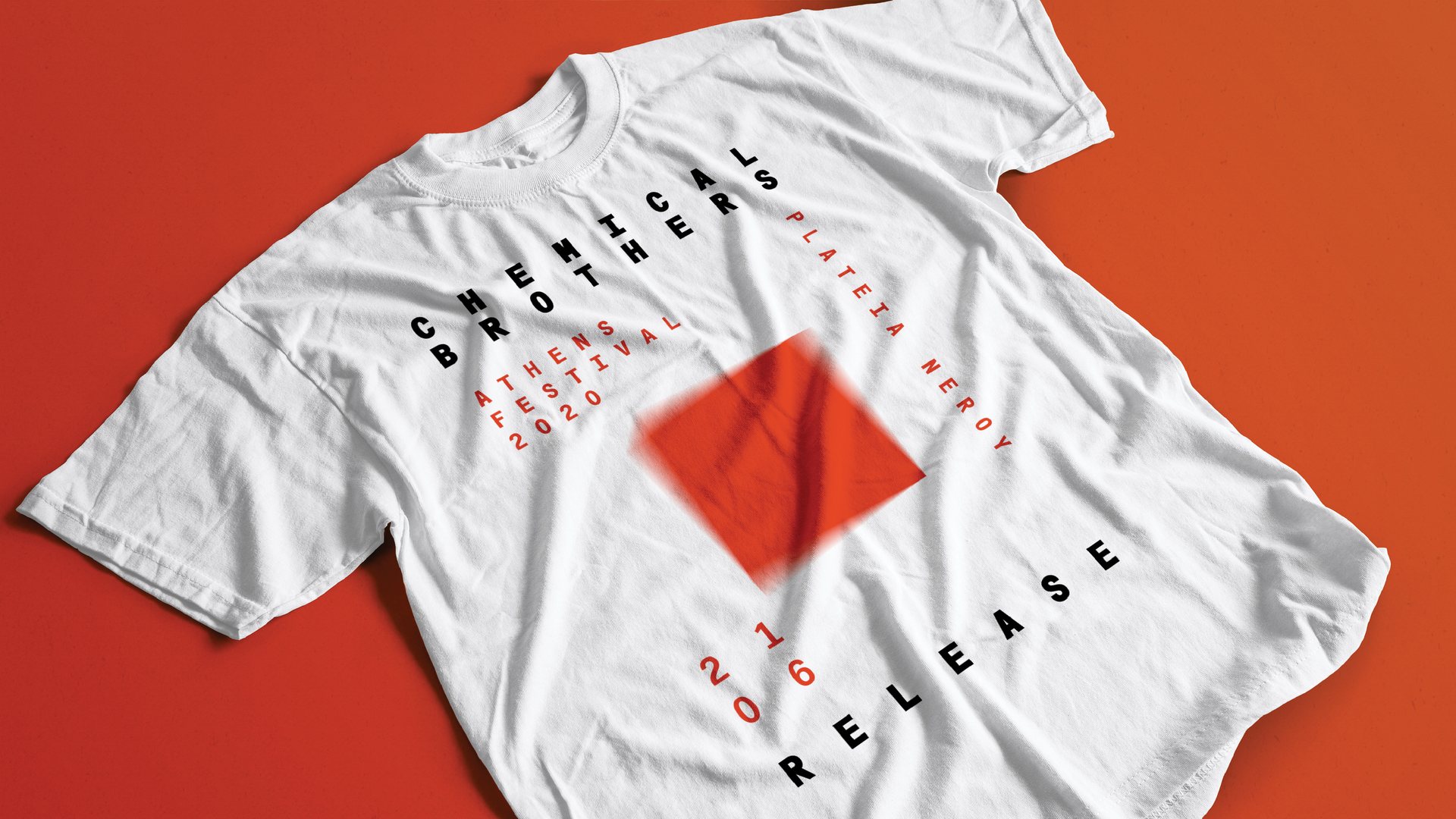
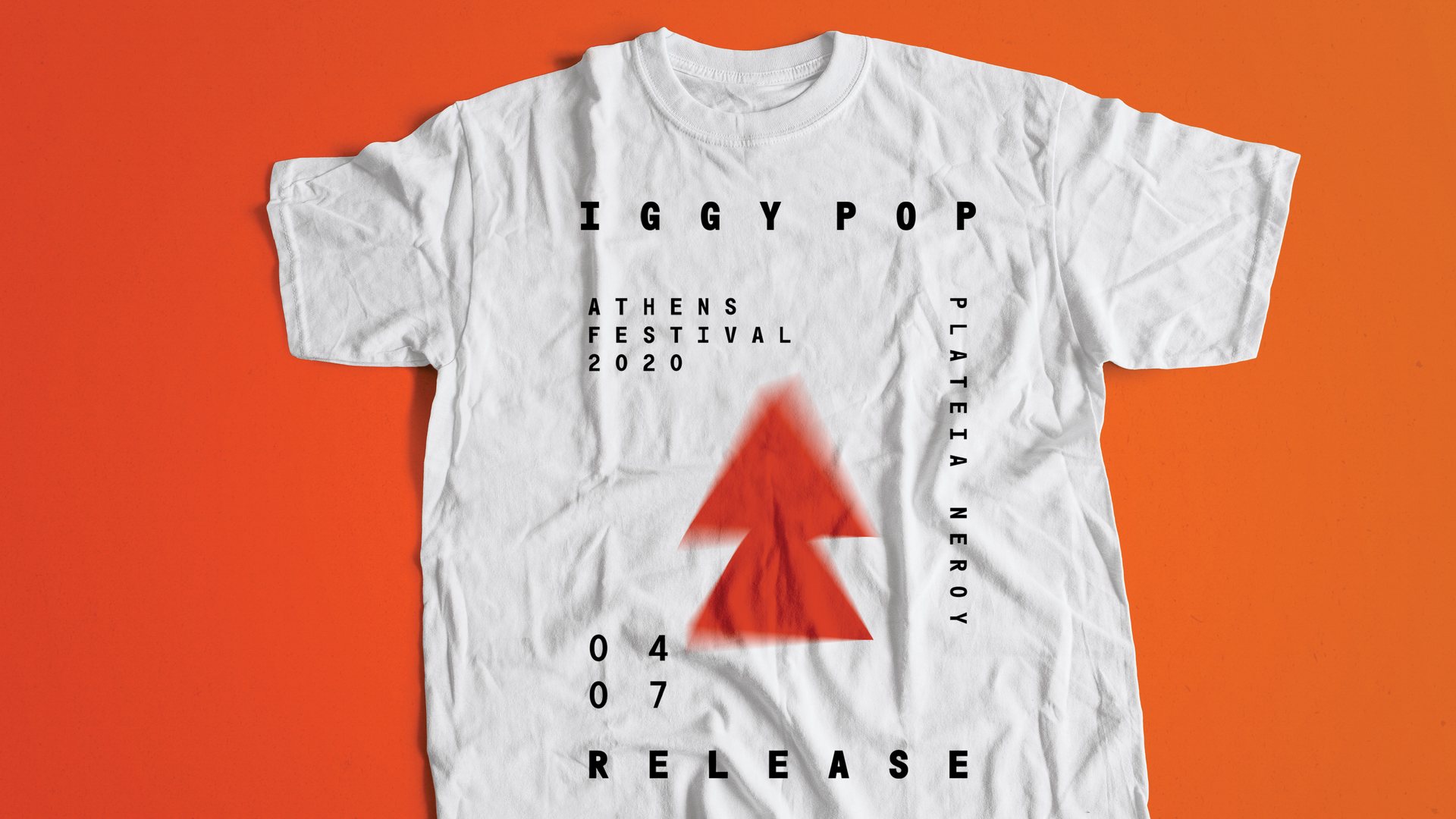
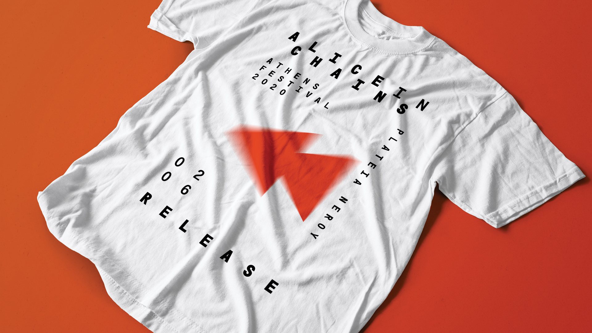
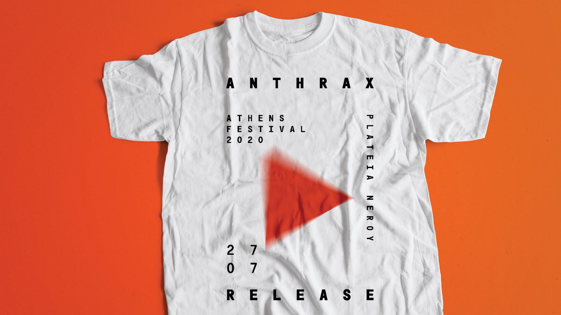
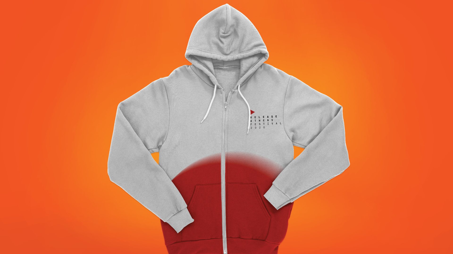
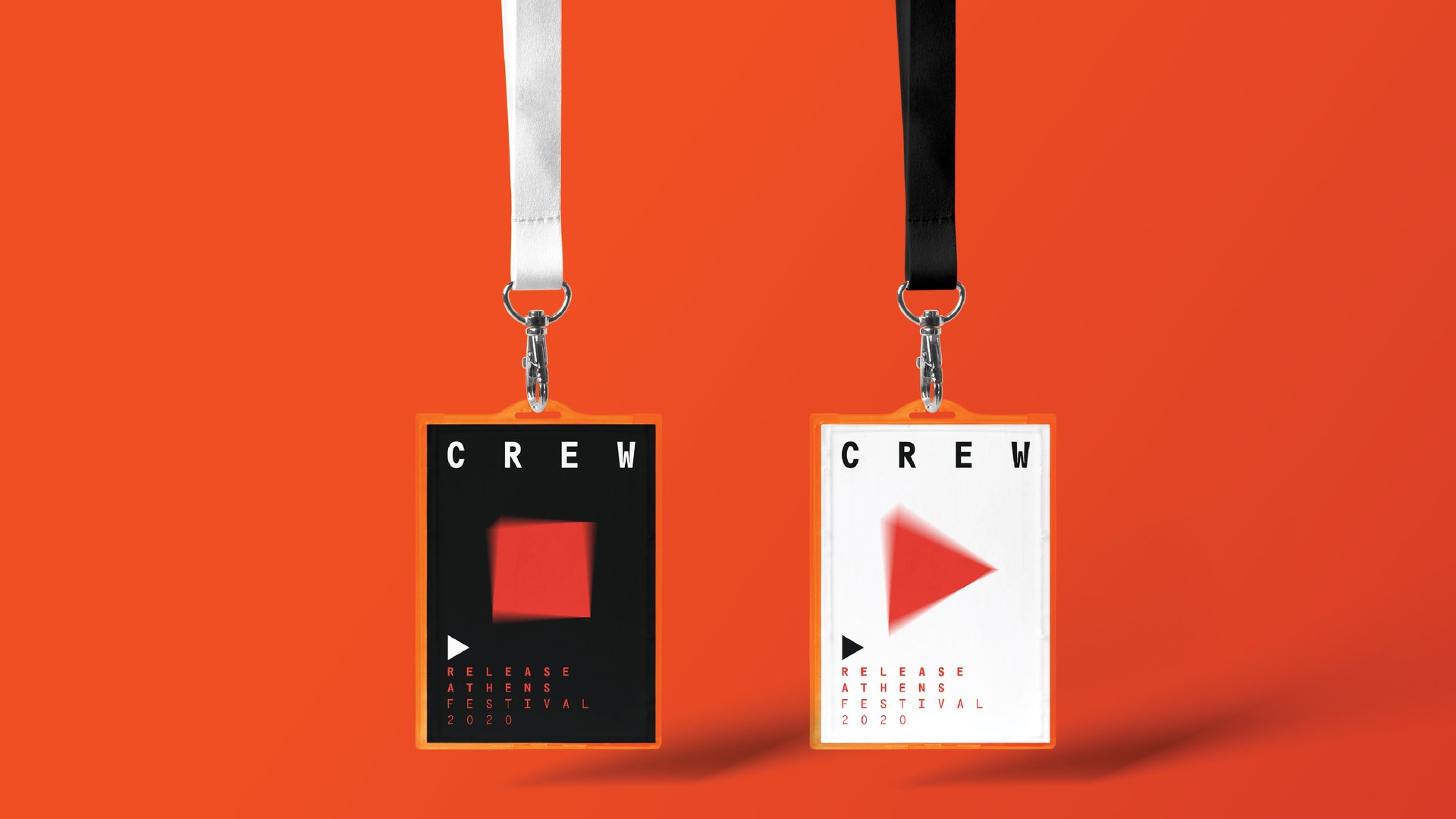
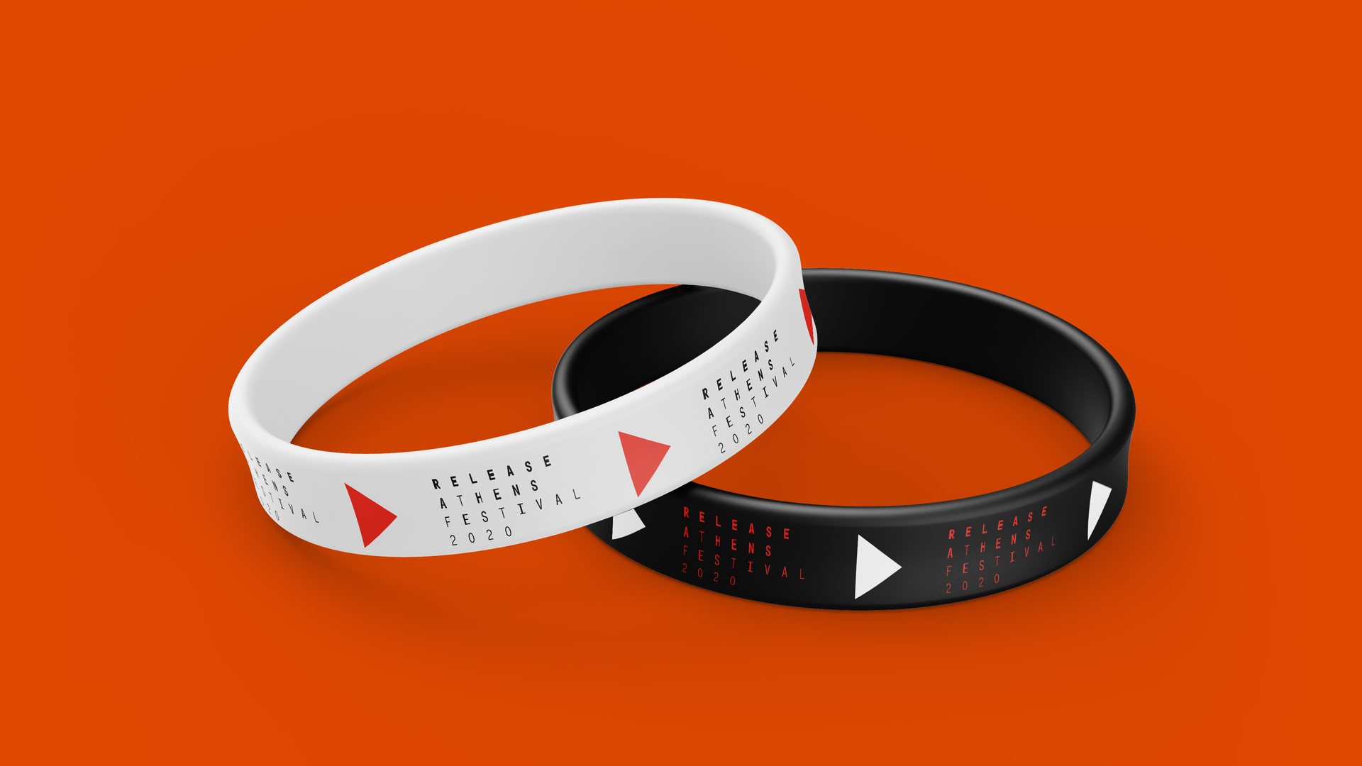
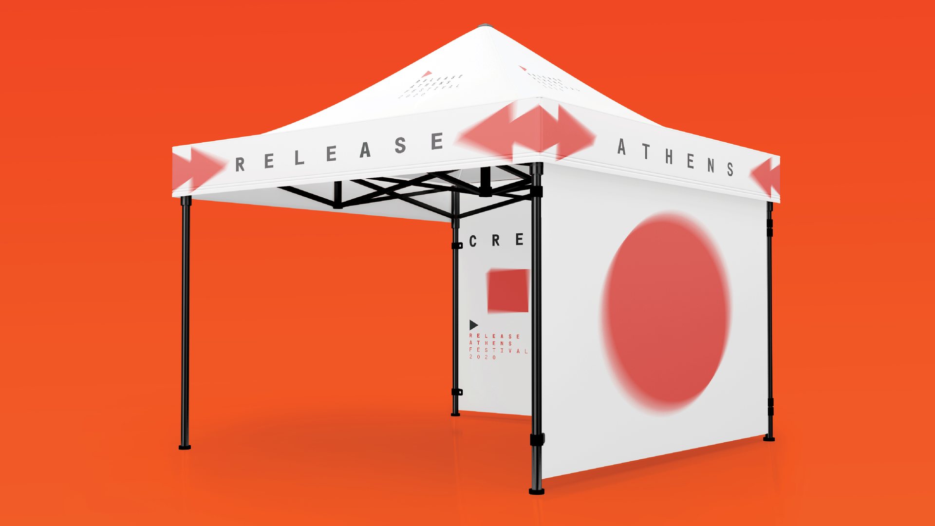
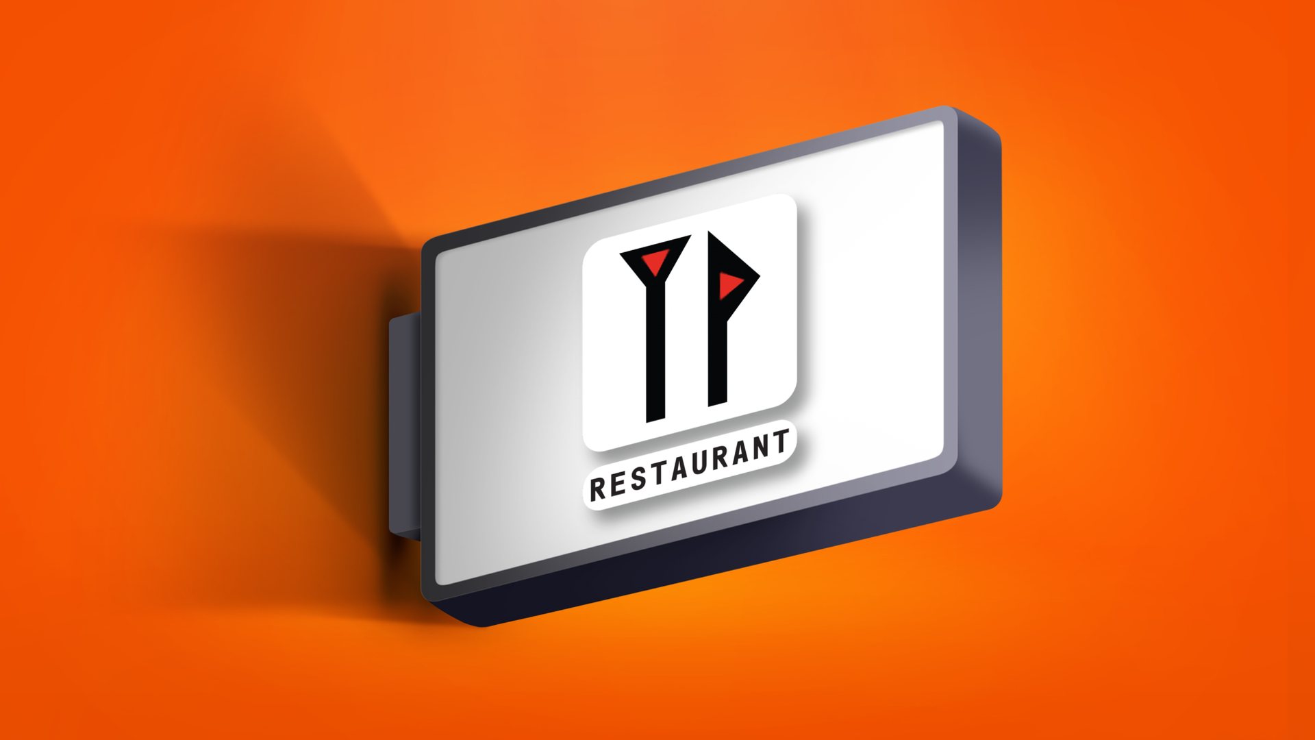
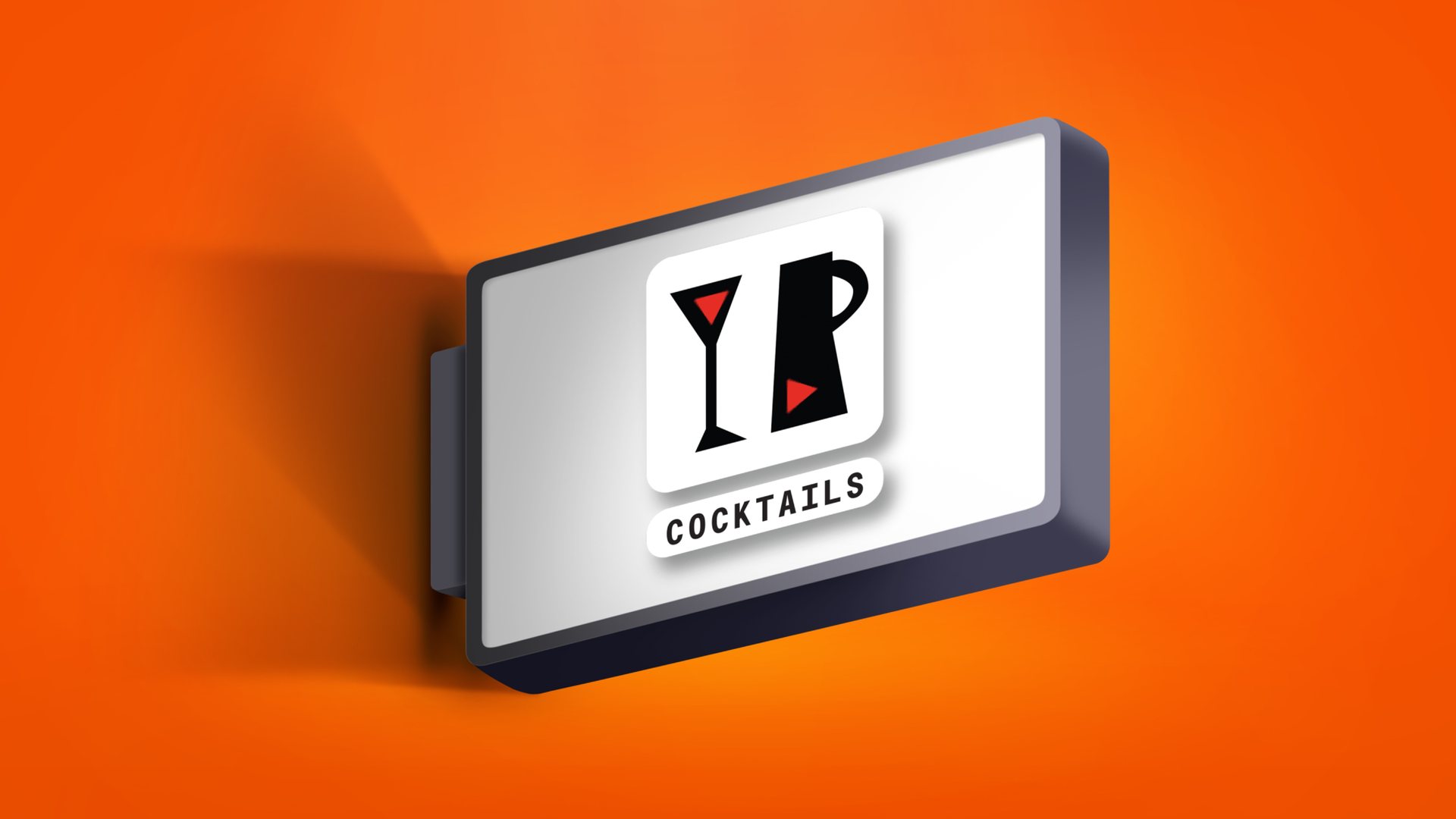
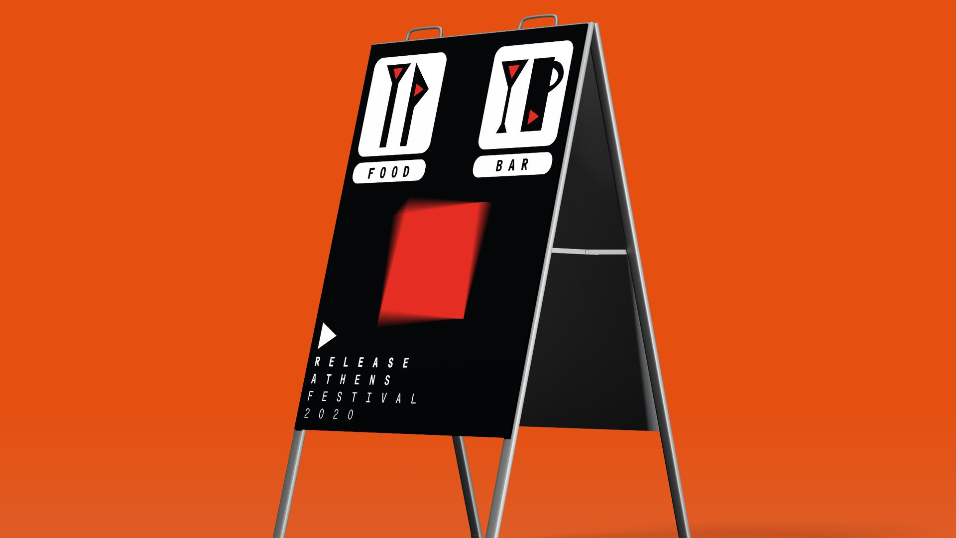
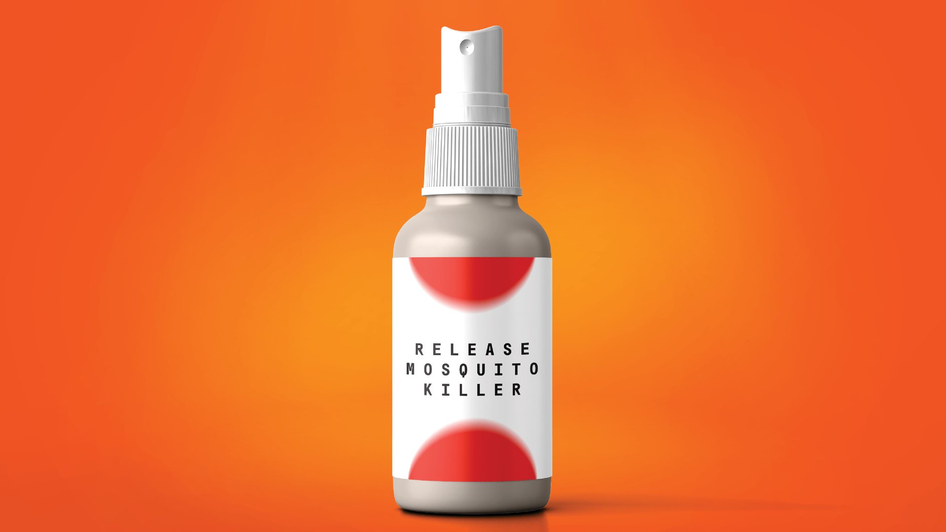
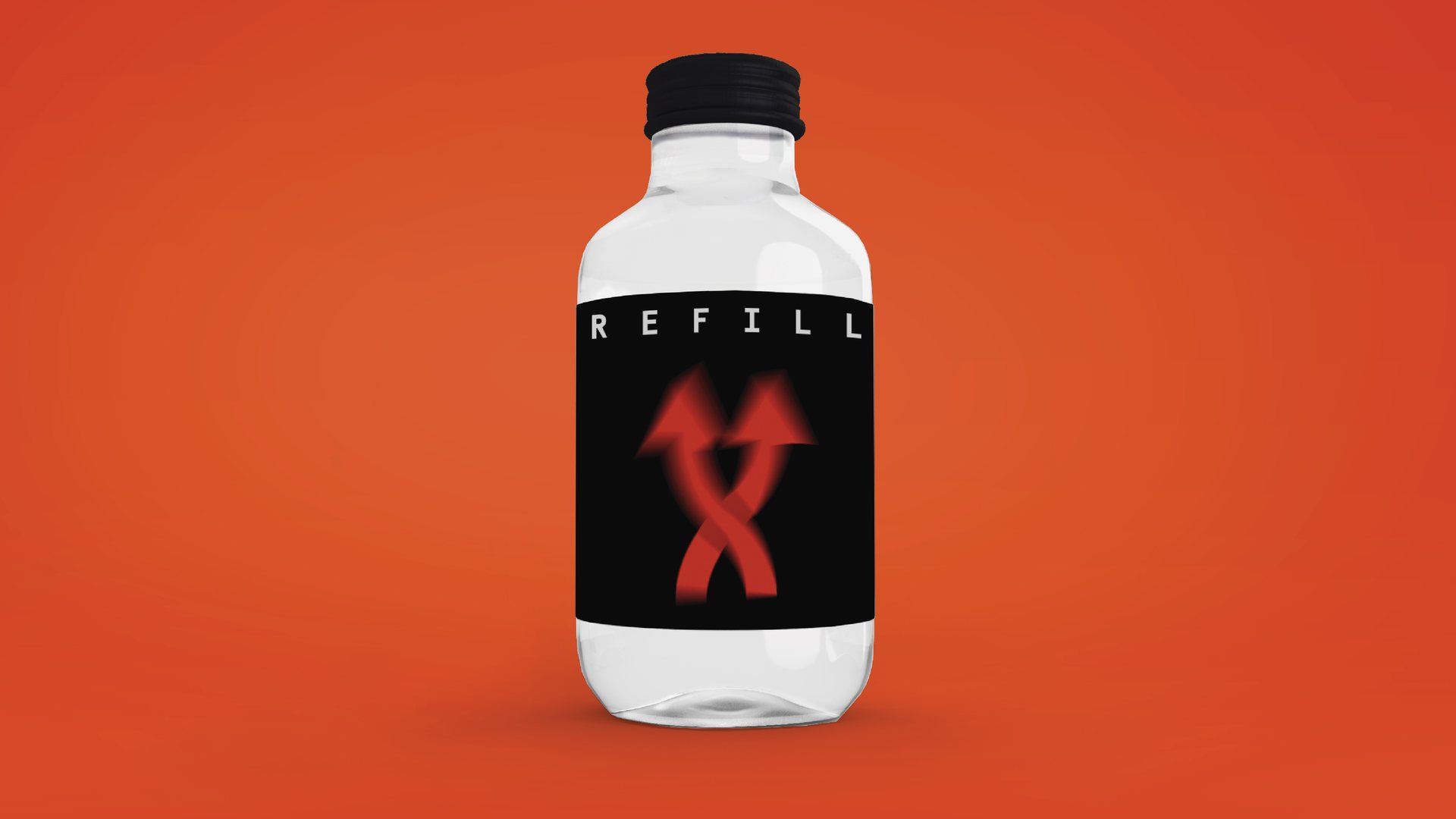
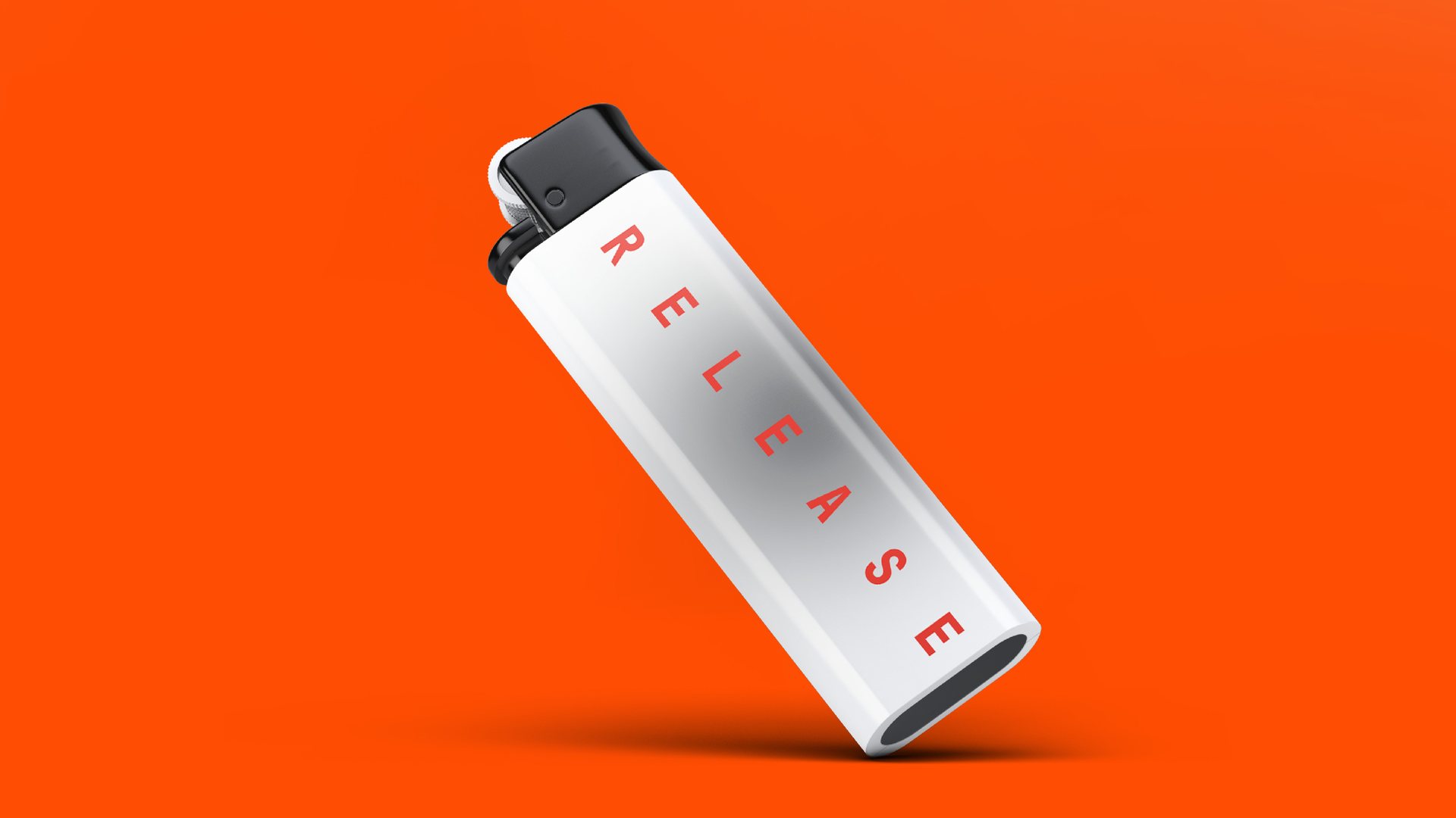
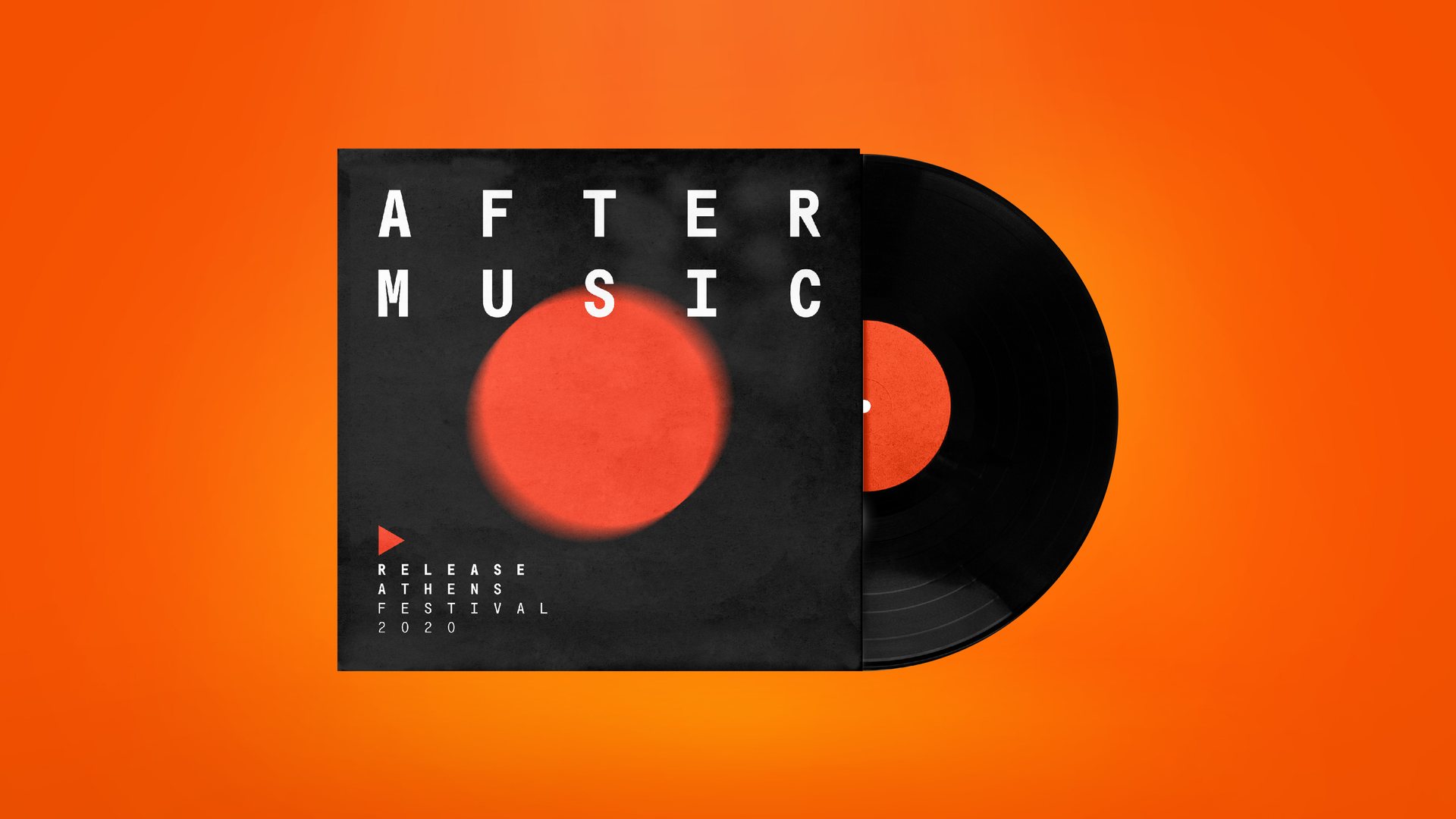
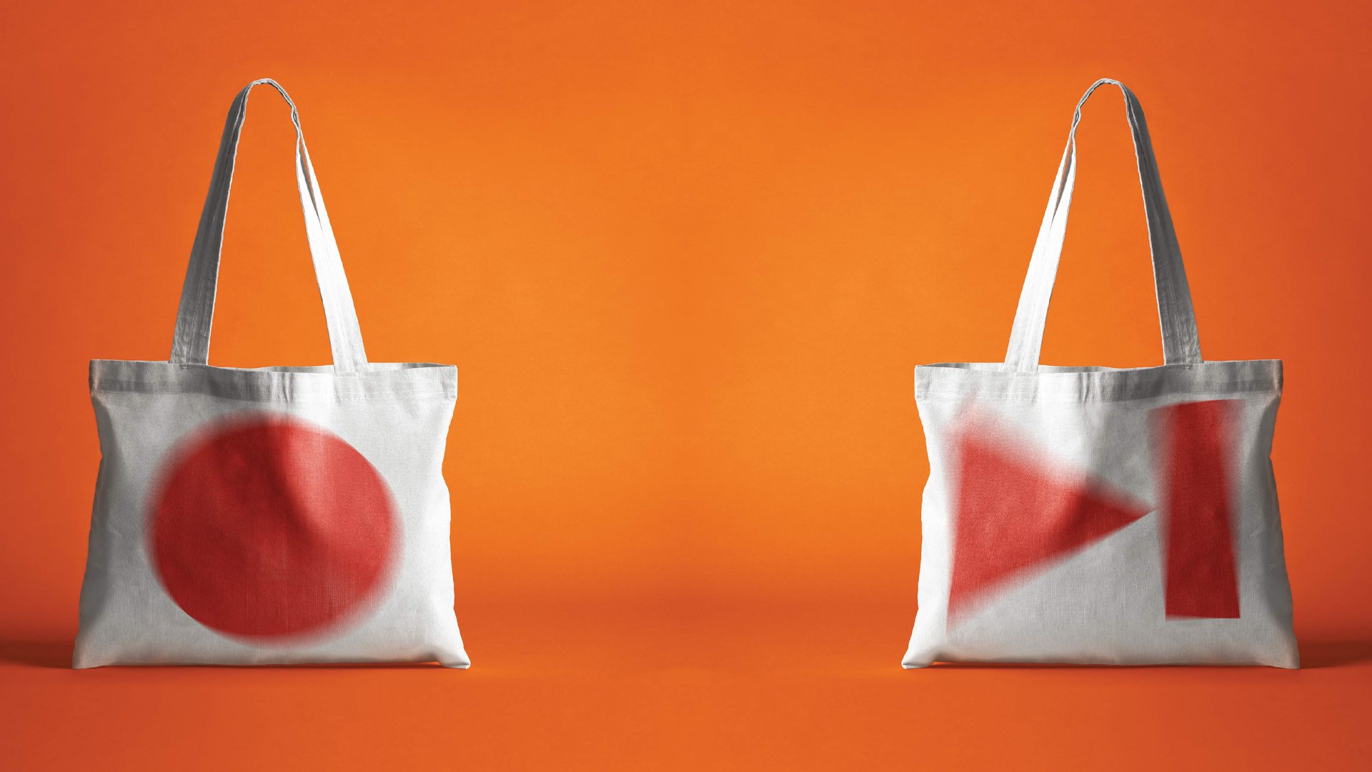
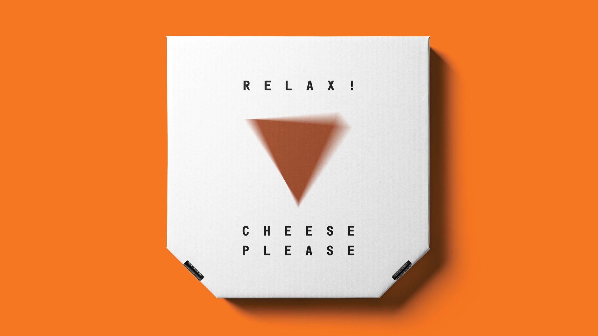
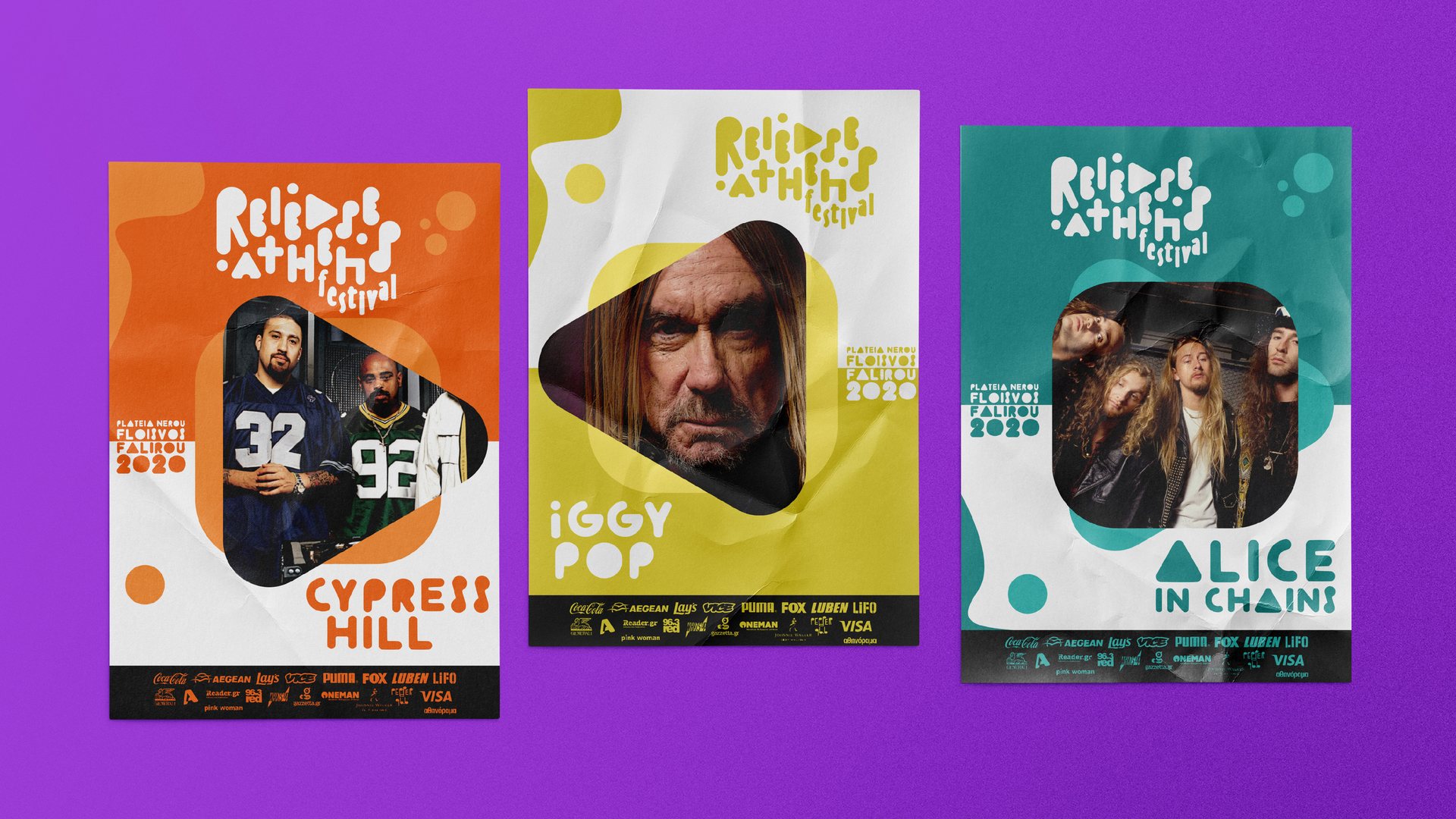
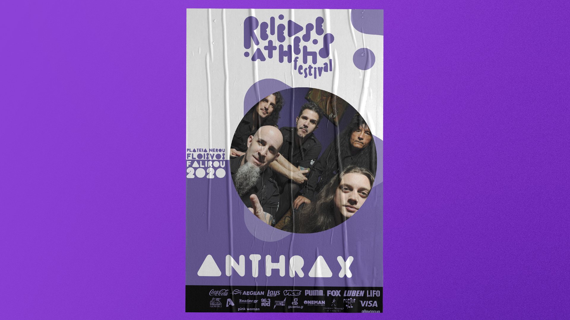
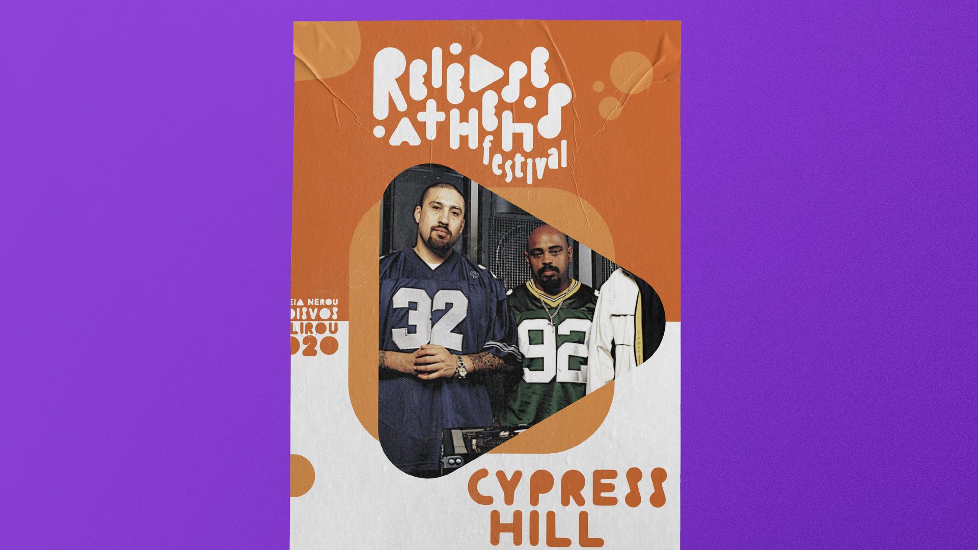
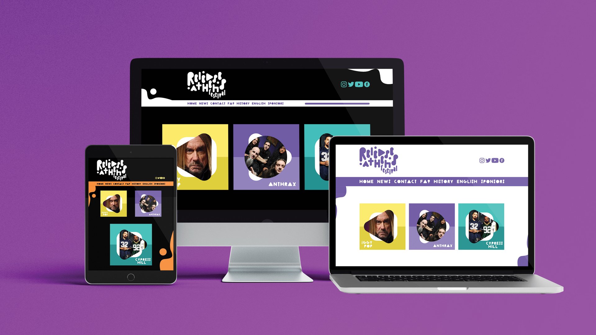
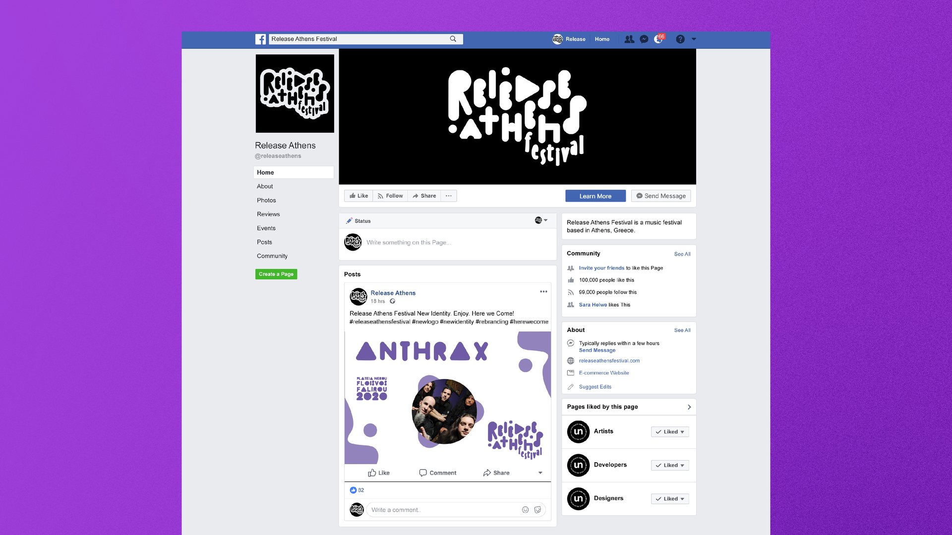
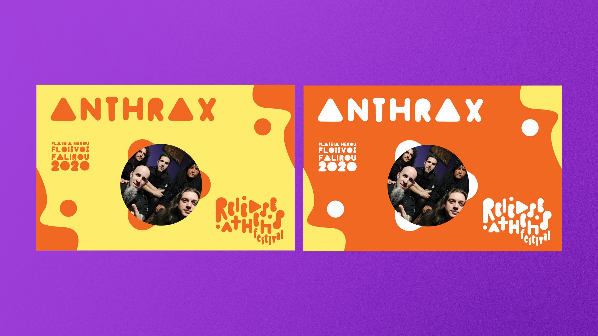
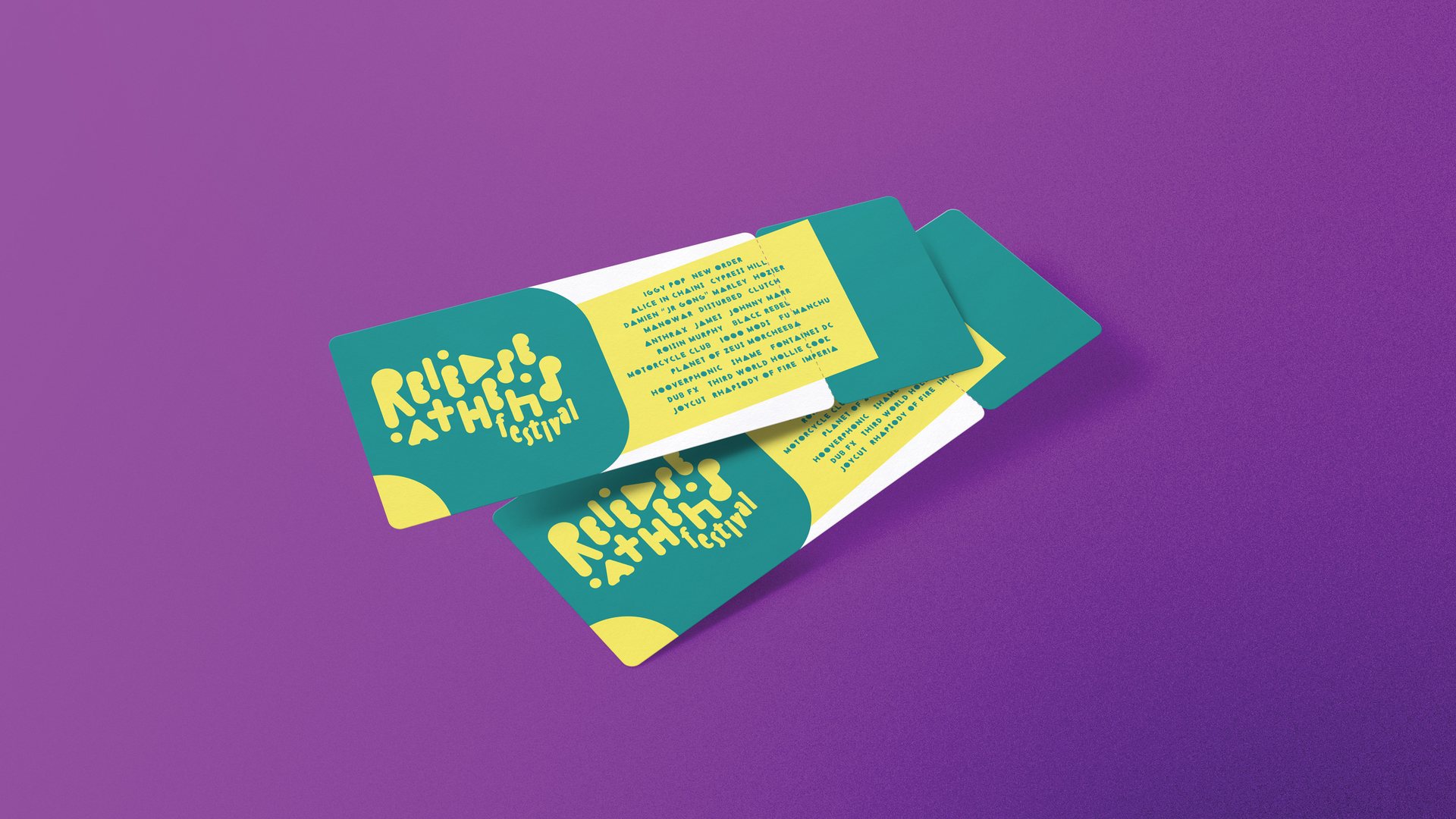
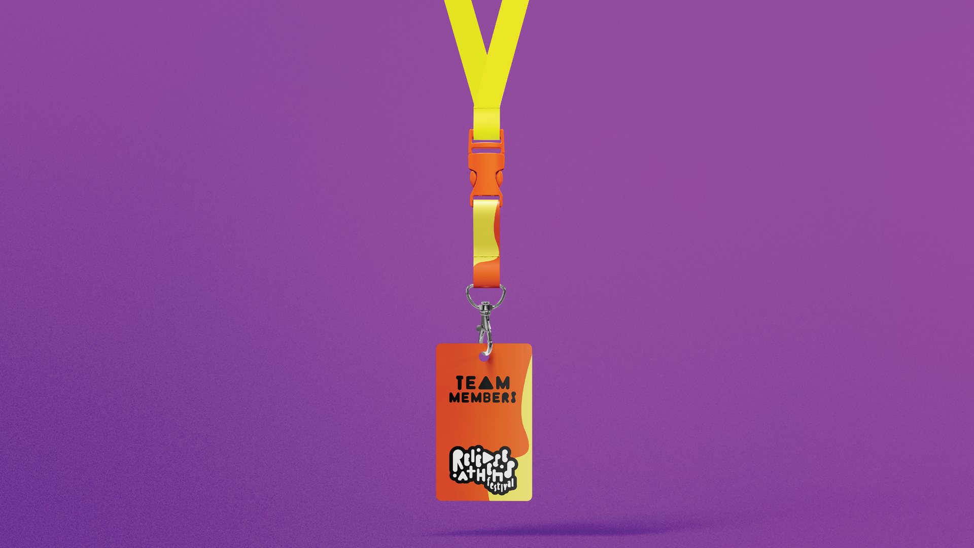
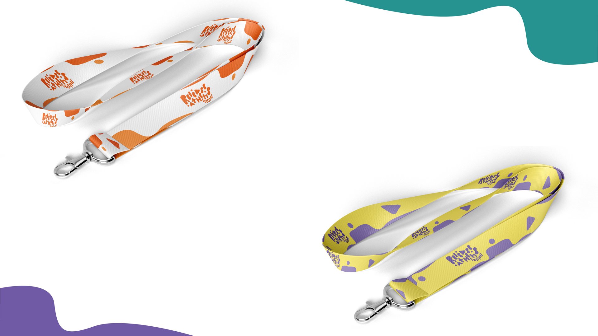
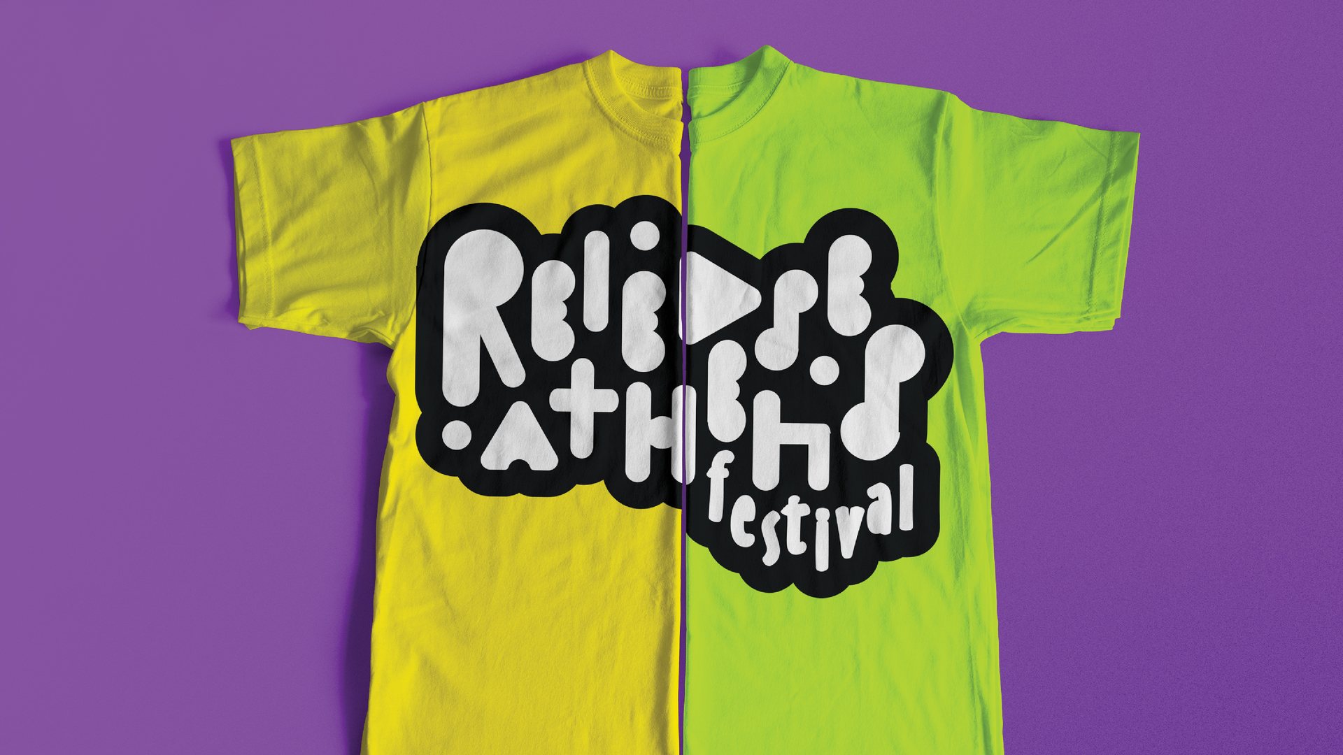
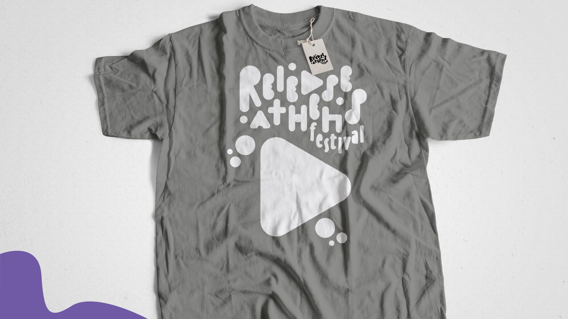
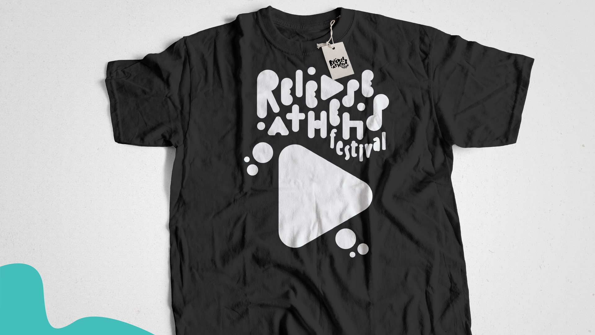
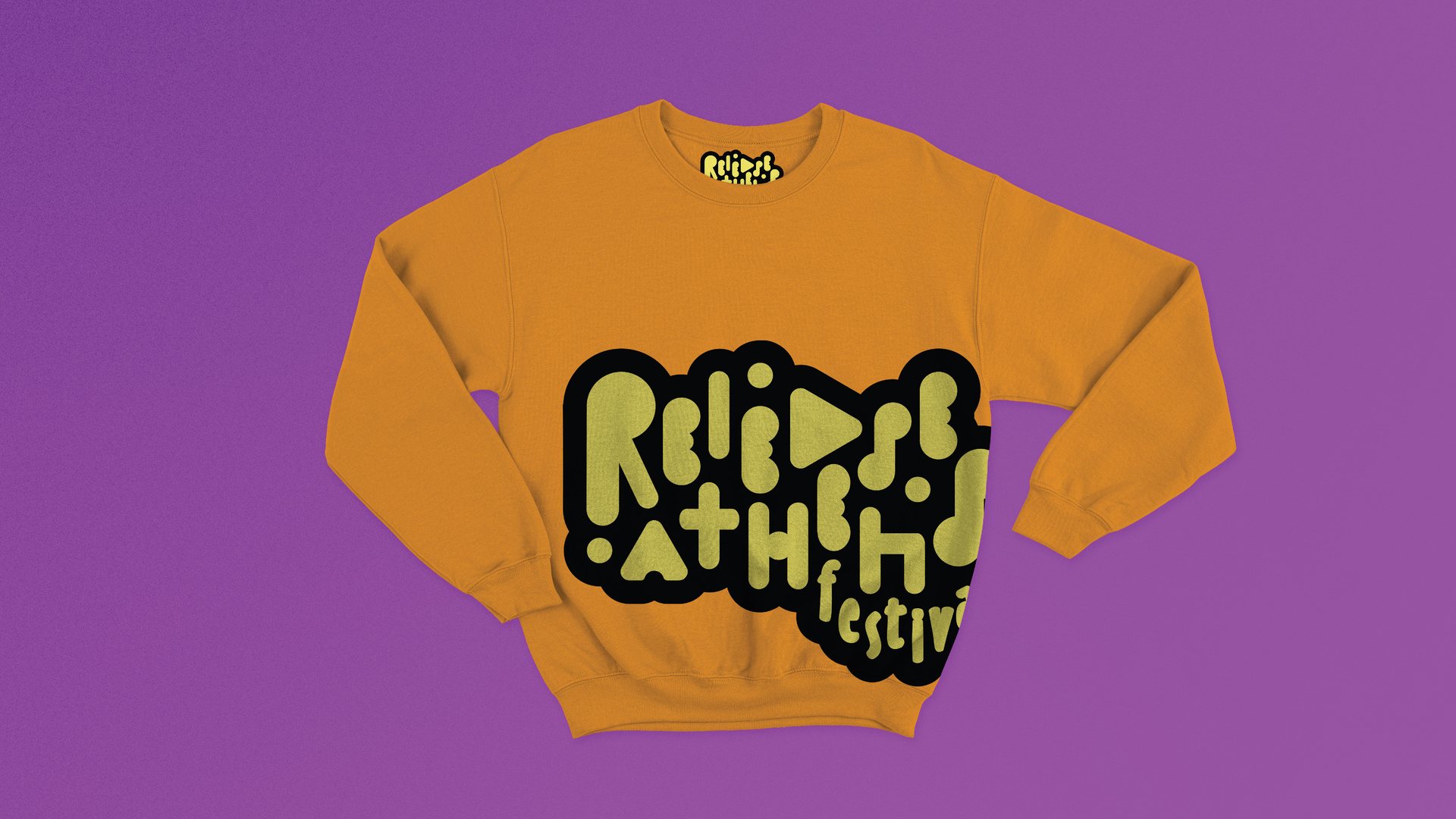
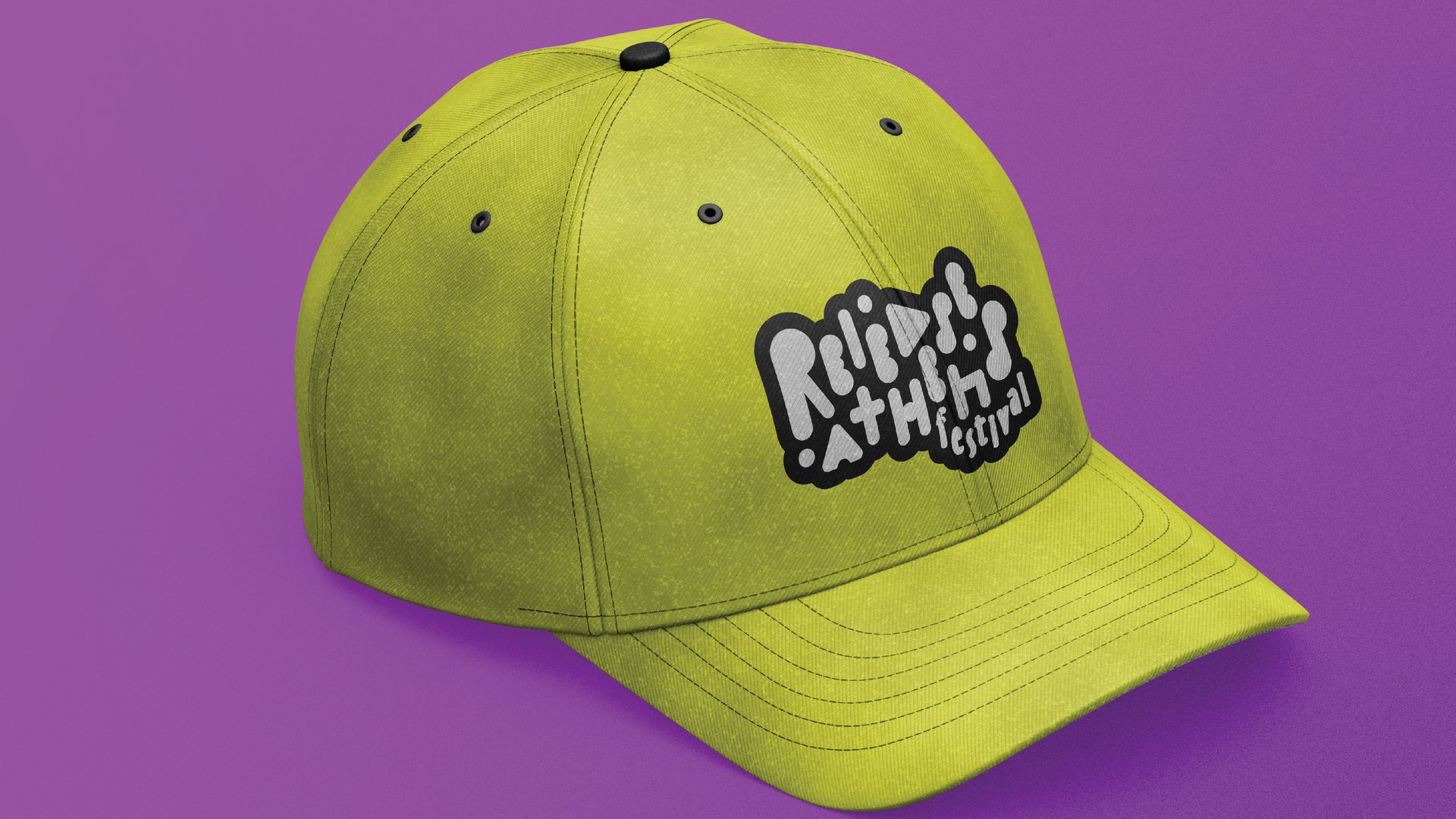
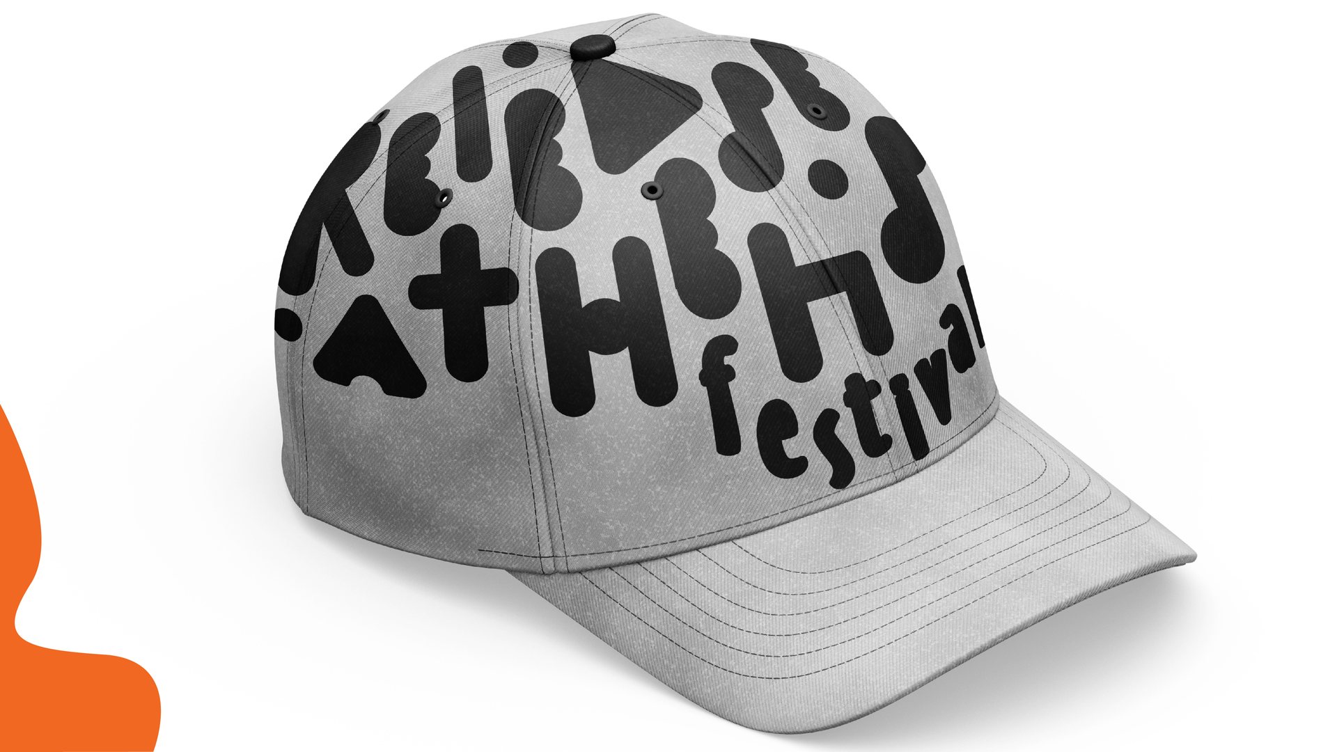
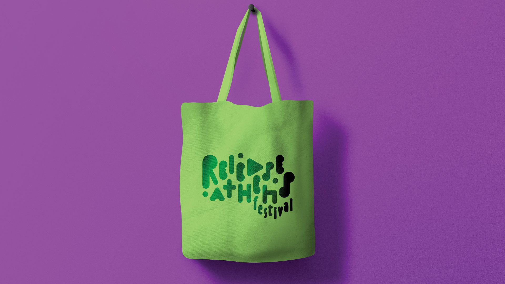
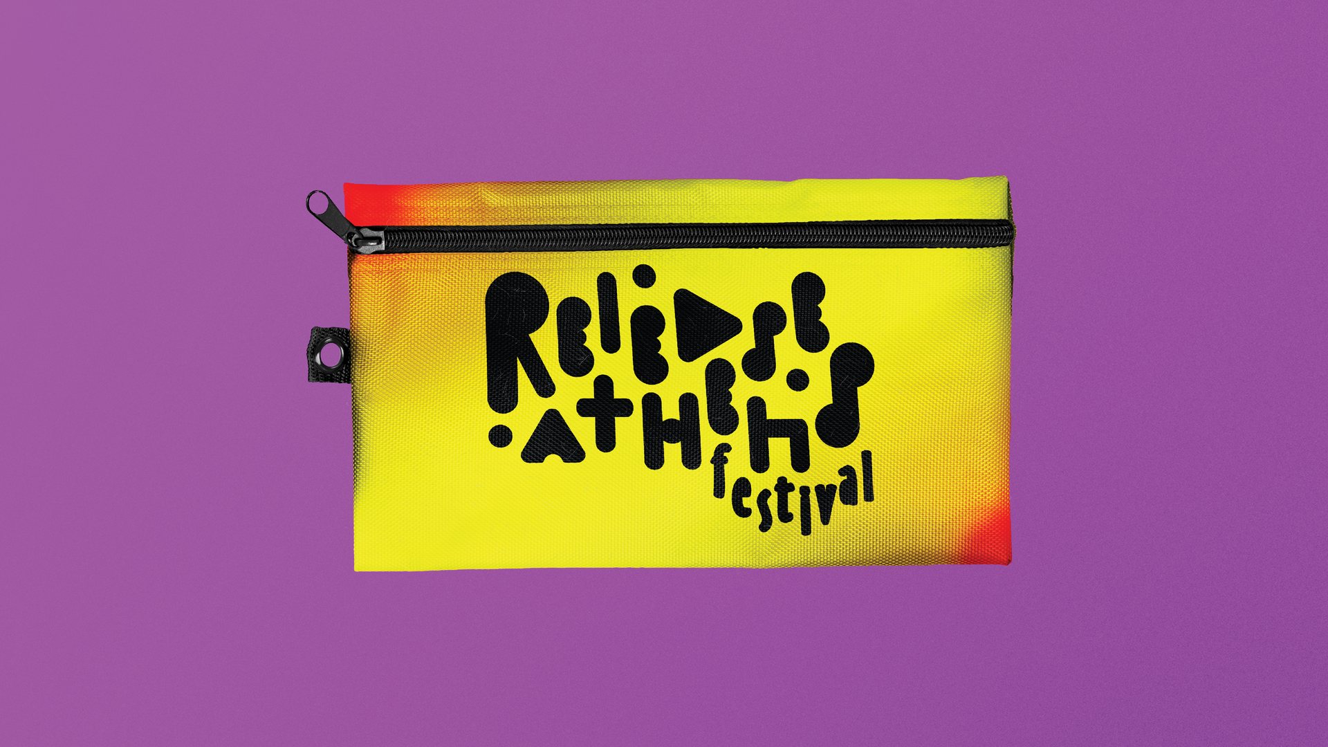
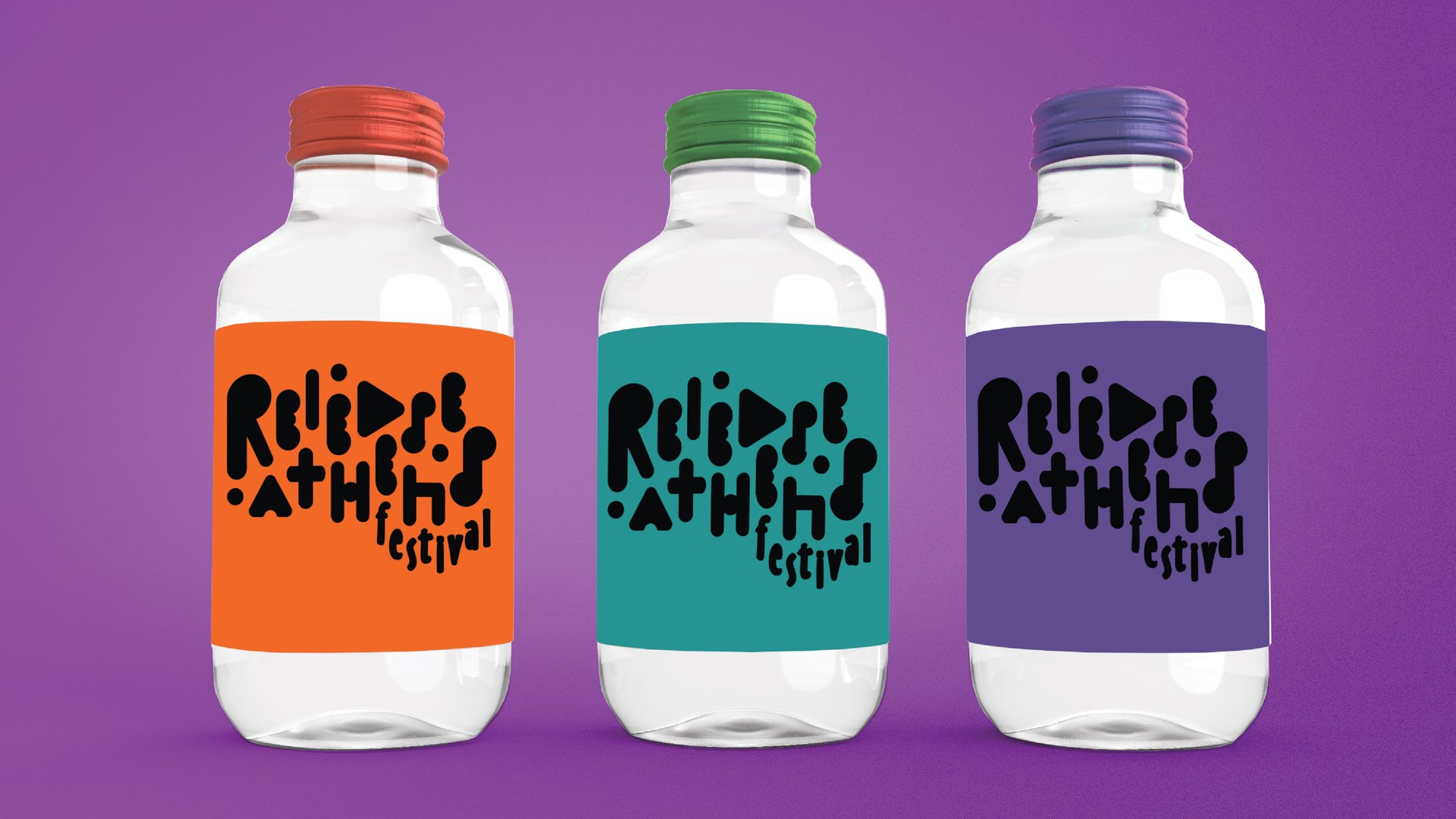
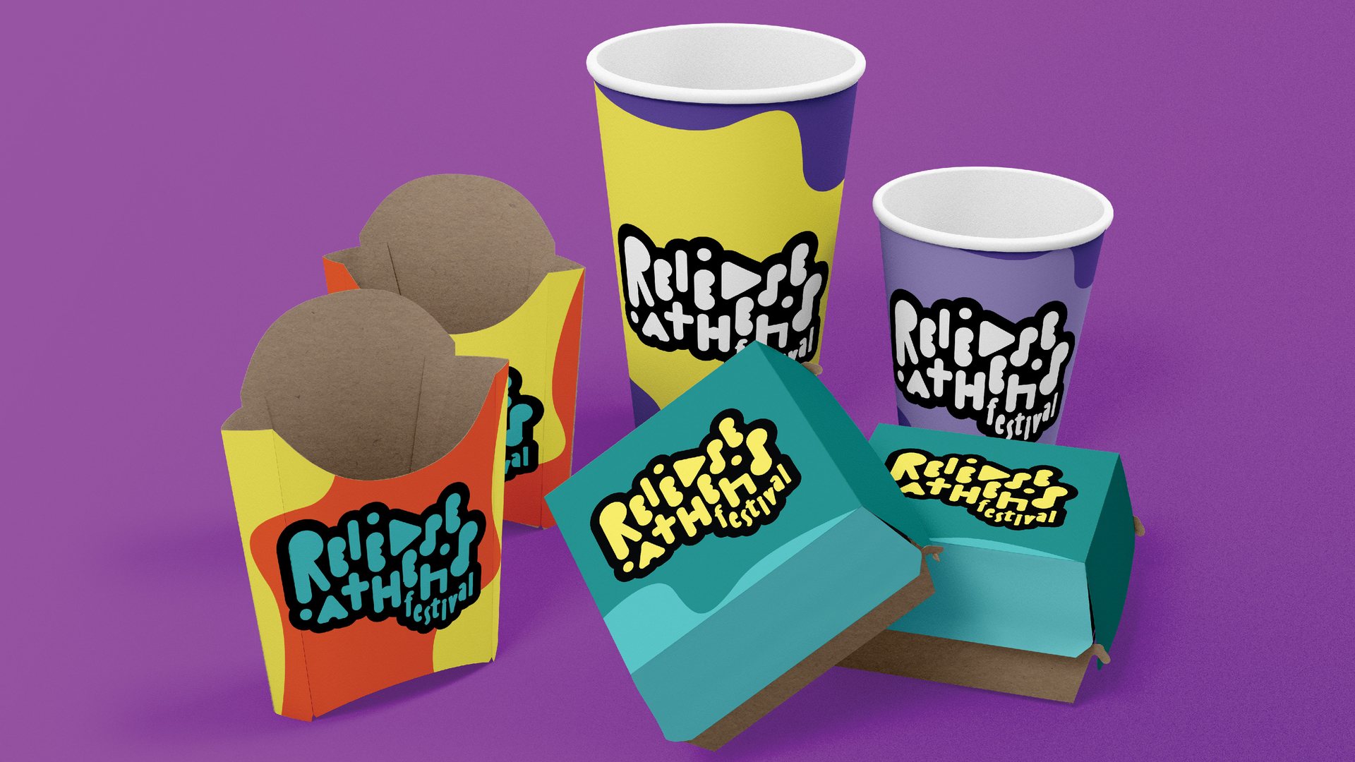
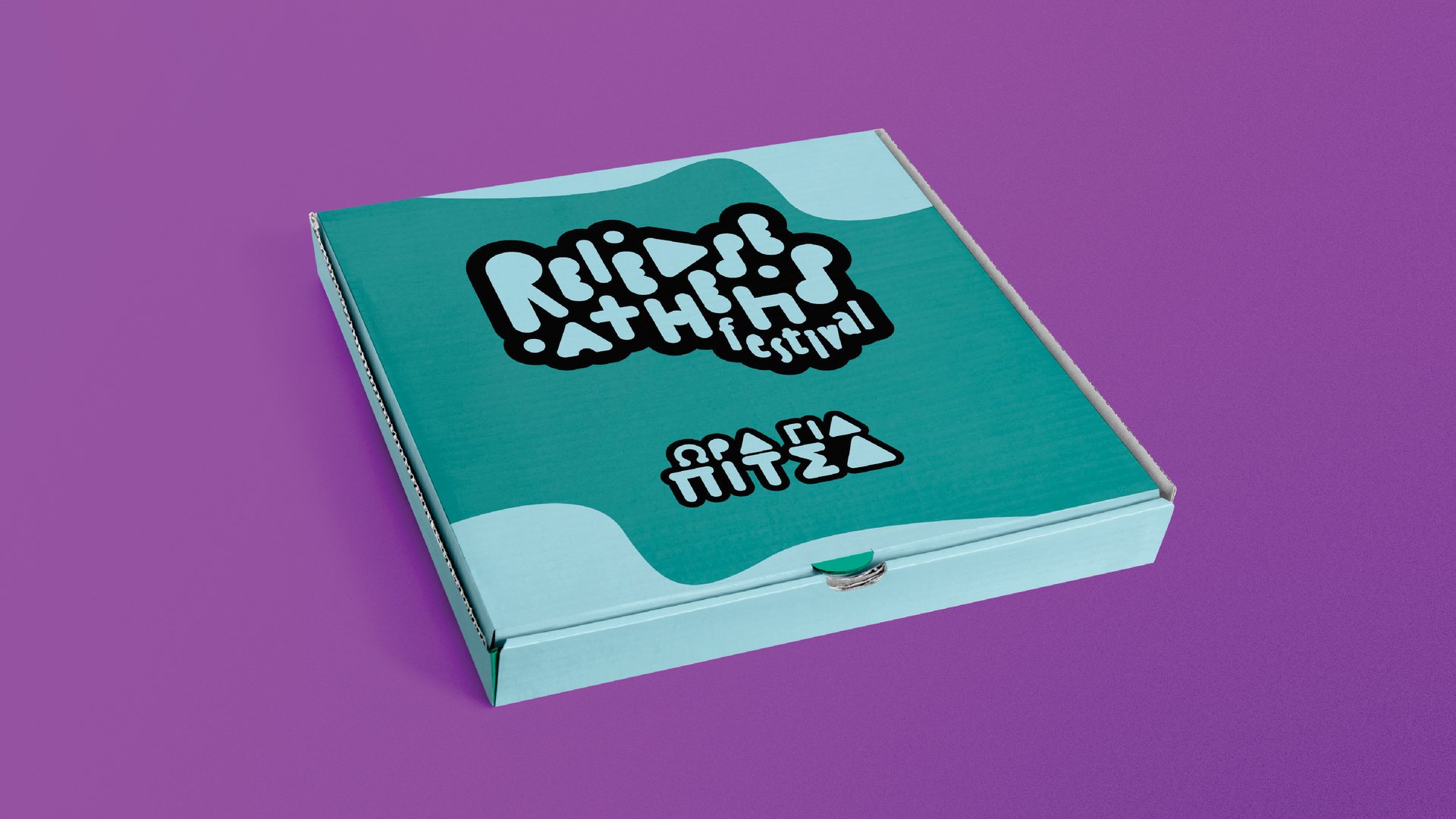
A student exercise at Vakalo College, in collaboration with Release Athens, to rebrand the festival for 2020. I prepared two different new visual identity proposals. The first is minimal and graphic, with the symbols of a media player in red on orange. The second is more playful, with a hand-drawn rounded logo and bold colours. Both were tested across the whole festival: tickets, posters, a website, social media, T-shirts, crew badges, flags, signs, food packaging and a pizza box.
It is a student exercise, not a commission, but it shows how I build an identity for a festival, from the mark to the applications. If you want something similar, get in touch.
Images (56)The symbols of a media player, play, pause, stop and record, become red shapes that blur as if in motion, on a bright orange ground with widely spaced monospace type.



A hand-drawn logo in rounded letters, where the A becomes a play button, in purple, orange, yellow and teal, with loose shapes that look like drops.
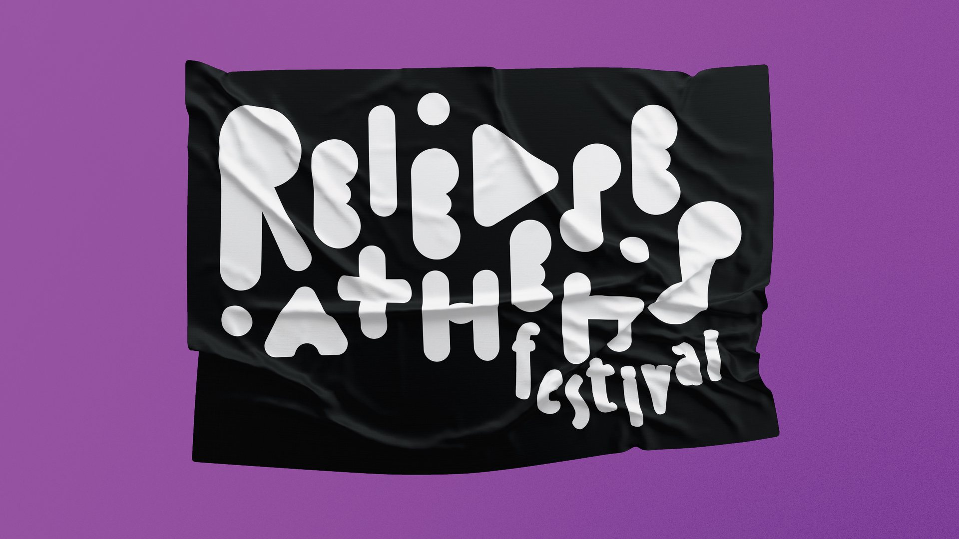
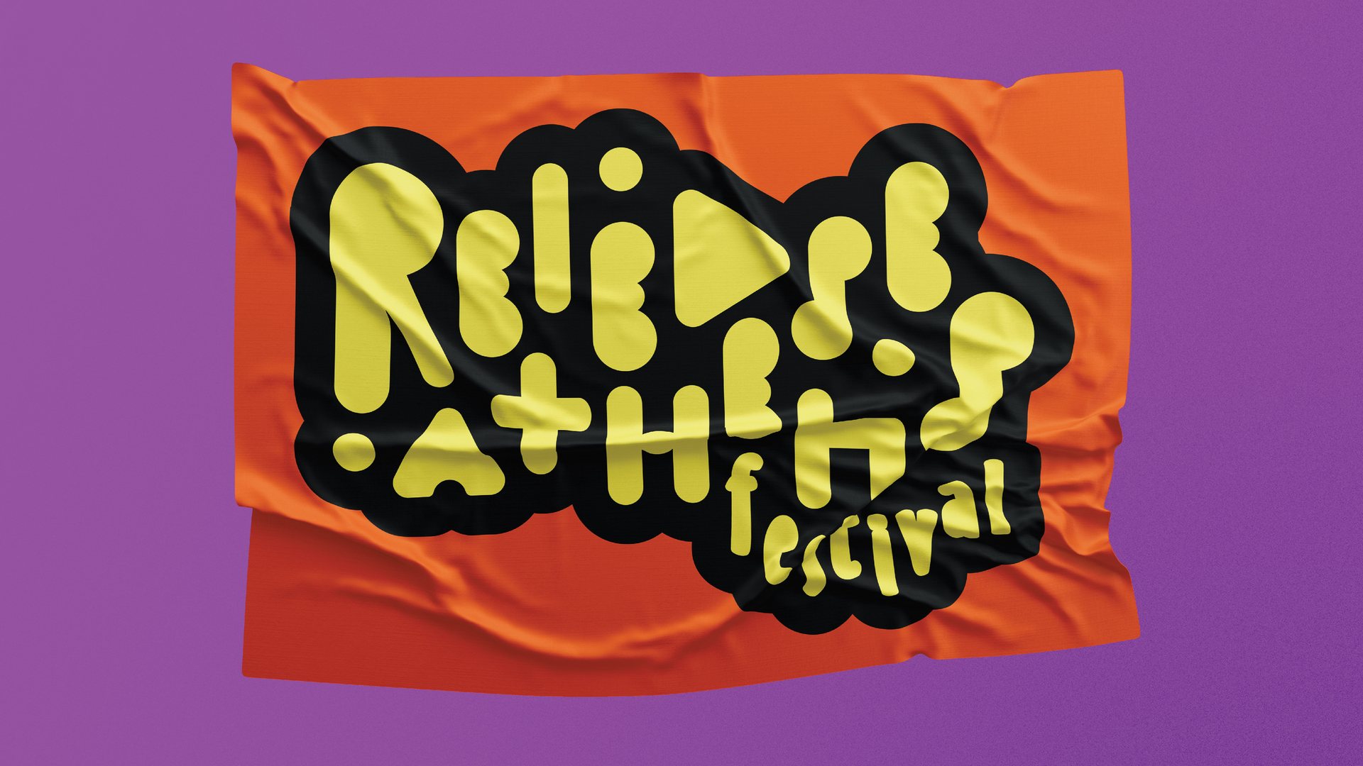
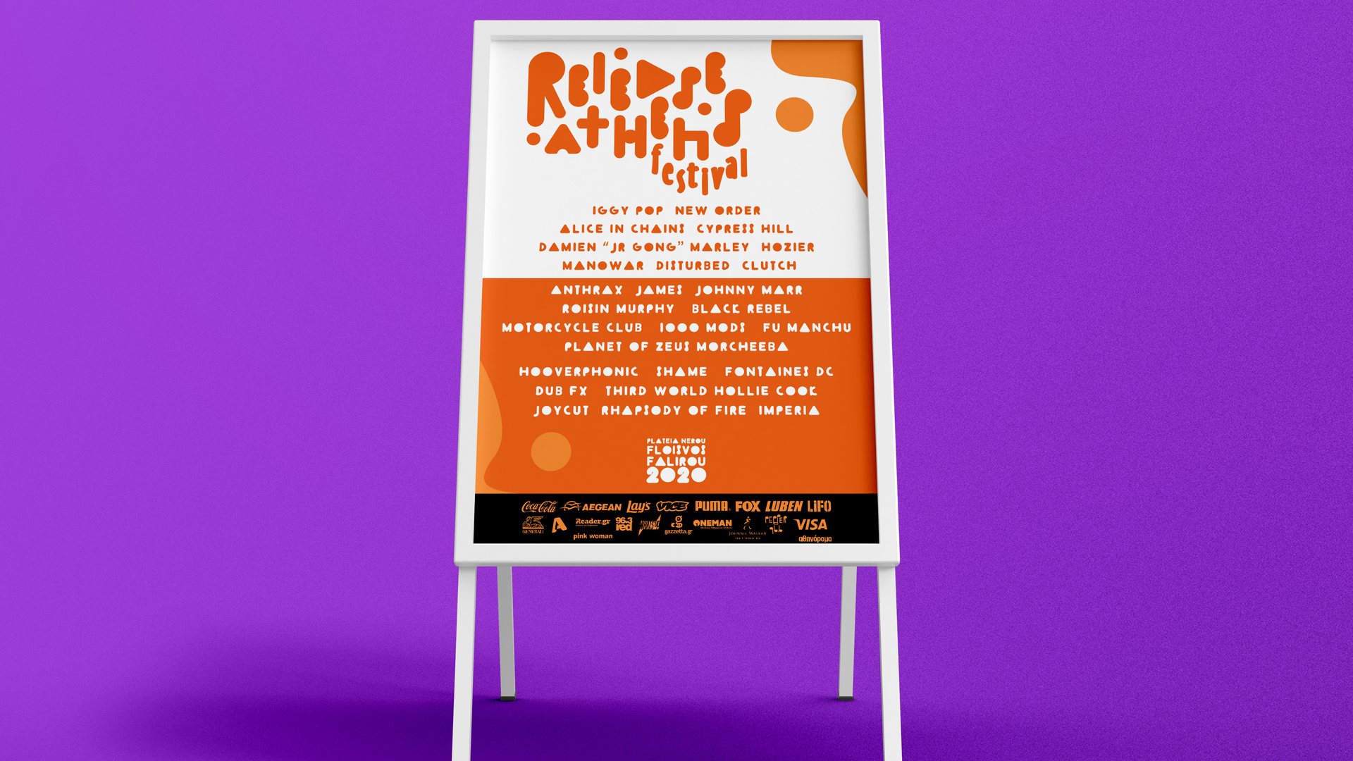
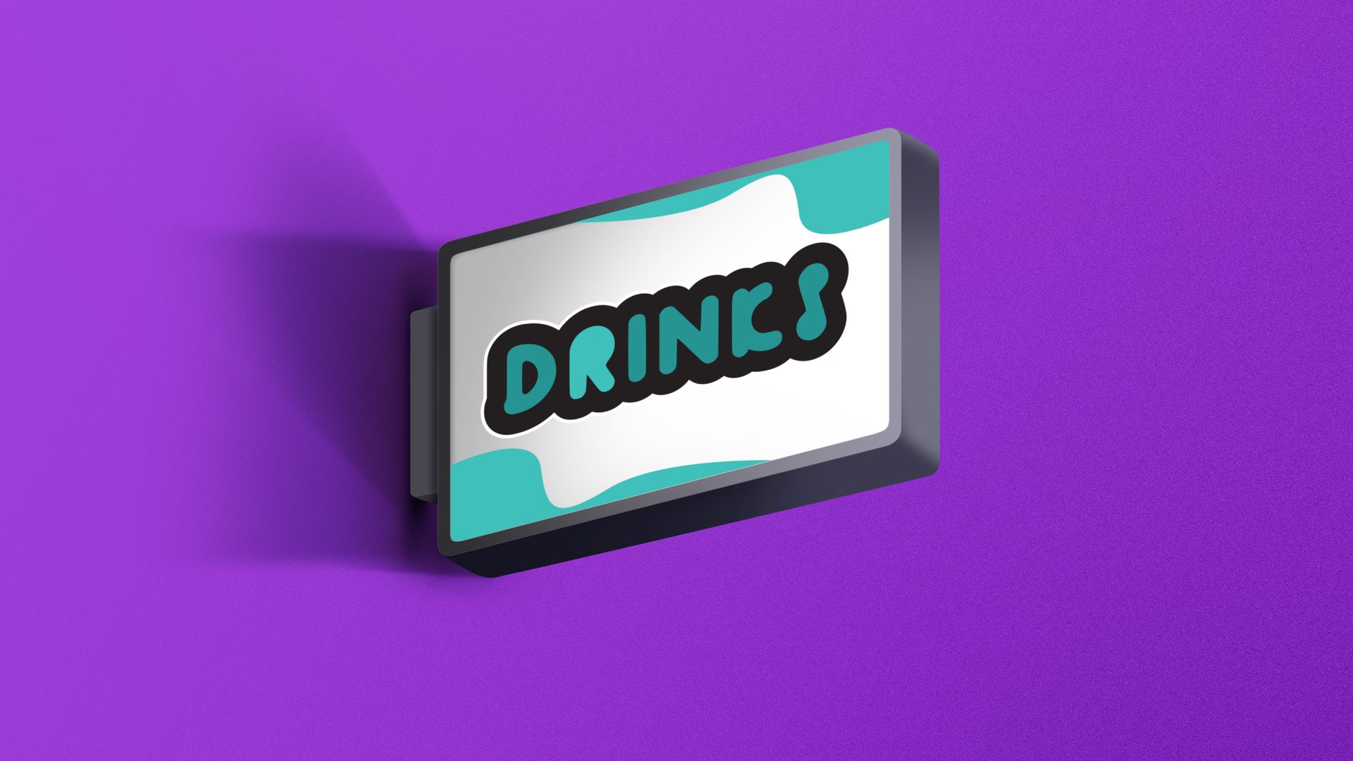
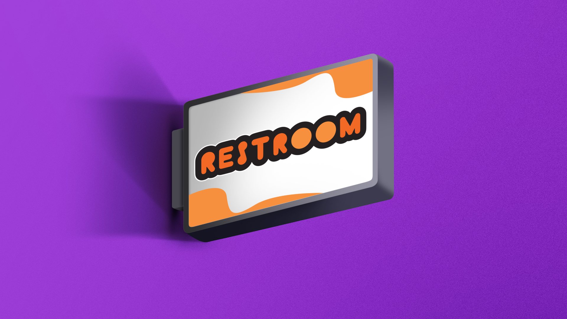
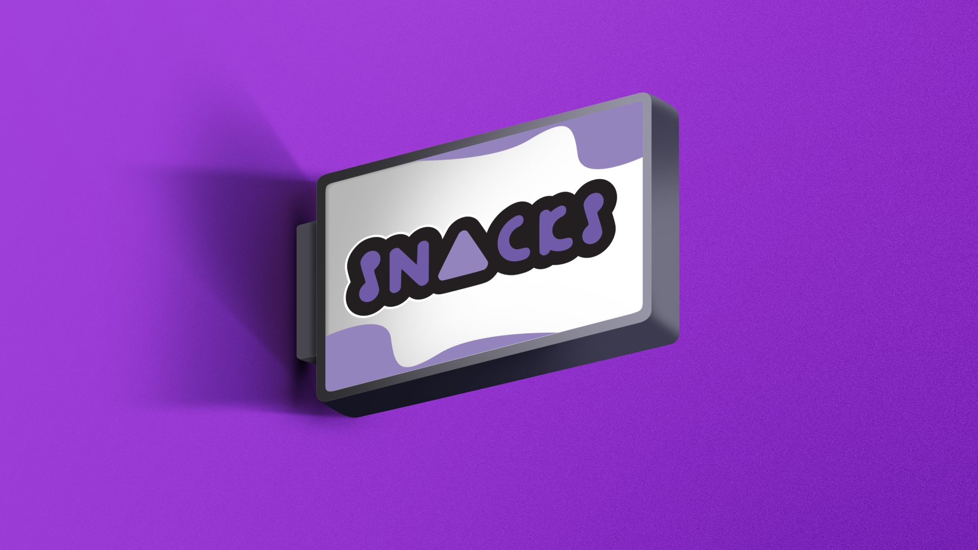
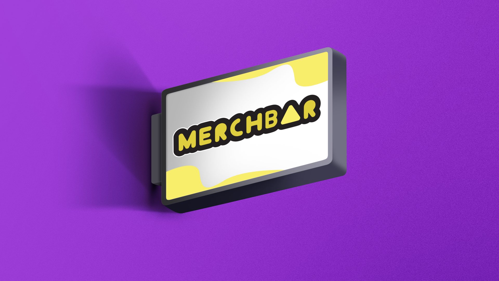
Brand identity. The logo is the start. The identity is the colours, type and rules that make a business card, a paper bag and a post look like they came from the same shop.
Digital, social and events. Posts, stories, short animations and event material, such as the Corinthian Carnival and the Seaside Days festival.
Print and editorial. Menus, catalogues, posters, leaflets and business cards. I hand them over print-ready, so there are no surprises at the printer.
Signage and space. Shopfronts, signs, murals and vehicles. Walls are where I started, so I especially enjoy this part.
Packaging. Labels, boxes and bags you notice on the shelf and can read easily, from bread and pastries to coffee and olive oil.
Looking for a brand identity, social media design, print, signage and packaging for your own business? Tell me about it and I will reply with a written quote, or see the packages with prices.