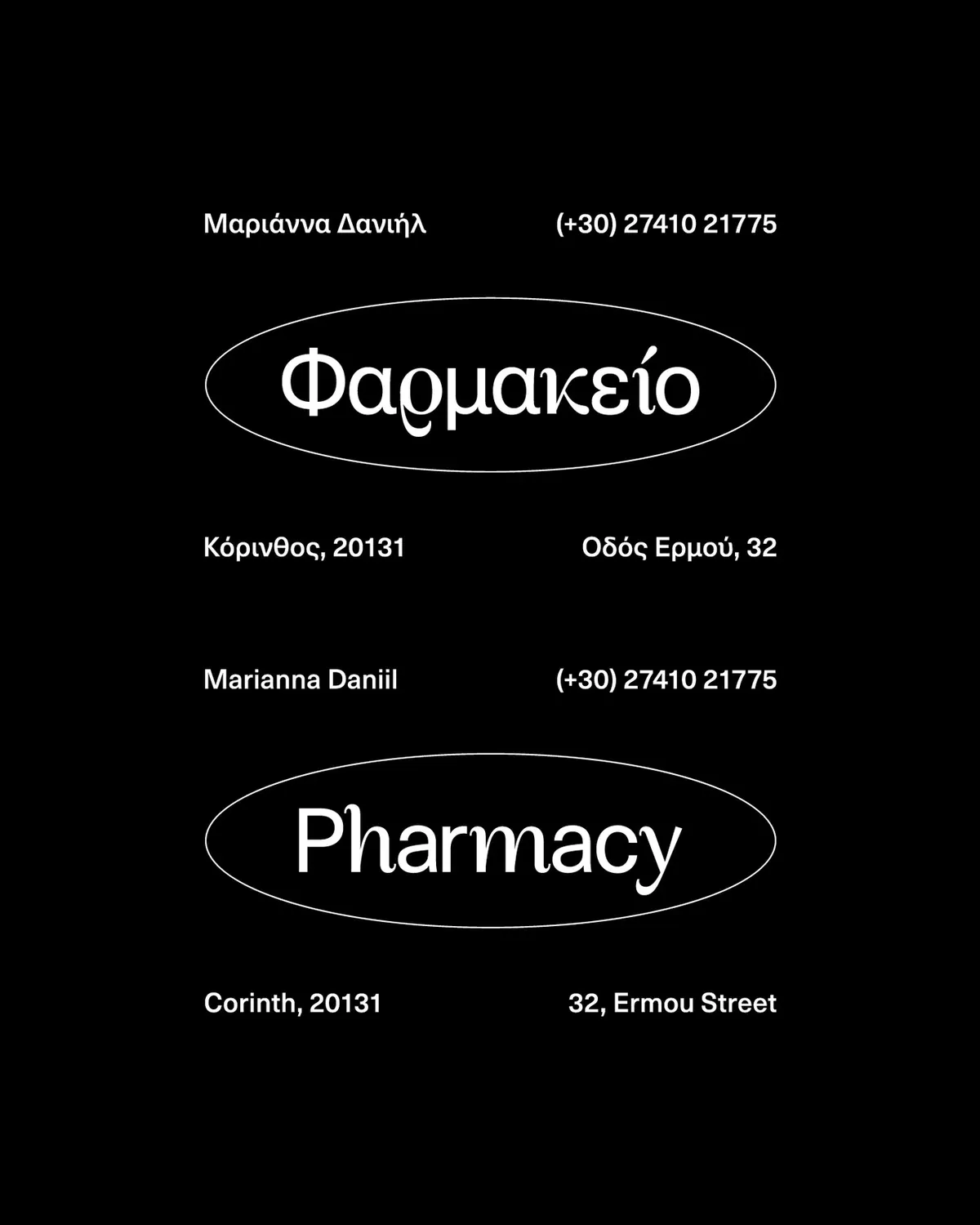
Daniil PharmacyVisual Identity Proposal
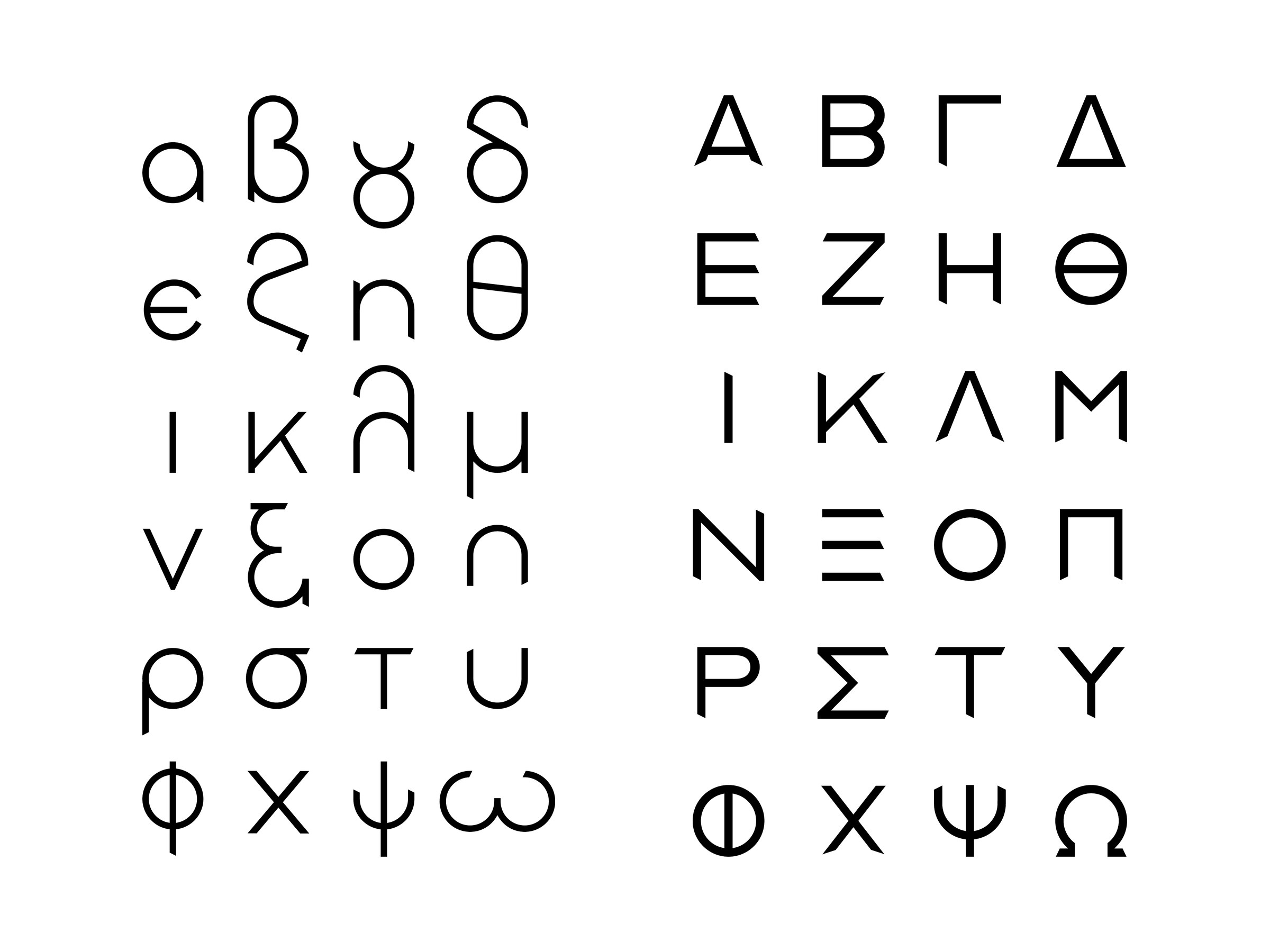
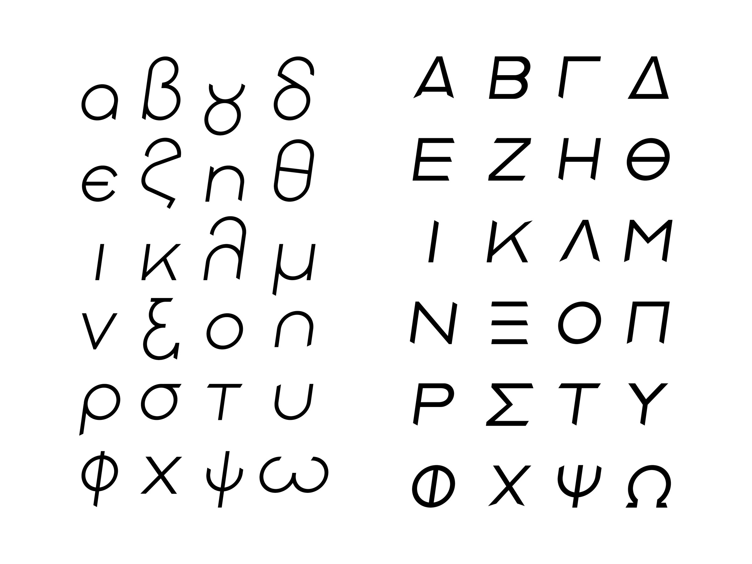
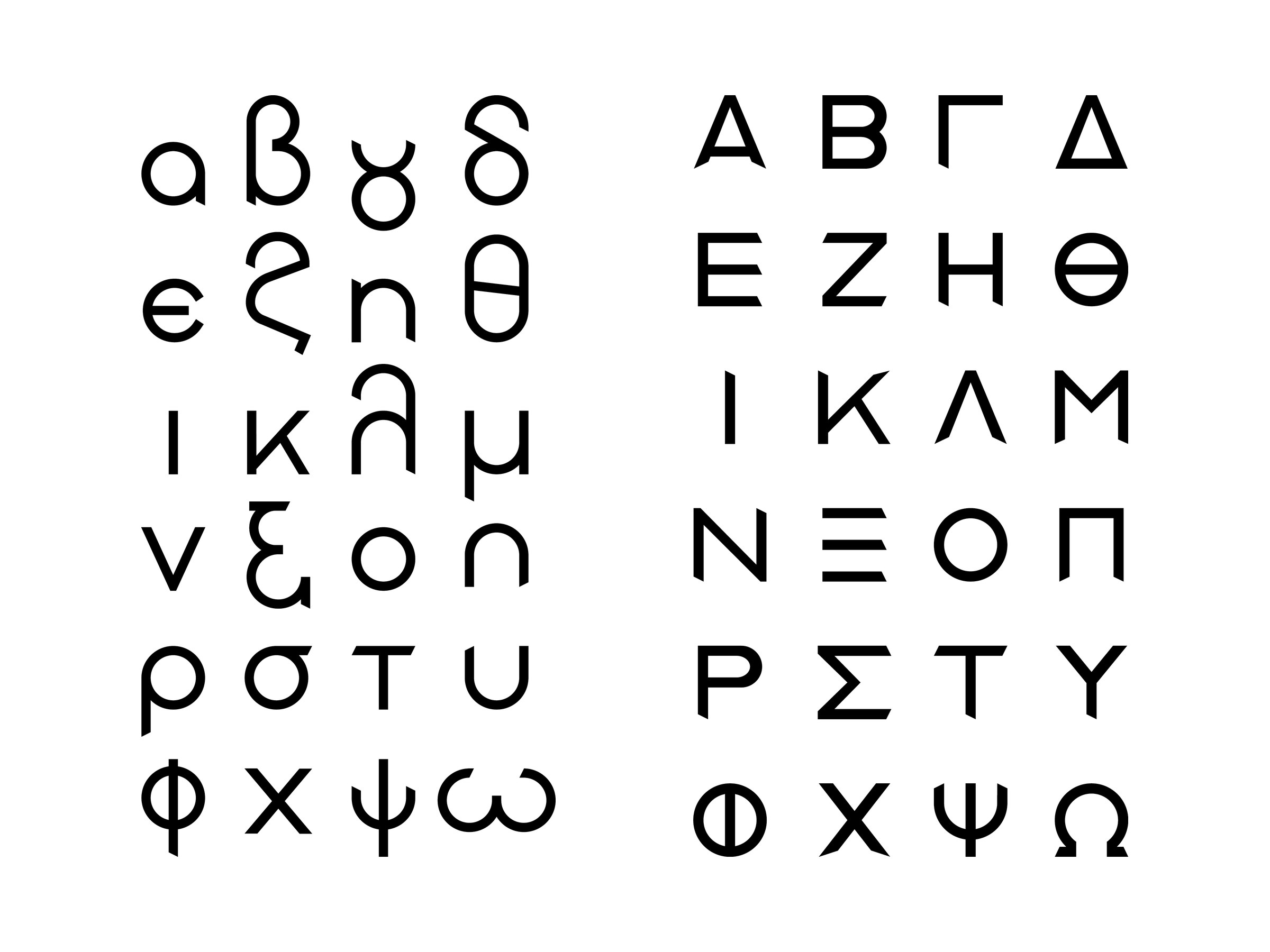
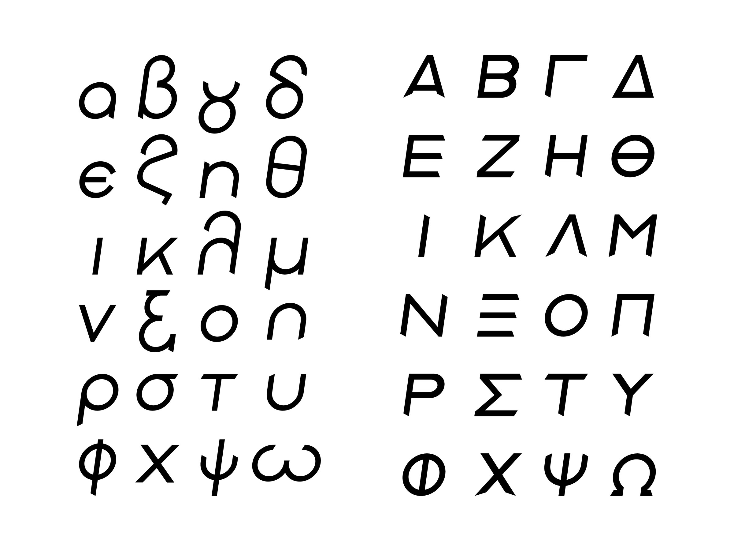
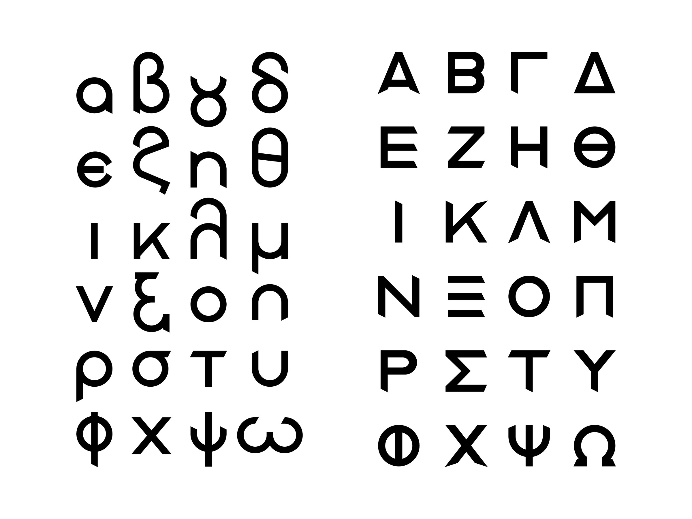
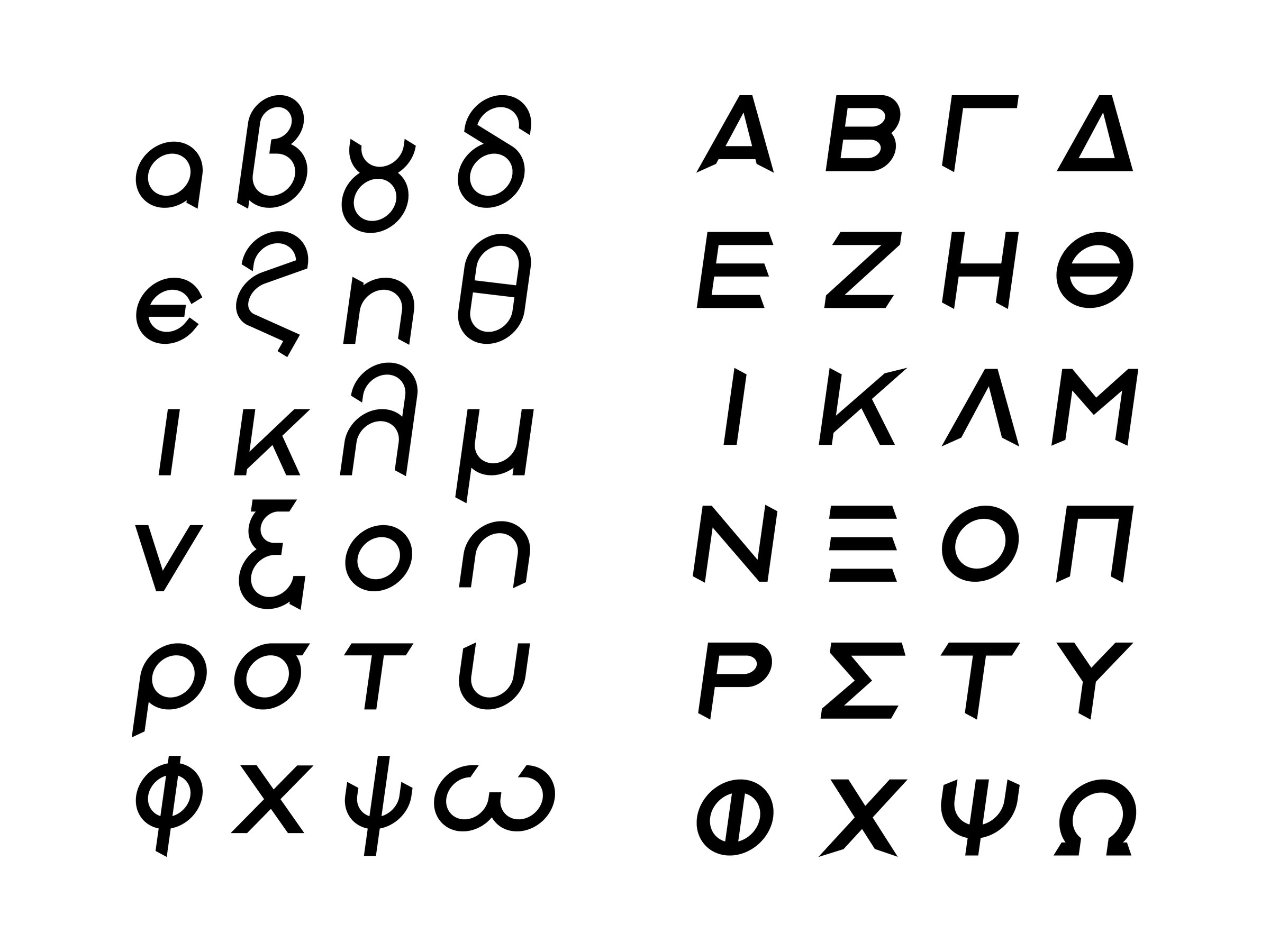
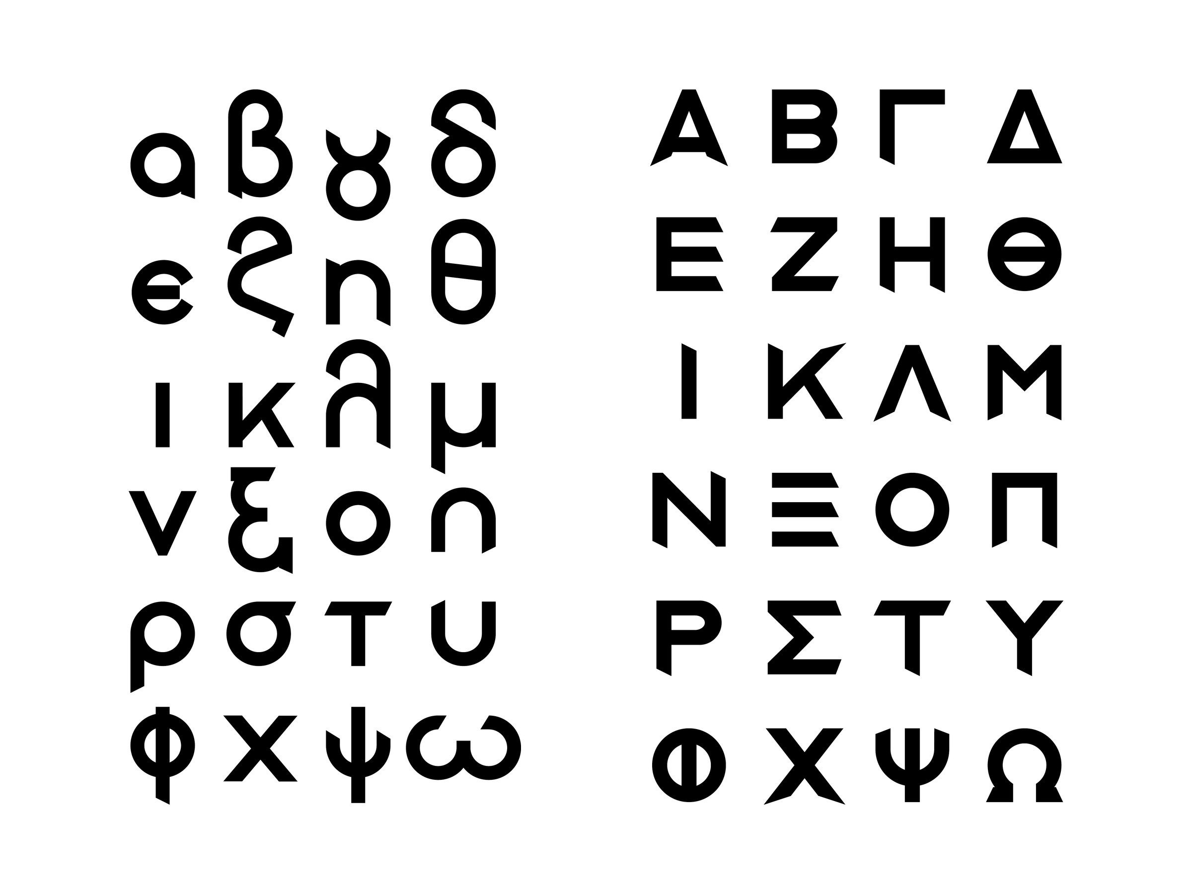
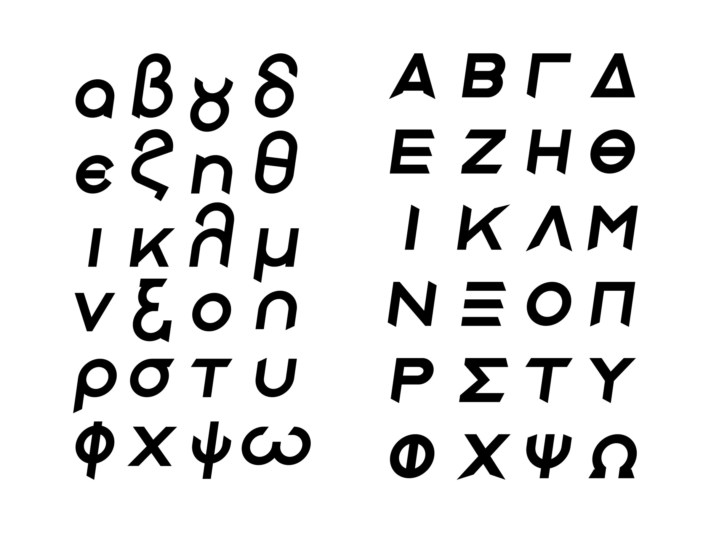
A student exercise at Vakalo College: a geometric Greek typeface drawn from scratch, with lowercase and uppercase letters. The letters are built from circles and straight lines with a constant stroke, and the terminals are cut at an angle, as in A and Γ. In the lowercase the circle does most of the work: β, γ and δ are made of two circles, or of a circle and a vertical stem. The family has four weights, Light, Regular, Medium and Bold, each with an italic. The specimen was printed on sixteen A3 pages, one for each weight of the lowercase and the uppercase.
It is a student exercise, not a commission, but it shows how I work on the letter itself, the basis of every logo and every identity. Today I work from Corinth for businesses across Greece. If you want a logo or custom lettering for your own business, get in touch.
Images (8)